How to draw background
How to draw background
How to Design Backgrounds
You might not realize it, but drawing a background is one of the most important parts of any character illustration.
Your characters shouldn’t be floating in a white background. They belong to their own, unique universe that defined the way your characters evolved up until the point you drew them.
In this Tutorial article, we’ll examine how artist Maddy Zoli creates a background. Follow along in Vectornator and learn how to do it yourself!
Character Design
If you’ve read our first lesson on character design, you know that a character’s backstory is the backbone of every line you draw.
You need to ground your characters in a deeper story than meets the eye; from when they were born, to where they live, what job they have, up to what their favorite food is. Sounds overkill? For us, it sounds more like fun!
Without falling into a deep rabbit hole, think of all these details about your character’s past, present, and future, and manifest them in their environment. In other words, project the story you have in your mind into the character’s background. Using visual storytelling like this will make your characters and worlds feel much richer and more real.
The Artist
This tutorial was made in collaboration with the amazing Maddy Zoli. We are creating a whole character series together on our YouTube channel, and she’s not only a pleasure to collaborate with, but she’s super knowledgeable about this topic. We could not have worked with anyone better for this step-by-step guide.
You will notice that each step that we mention in this tutorial does not go into the most minute of details. Meaning that we won’t mention a step each time a new layer is created or a new shape is drawn. Instead, we will condense each structural addition to the design process as one overarching step.
We’ve combined practice and theory here, so buckle up!
Get Your References Right
This step is about finding the right inspiration for the type of background that you want to design.
Can you guess where Maddy’s references come from? Her inspirations are pastel cityscapes with neon lights from ‘80s and ‘90s anime like Sailor Moon and Cardcaptor Sakura. She’s going to incorporate their aesthetic into her background design.
They’re already set up to have interesting lighting, action, and good composition. But you can also just go outside and draw landscapes or urban scenes you see around you.
The most important thing here is to give everything meaning. You shouldn’t think of your character and their background as separate things, but as one single unit. You’re not just drawing a background for your character, you’re drawing the scene that happens to have your character in it.
Sketch Your Basic Shapes
A popular style of sketching is to do a few small, 5-minute «gesture» studies from references where you simply block out the major values.
Then pick one or two studies to develop into more detailed sketches that you spend about 30 min to create, just like the sketch that Maddy completes in Procreate.
Thinking this way helps you integrate all your elements in a better and more interesting way. Because your viewer gets me more invested in the environment than if it were just a decorative backdrop.
So in our case, we already know that Jocasta is a teenage girl with superpowers. But what Maddy as the creator knows is that she lives in the future, in a busy city where she has to wait for public transport every evening to go back home.
You can tell by this little eye-catching element—the bus stop sign is actually a space shuttle.
Upload Sketch into Vectornator
From Procreate, simply export your sketch as a jpeg/png and import it into Vectornator. You can do that by drag and drop from the Gallery Tab.
Position Your Character
Maddy placed Jocasta in the scene following the rule of thirds.
There are many ways to create a great composition by using various tried and tested rules (like the rule of thirds) that help you achieve a balanced aesthetic. If you want to learn more about it, check out our video tutorial on creating great compositions filmed by another, amazing illustrator—Soodabeh Damavandi.
Organize Your Layers
It’s important to stay neat and organized with your layers—the extra effort you put into this step will help you tenfold as you progress with your illustration.
So after you’ve placed your character, hide the character layer. Then, lock the sketch layer after you’ve lowered its opacity.
This is also a good time to talk about technique!
There are two ways to design a background: using perspective or layering your landscape. Today we are focusing on the layering technique. If you’d like us to cover perspective theory in another video, please comment below.
So, if we break down the landscape, we have five layers in total. From front to back, so from the closest to the farthest, the layers are:
From this point on, simply remember to always create a new layer for any new design element to your illustration—for instance, the bus stop is on a separate layer, and so is the second row of buildings, and so are the moon and stars, as so on. You get it.
Tell the Story With Colors
Color is another super important aspect that can tell more about your character’s story.
So to recap: this world is in the future, it’s filled with magic, and it’s also inspired by Sailor Moon. No shock here that Maddy has chosen bold colors like neons, pastels, pinks, and greens. Anything but dull!
Here are all the hex codes you need in order to recreate Maddy’s piece:
Ultimately, you have to ensure that you use a color combination that is contrasting enough but remains harmonious with your character at the same time. That is why Maddy picked very similar hues to the ones that she used for Jocasta.
You’ll notice that the shades Maddy chose are going to be used and reused in a wide variety of design elements throughout her composition. Choosing a diverse, yet limited color palette will help you in the creative process, but will also make your artwork more cohesive and identifiable.
Set the Mood With the Time of Day
Stay away from a solid background color and use the time of day as a way to set the mood. For this scene, Maddy chose early evening.
It fits with the way both Jocasta and her ghost friend feel right now. Jocasta looks like she’s already over it, but since ghosts appear at night, he is just about to start his day!
To achieve this look, Maddy creates a purple square that fills up the entire canvas (C18FF0). She then applies a dark blue (3E6AED) linear gradient starting from the upper right corner.
Maddy then duplicates the square, rotates it so that the gradient sits in the opposite corner, and changes the gradient color to a beautiful orange (EFB09F). Did someone say sunset vibes?
Create the Second Row of Buildings
We are going to start with the second farthest layer of objects (the farthest being the sky).
This particular order is not that important. But if you have a cluster of layers that overlap each other, like the buildings, train station, and so on, it’s best to start with the farthest so you can understand how to place your objects in the foreground, how much negative space you have to play around with, and what colors contrast best.
Maddy picks up the Shape Tool and starts creating geometric shapes to define the frontal view of the buildings. The shade of blue she uses is 869FEF.
Draw Perspective
And to draw the sides, she opts for a darker shade—957AE1.
Not only that, but she also uses the Node Tool in order to change the angle of the top side of the rectangle so that they align with the vanishing point of your composition.
Add Details
Maddy adds a banner to the buildings that are closer to the viewer’s perspective.
Although these buildings are technically still in the second row, they are the closest of the farthest buildings. So adding any details here will only create a more realistic setting.
Draw the First Row of Buildings
Same as before, pick up the Shape Tool and draw rectangles to fill up the city. Maddy chose 957AE1 again, and 4265D2 for the sides.
Create Ambiance
To add even more depth to your background, consider including details like the city fog.
Simply draw a rectangle with the Shape Tool and give it a fun linear gradient that fades from the bottom up. The left color (in our case, the bottom color) is a beautiful teal (2885C7) and the left color (in our case, the top) is white (FFFFFF) with 0 opacity. You can achieve this by bringing the A channel to zero.
Add More Details
Bear in mind that the closer you get, the darker and more detailed your objects will be. While the previous row of buildings is going to remain a cluster of minimal rectangles and solid blocks with very few windows.
So in the buildings closest to the character, make sure to add all sorts of details like windows, lights, or billboards. Like this “Coola” sign which Maddy creates with freehand brushstrokes using the second preset from our Brush Selection Pane.
A tip to add multiple windows to the buildings in the foreground is to select multiple objects with the Select Tool and duplicate them in sequence.
Draw the Bus Stop
With the Rectangle Tool, trace all the main shapes that comprise the bus stop.
As before, use the Node Tool to change any angles that need to lead to the vanishing point of your perspective. Here she uses purple for the fence (7125D0), white (FFFFF) and yellow (FEF66F) for the cover, and an extra shade of blue (957AE1) for the sign.
Add More Dimension
The elements of the bus stop are also part of the sunset scene.
To evoke that, we’re going to do something about these solid colors. So duplicate the top rectangle you used to create the fence, make it more narrow, place it on top, and give it a gradient that shows the reflected sunset light.
Maddy goes for a linear gradient (the gradient in the center), and changes both the right and the left color to a light orange (EFB09F). Then she makes the left color completely transparent by changing the A channel to zero.
Apply the same effect, in the same way, for each individual rail.
Add Elements to the Sky
Finally, we’re moving on to the details in the sky, where we are going to add a few clouds, stars, and the moon.
For the clouds, pick up the Brush Tool and play around with the pressure you apply to your canvas in order to create a shape that starts small and builds up gradually. By changing the pressure, the line can go from very thin to very chunky in a single stroke. To achieve this effect, Maddy uses the 4th brush from our presets with Pressure Sensitivity on.
After drawing the clouds, use the Node Tool to make any adjustments to their shape.
Because the clouds will naturally reflect the sunset light, give them a gradient that goes from an orange hue (F92CEE, left) to a light pink (F9DCEE, right).
As for the moon, create two circles and use the Subtract Boolean function to cut a perfect semi-crescent moon. Don’t forget to hold one finger on the canvas to preserve the aspect ratio.
Finally, add stars with the Shape Tool. Maddy decides on a 12-point-star. You can edit the number of points via the slider on the left and you can change their shape by holding down one finger while dragging your Pencil on the canvas.
Add some Cool Details
Are you also one of those people who save the best for last? Time to add one of the last and coolest graphic elements to this piece.
Create the space shuttle with minimal effort with the Iconator function. Simply tap on the last tab in the Inspector to access Iconator and use the search bar to find what you need.
Maddy picks the space shuttle she likes best, resizes it, colors it white, and centers it in the middle of the sign. Easy peasy!
Add Light Effects
For extra flair, finish off by adding some circles of lights to give a sparkling effect of the distant city. Use the Shape Tool for the circles, of course, and then play with the gradient function in the Style Tab to give it a nicer effect.
Maddy went for a linear gradient with pink (F9A3D8) on the left while the right is left 100% transparent.
Then go to Blend Modes and choose Overlay.
Add Movement
To make the illustration mode dynamic, add a final layer of particle lights that cross the scene. For this, Maddy keeps the same brush as before (the fourth from our presets) to create very fine strokes filled with the same gradient from Step 15. And then set the blending mode to Overlay again.
The moment we’ve been waiting for: After all these steps, the illustration is now complete!
Why Drawing Backgrounds is Important
Whatever the background of a drawing is, it has a huge impact on the final artwork—whether good or bad!
Once you have learned to draw objects and characters in dynamic poses, the background is the last piece of the puzzle that brings everything together.
Your background acts as a yin to your character’s yang. If you have created your character using rounded shapes, use angular shapes will have to represent the background. If your character is dark, use light background colors, and so on. The key is to contrast with your character to help them stand out.
Your background is supposed to highlight your character and its story on a technical and conceptual level. So if you ask yourself whether designing a background is important, we believe that it is actually vital.
We hope this tutorial was helpful for you. In case you haven’t already, make sure you download Vectornator so you can design your own stunning backgrounds like the one Maddy created.
If you’re new to our tool, check out our Learning Hub or YouTube channel for graphic design tutorials and fresh inspiration; and pick a ready-made template to create designs within minutes.
Don’t forget to always tag us on social media so we can repost your work!
How to Draw Backgrounds – A Comprehensive Guide
How to draw backgrounds better than you ever have before! This guide gives detailed tips on how to draw better backgrounds. It covers ten topics and goes into specific tips for each one. This drawing guide is perfect for beginners and advanced artists alike. Also, it will help artists learn to make backgrounds that can be used for whatever their field, including hobby art, comics, book illustration, decor, or stationery. So, continue reading to quickly improve your sketching and painting skills.
Overview of How to Draw Backgrounds
Below is a list of the topics covered in this how to draw backgrounds guide.
1. Using References
The first step to draw better backgrounds is to use references. This can include referencing real life, other artworks, or photographs. Additionally, you can reference educational materials, such as books, tutorials, and speedpaint videos. (Make sure to follow proper copyright laws though when using reference that does not belong to you.)
Despite the misconception, using references when drawing is not cheating. Also, despite another misbelief, using references does help you improve at drawing backgrounds. For example, studying the forms, colors, sizes, etc. of trees from real life will help you to more accurately depict them in your background drawings.
Below, you can see the reference photo I used to do a background study of a town. By replicating the photo brushstroke by brushstroke, I took in much more detail than if I had just glanced at it. Additionally, by recreating the photo, I learned what buildings look like, how wet streets shine from rain, etc.
Now you have learned how using references can help improve your background drawings. For specific tips on how to use references in your art, read Tips for Using References in Your Art.
2. Nailing Your Perspective
The second step to drawing better backgrounds is nailing your perspective. Inaccurate perspective can be distracting or confusing to the viewer of your background drawings. That is why it is important to learn how to use perspective properly. Additionally, when applied well, perspective can help give some “extra oomph” or the right mood to a background drawing.
So, to draw better backgrounds, make sure to study horizon lines, vanishing points, how to make things to scale, etc. Looking for somewhere to start learning perspective? You can check out these books to help you learn the fundamentals of perspective drawing: Successful Drawing & Perspective Made Easy. #affiliatelinks
3. Blocking Out Your Sketch
Another helpful tip to draw backgrounds is to block out your sketch. Put simply, this means doing a quick, loose sketch before drawing more detailed. Similarly, you can also start your background drawing by doing some tiny thumbnails to decide on the best composition and layout.
Doing these things ensures you do not waste time detailing a part of your drawing only to realize the perspective is off or the scale is all wrong. Likewise, blocking out your sketch helps to ensure your drawing will have good readability and clear silhouettes. Furthermore, it will help you figure out where your perspective lines should go and to determine the best framing for your background drawing.
Below you can see how I first blocked out a sketch for my background study. You can see how I did not worry about making perfectly straight or clean lines in the beginning phases of the study. Instead, I focused on getting things the right scale and angle. I used my sketch as an underdrawing to make the next round of sketching easier, faster, and more accurate.
4. How to Draw Backgrounds with Depth
Most background drawings look best with a good sense of depth. So, here are some tips on improving your background drawings by adding depth:
Firstly, create depth in your backgrounds by incorporating a foreground, middleground, and background. Make these areas distinct from each other to add extra readability to your background as well. Secondly, if trying to add depth, choose “camera angles” that are not straight on. This will show more planes of objects at once, causing them to appear more three dimensional. This leads to the third tip, which is to think in 3D. Try to incorporate cubes rather than squares and cylinders rather than circles into your drawing. Fourthly, use shading to help add depth. Also, try blurring the background or foreground to create depth of focus. Likewise, you can add less details to things that are far away to create depth. Finally, you can incorporate atmospheric perspective to landscapes to give your backgrounds more depth.
5. Thinking in Grayscale
An additional tip for drawing better backgrounds is to think in grayscale. This means visualizing or literally turning your background drawing into grayscale to ensure a variety of things. For example, that the background has good readability, contrast, shapes, focal points, and depth. Likewise, using dark tones in the foreground and lighter tones in the background helps add depth to a background drawing. Putting a drawing into grayscale helps make it more obvious if your background is following this rule. So, to temporality turn your background into grayscale, use a drawing program or black and white camera filter.
Still confused how viewing your background in grayscale helps? Look at my background drawing below as an example. Temporarily making the drawing grayscale helps me more easily see that I have enough dark and light colors – also known as contrast. And good contrast helps the drawing have good clarity and depth. Additionally, it helps me see which areas of the background are receiving the most attention – also known as the focal points. If one of these areas are noticeably lacking, I can turn a drawing back into full color and try to fix the problem. That is why thinking in grayscale is helpful for achieving nice backgrounds.
6. How to Shade Better
Another important part of drawing good backgrounds is shading. The actual shapes and lines may be the most crucial parts to a good background drawing, but shading is an element that can take your backgrounds to the next level. Of course, there are many online tips and tutorials easily accessible that teach how to shade better. However, here a few important tips about shading: Determine the direction of your light source, focus on shadows and highlights, and do not over blend.
7. Choosing Good Compositions
When learning how to draw backgrounds, a valuable skill to learn is how to choose good compositions. In other words, choosing appropriate layouts to use in your drawings. If used correctly, composition can help you achieve the correct vibe you desire your background to give off. For example, you can use composition to give off a peaceful, exciting, or shocking feel. To achieve good composition in your background drawings, study framing, camera angles, and focal points.
Additionally, good composition is extremely important for comics. That is actually why I did this background study. It is to help me get better at drawing backgrounds for my upcoming comic.
8. Using Stylization
Another important tool to help you draw backgrounds is stylization. Sometimes, breaking away from realism can help you create even more amazing backgrounds. Stylization can also be used to simplify a background and make it faster to draw. Also, stylization can add clarity or spunk to a background drawing. It can even help achieve a better flow or composition in your drawing.
To use stylization, try exaggerating, simplifying, changing colors, etc. Also, study different famous stylized art styles or create your own. Furthermore, do not be afraid to stray from realism. As mentioned, using various methods of stylization can help you achieve the right feel or look to your backgrounds.
9. How to Draw Backgrounds from Imagination
Although drawing realistically or from reference are great methods to practice drawing backgrounds, sometimes artists want to create their own original backgrounds. By doing so, artists are able to avoid copyright issues and/or are able to depict the ideas in their head.
However, there really is no such thing as drawing from “imagination” or “originality.” Everything an artist draws is based on conscious and subconscious things they have previously seen or learned about. So, in order to draw original backgrounds, artists must first learn about backgrounds. For instance, if you want to draw a town from imagination, you need to know things about towns and about drawing. So, to draw better towns from imagination, it helps to first know a lot about towns and about drawing. Likewise, it helps to practice all the previously mentioned tips for drawing backgrounds.
One more tip for drawing from imagination, is to combine multiple references. This way you can create something one a kind and call it your own original work. Additionally, when drawing interiors, try doing an overhead sketch of the room first. Drawing aerial, blueprint angles is pretty fast and easy, so it helps you plan out the layout of a room before investing time drawing it from a more complex angle. This tip is also helpful for when you need to draw the same room consistently from multiple angles. For example, I will need to do this when making my upcoming comic.
10. Practice Makes Perfect
Finally, the most important part of drawing backgrounds is to actually practice drawing backgrounds. It is great to read and learn about drawing backgrounds, but it is also great to experiment and test your knowledge. When drawing backgrounds, avoid tracing, even when doing studies, as this does not help as much as free-handing your own backgrounds. Also, remember to break out of your comfort zone and try to draw challenging or new types of backgrounds. Moreover, try doing a mixture of sketches and finished illustrations. You can get more practice in just doing sketches of backgrounds, but it is nice to make some polished backgrounds as well.
I have been using these tips to practice making backgrounds for my upcoming comic. For instance, the background painting below is a study I created of an old town. By making this drawing, I am now better able to create original backgrounds for my comic. With time and effort, I know you too can improve at drawing backgrounds, as practice makes perfect.
I Hope You Liked These Tips on How to Draw Backgrounds!
If you enjoyed learning about these tips to draw backgrounds, I would love to know. So, s hare a comment below on your favorite tips from this article.
Also, read more tips about drawing and comics. And subscribe for more content like this.
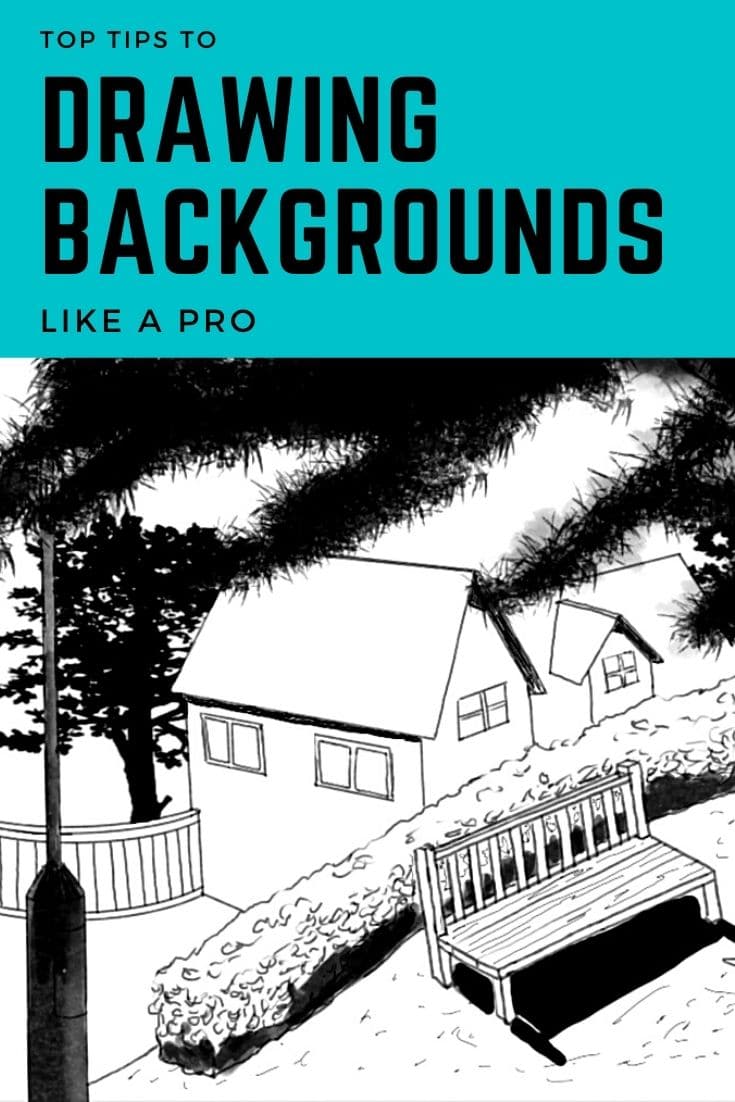
Top 10 Tips to Drawing Backgrounds Like a Pro
Posted on Last updated: December 14, 2021
Home » Drawing » Top 10 Tips to Drawing Backgrounds Like a Pro
Want tips to drawing backgrounds of your artwork like a pro? Saying yes? No worries, just read this post till the end as this post says it all!
There are a lot of things that artists can draw.
For example, artists can draw a house, a landscape, mountains, fruits, a cityscape, galaxy, or a portrait.
Do you know one thing that all artists draw in their drawings or sketches?
The answer is simple: Drawing Backgrounds!
Yes, it is right! Drawing the backgrounds of a painting is one of the biggest yet important parts of an artwork that almost every artist must do.
Today I will show you how you can draw a background like a pro.
One thing that you must keep in mind is that you should make the background of your drawing simple but make it colorful as well.
Because if you draw simple backgrounds, the image that you have drawn will become the focus of your drawing.
It does not mean that you should pay less attention to the backgrounds.
When you’re drawing simple backgrounds, you’ll want to learn some tips on how to draw one point perspective or two point perspective.
Why drawing backgrounds is important
Remember, backgrounds are very important in drawings.
They are an essential part of the compositions.
And they have a major role to make or break your piece of art.
Even if you, as an artist, have left the space empty or white in the background, it means that you are still creating the background – a white background.
So, whatever the background of a drawing is, it has a huge impact on the final artwork – whether the impact is good or bad!
Once you have learned to draw objects, people, or characters in dynamic poses, it is time to begin drawing backgrounds.
It is important to use those colors in the background that match the main image.
If you have created all positive shapes in an image, then the negative shapes will represent the background.
This post highlights everything that you need to know about drawing backgrounds.
Here, you will come to know some basic and advanced tips by which you can draw backgrounds of your drawings and paintings like a pro.
We will show you how you can draw some basic shapes as well as lines.
By reading this post till the end, you will also get to know adding patterns in the backgrounds to add a visual appeal to your drawing.
Are you ready to discover some tips for backgrounds? Let’s take a start now!
Use light colors in the background so it can complement with the main elements
The first and foremost tip that may help you in drawing the background of your artwork is using light colors.
When plain backgrounds are not used, obviously some colors are added in the background to make them look appealing.
Such colors should be added in the background that can complement the main object of the drawing rather than competing with it.
Let’s say you are drawing a landscape where there are brown rocks in the front and at the back, there are large mountains.
The upper portion of the painting is filled with sky.
As the rocks in the front are the focal points and are dark brown in shade, for coloring the background (including mountains and sky), you need to add colors mixed with white.
For example, for the sky, you can add light blue color and for mountains, you can add the same brown shade that was used for the foreground rocks but this time, the color is mixed with white to add a light effect to the background.
What you have learned: Never add such colors in the background that competes with the focal point for the attention of the viewer!
Avoid long straight or curved lines when drawing backgrounds
The next important tip is to avoid long straight and curved lines.
Now you must be thinking lines are everywhere in the drawings then how you can avoid them.
Let me tell you.
You can definitely use long straight and curved lines but there should be some object that breaks into them.
In other words, I can say that they should be disconnected.
Because if there are long lines in the background, the whole artwork may become boring or inartistic.
Consider this by taking an example of arranging a room.
To set a room, you will put various pieces of furniture, wall hangings, or carpets just to fill up the blank space and long lines.
The same is the case with drawing the backgrounds.
If there is monotony in the background using long straight and curved lines, you should break it otherwise the viewer will not be attracted to the whole artwork.
Therefore, to make your backgrounds interesting, you should avoid using long lines.
What you have learned: For making the background of your paintings appealing, interesting and not disturbing to the eye, never draw long lines, either straight or curved.
The lines must be broken by some objects.
Never use a plain paper background for complex compositions
Want another tip for drawing backgrounds?
Never use a plain paper background for complex compositions.
A plain paper background means that you have not drawn a background because the color of the paper serves as a background.
This type of background is easy because you just need to select the right color of paper that you may use as a background.
BUT a plain paper background does not work well for complex compositions.
If the subject is complex, a plain paper background will make the subject dull and boring instead of making it interesting to look at.
That being said, a plain paper background can work well if you are working on a still life painting or drawing a simple portrait.
What you have learned: For simple portraits and still life paintings, using a plain paper background is good but for complex art compositions, never use a plain background.
Parallel lines in the background should not conflict with one another
For designing the background of a drawing, another technique is about parallel lines.
To make a background add a positive vibe to the subject, you can draw parallel lines in the background but they should not conflict with one another.
Let’s take an example of a background of a room.
In such a drawing, you need to show the interior of the room such as a sofa, flower vase, clock, wall hanging, or a table.
If you group the furniture or other interior items of the room in such a way that the lines are becoming parallel, what will it show?
Can we call it a good composition?
The parallel lines are conflicting with one another.
They should be broken by other objects.
For example, if you have drawn a curtain then its parallel line should not match with that of the sofa (placed just beside the curtain).
What you have learned: If the background of your artwork contains many parallel lines, make sure that they are not conflicting with each other.
Always try to make them with some objects!
Draw a background that unifies the whole artwork
It is another technique that an artist must follow if he/she is drawing backgrounds.
You should draw such a background that unifies the whole image.
This tip for drawing the backgrounds is typically related to the colors.
It means that the colors of the background should be such that they can complement the colors of the main object.
For example, consider a drawing in which there is a bird sitting on the branch of a tree.
Now the question arises here is what will be the background?
Will it be a plain background or should an artist use light colors?
It totally depends on the colors that are used in the bird and the branch of a tree.
If the bird has yellow and black color and the flowers on a tree branch have pink colors, then you can use yellow and pink colors in the background.
But instead of making them too bright, try to make colors diffused so that the viewer can focus on the actual subject of the image and that is a bird.
What you have learned: An artist can use different colors in the background. But such colors should be used that can unify the whole piece of art.
Use a tinted background to soften the hardness of a plain background
If you have used a plain background but want to soften its hardness at the same time, you can use a tinted background.
Basically, a tinted background is also a plain background but you can add some shades of colors or pencils in the selected areas, maybe in the corner of the painting or at the edges of the main subject.
The tinted background helps a lot in making the subject to focus the attention of the viewer.
But one thing that should be kept in mind is that such colors should be used for a tinted background that matches the colors used in the subject.
What you have learned: If you do not want to use a plain background but make the background simple as well, you can use a tinted background by shading in some areas of the background.
Use elements in the background to create depth
The next tip for drawing backgrounds is to use some elements in the background that can create depth.
Imagine you have created a landscape drawing.
The whole scene is beautiful, the light is perfect but there is something that is making your artwork look flat or compressed.
It is due to the background!
Use some elements in the background that makes an artwork interesting.
For example, if there are mountains in a landscape painting, you can add a lake.
This will definitely give depth to your photos.
What you have learned: Always try to use some elements in the background that can create depth and can make the artwork appealing to the eyes.
Draw a background that can add to the quality of the scene | a tonal background
Always draw an appealing background to add to the quality of the whole scene.
For example, in the case of a landscape painting, you can draw different trees in the background that may enhance the whole picture.
You can also create an illusion of a blurry landscape. It can also enhance your painting.
What you have learned: An artist must always use such a background that can to the quality of the scene.
Add shadows and highlights
If you are drawing backgrounds of anime films, you should use colorful backgrounds.
Plus, it is better to add shadows and highlights in the backgrounds using different techniques so that an illusion of depth can be created.
What you have learned: Adding shadows and highlights in the background is a good technique for creating an illusion of depth.
Use different shades of colors in the background
Most artists prefer to use the white paper for their drawings but they want a colored background at the same time.
In such a case, using different shades of colors in the background is an ideal option.
It is a great technique by which you can draw backgrounds like a pro.
What you have learned: Instead of adding different colors, you can add different shades of the same color in the background.
Conclusion
So, these are the top ten tips for drawing backgrounds.
It is also important to make the backgrounds as simple as you can so that the viewer can focus on the main object that you have drawn in your painting.
The colors used in the image must also correspond with that of the background.
So, if you want to draw backgrounds like a pro, follow all the above-mentioned tips, have fun and happy drawing.
Do you know any other technique for drawing the backgrounds in artworks?
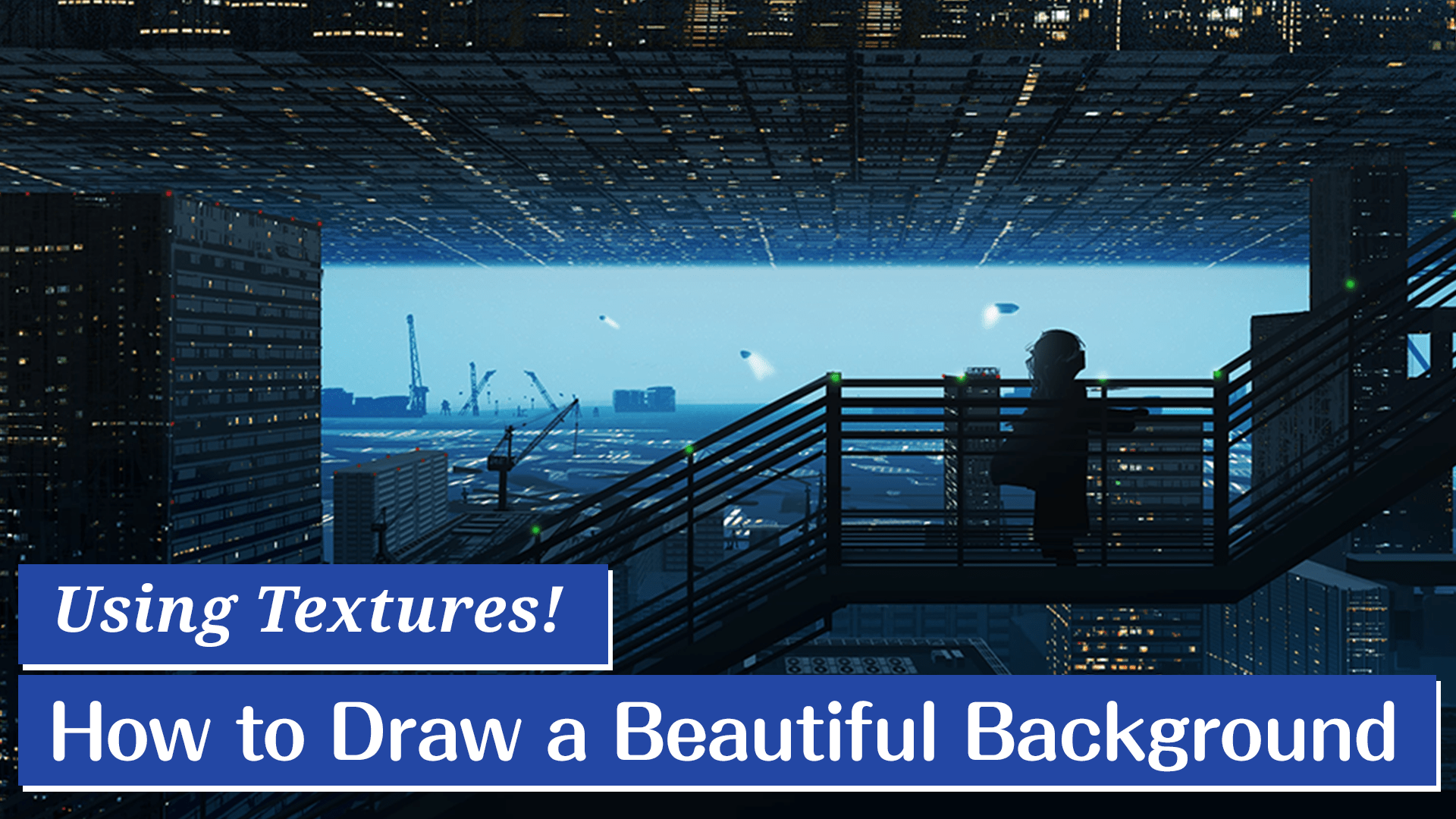
Using Textures! How to draw a beautiful background
In this article, I would like to create texture and apply it to drawing an entire city.
The building textures we used here are now available at ART street! Please check it out!
1.Creating a rough sketch
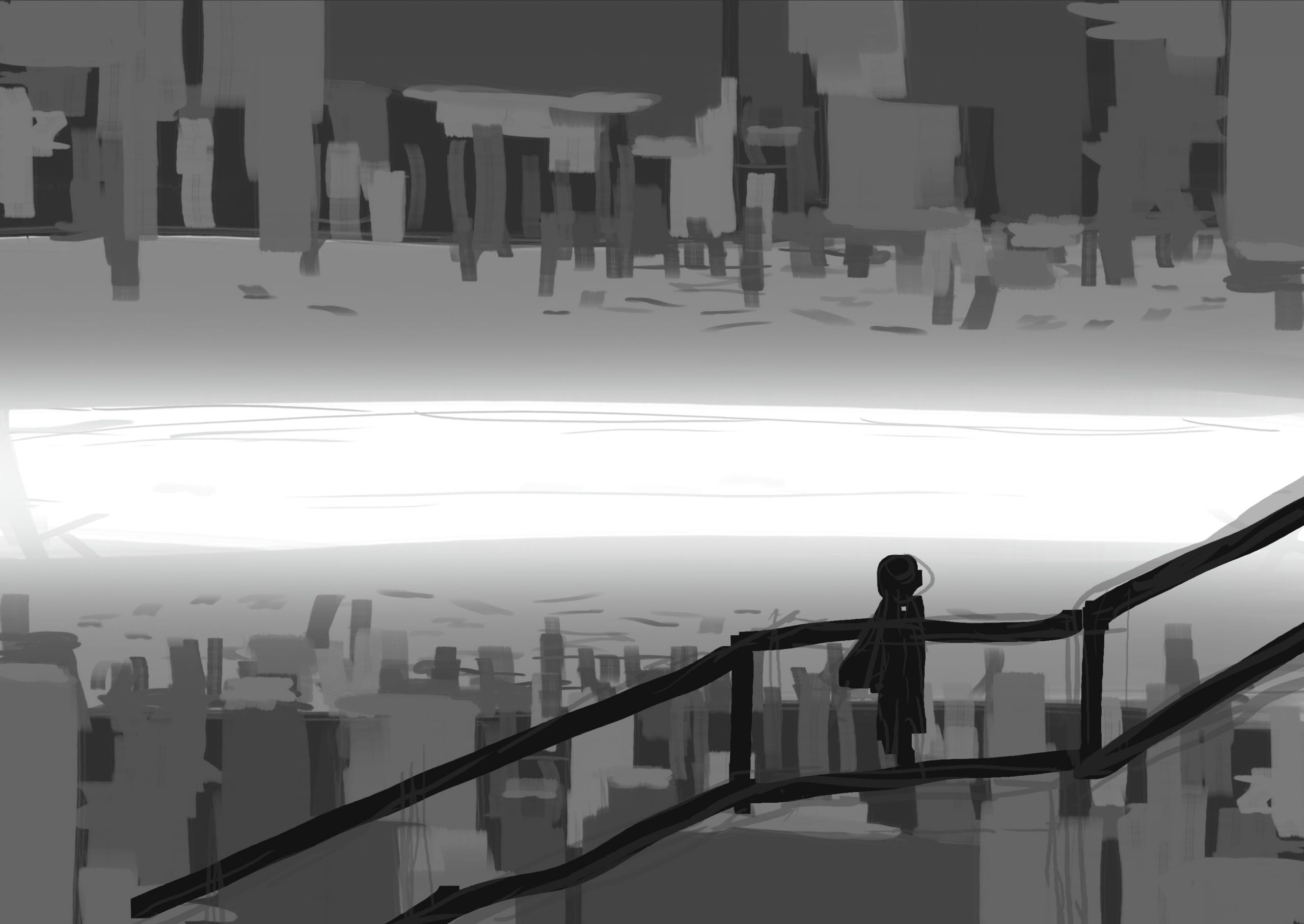
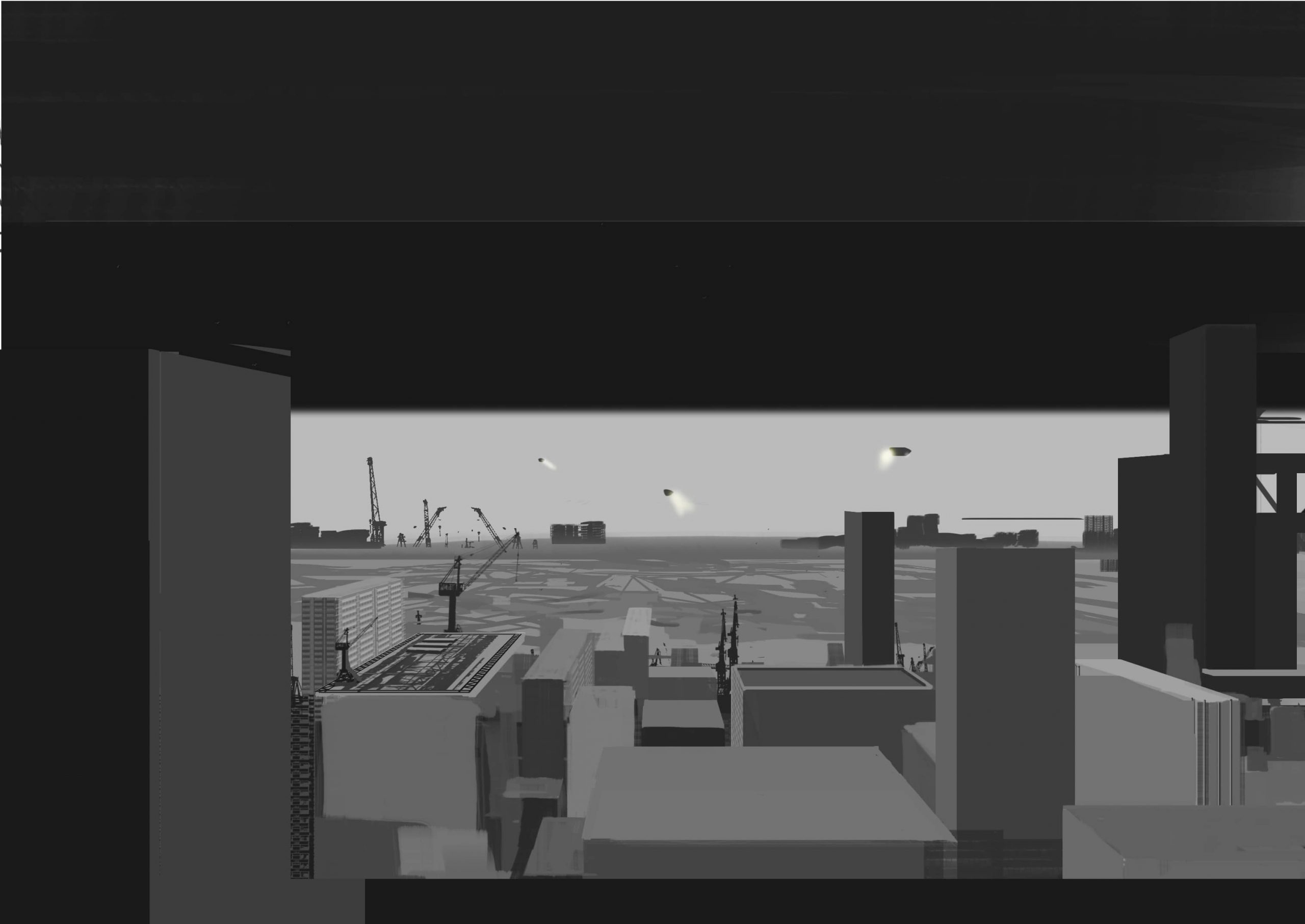
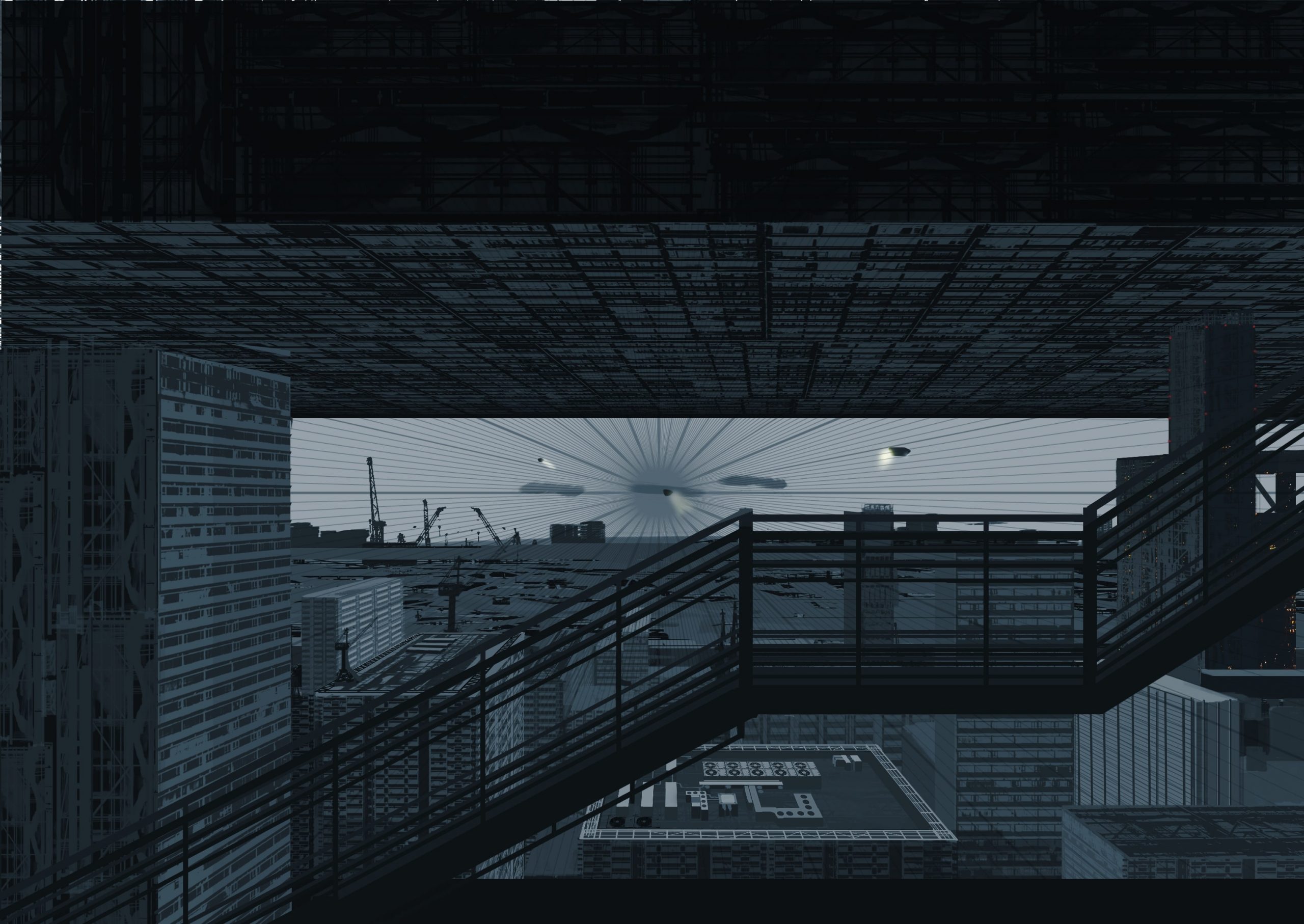
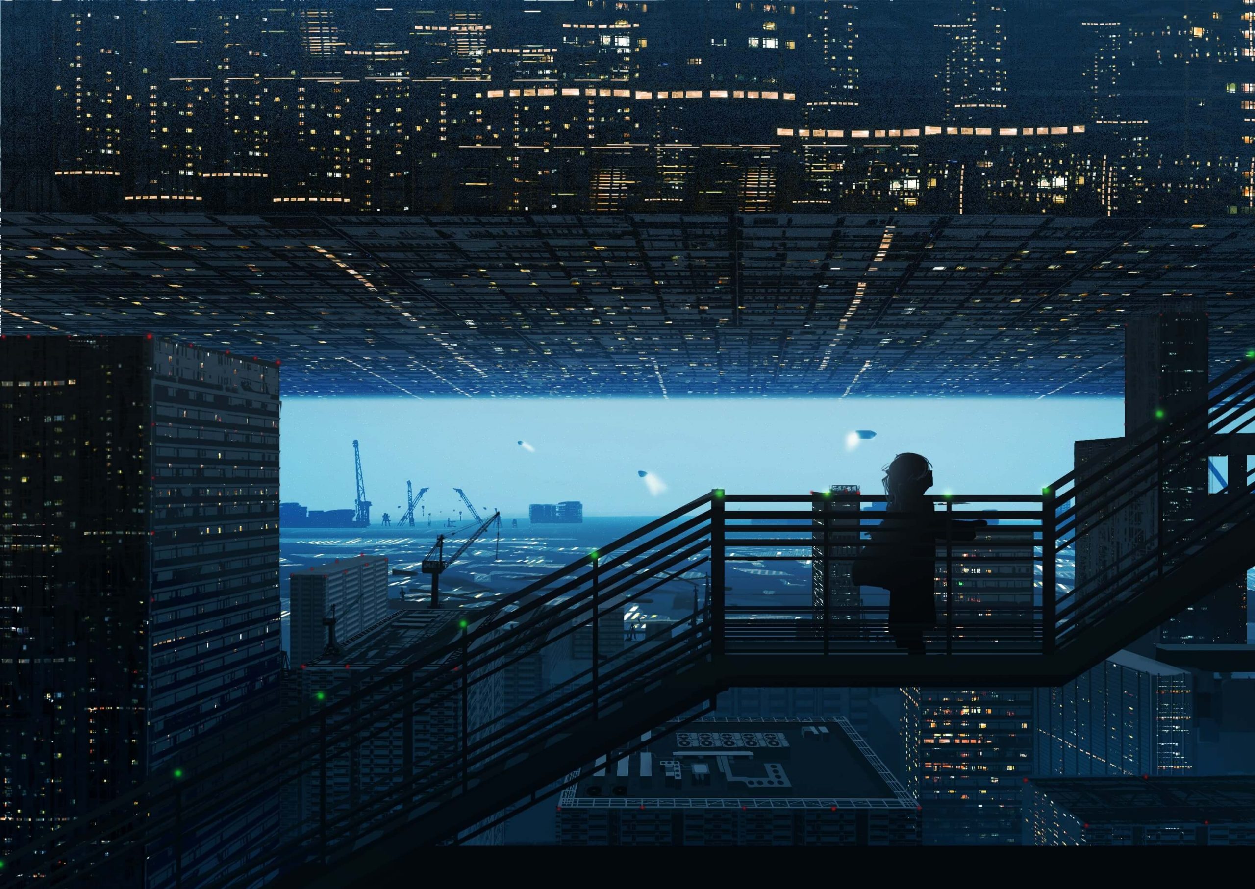
(1) The first step is to roughly lay out the silhouettes of the buildings in black and white. Don’t worry about the details yet, and draw out the image you want to paint in your mind. I wanted the light in the background to moderately brighten the city, so I used a soft brush to create the ideal brightness. Then I placed the stairs in the foreground and painted them in black to clarify the relationship between the foreground and background. The image is of a shadow of a girl quietly walking up the stairs.
2.Texture creation
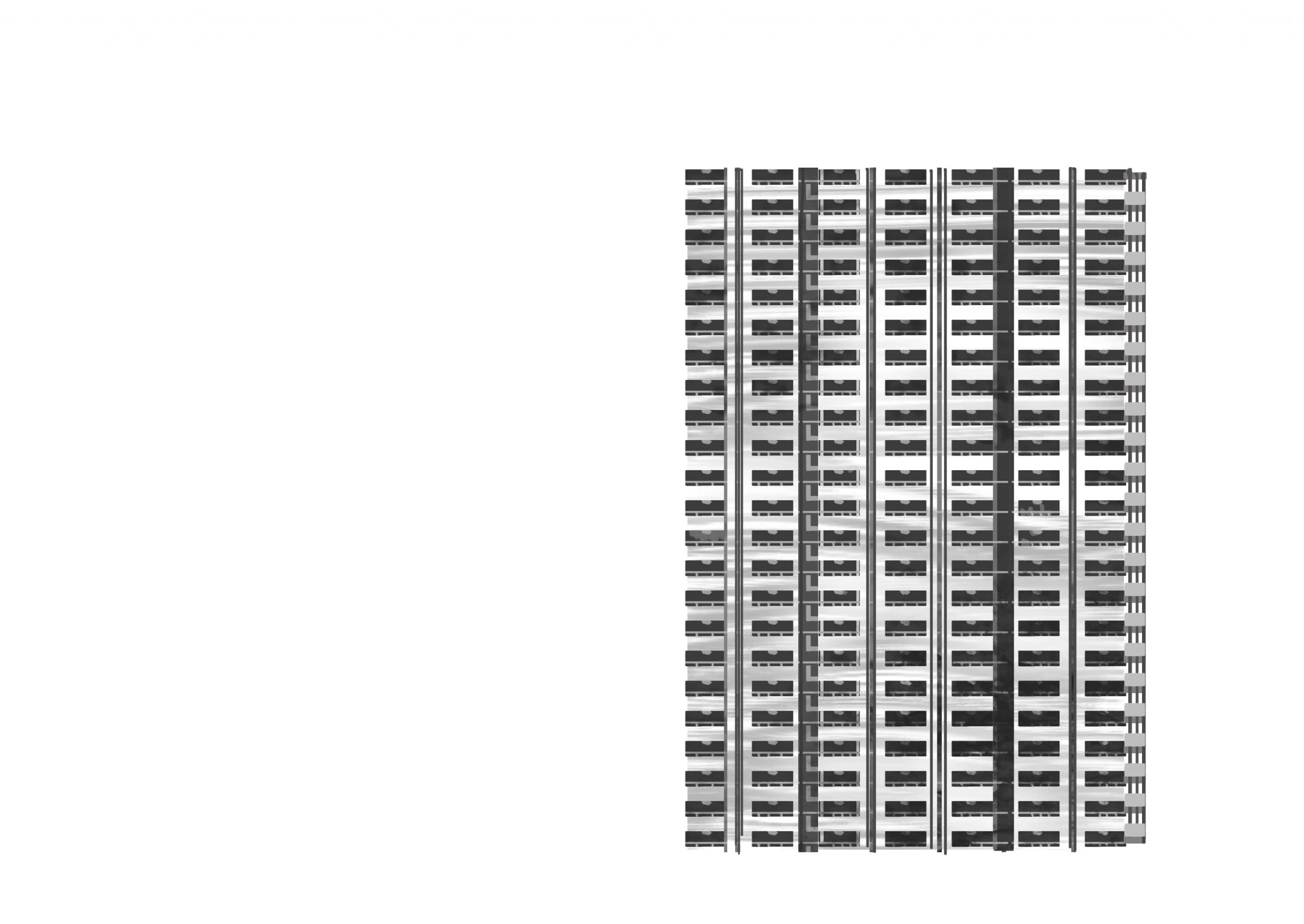
If we create the texture at this stage, it will be easier to create the texture for the building wall.
(1) The first step is to draw the steel parts that will be the window frames. Draw a line and then copy and paste it repeatedly like the image below.
(2) Next, draw the lines that are thinner than the previous lines, which will complete the window frames. You can use the same lines, but drawing thin lines with narrower intervals will create a more realistic look.
(3) Create a new layer below the layer where you drew the frame, and fill it with black. This time we will draw the lighting roughly, as we expect the picture to be seen from a very low angle. This time I’m going to draw the lighting roughly as if it were seen from a distance.
(4) Using the tone curve, adjust the dark areas to be darker and the bright areas to be lighter. Prepare several different textures from this one to create a sense of random or natural patterns.
(5) Create another texture for the building in the same way as before. It is the method used before, but the trick is to keep the light and dark areas clear. Make the wall slightly dirty to give it an apartment-like appearance.
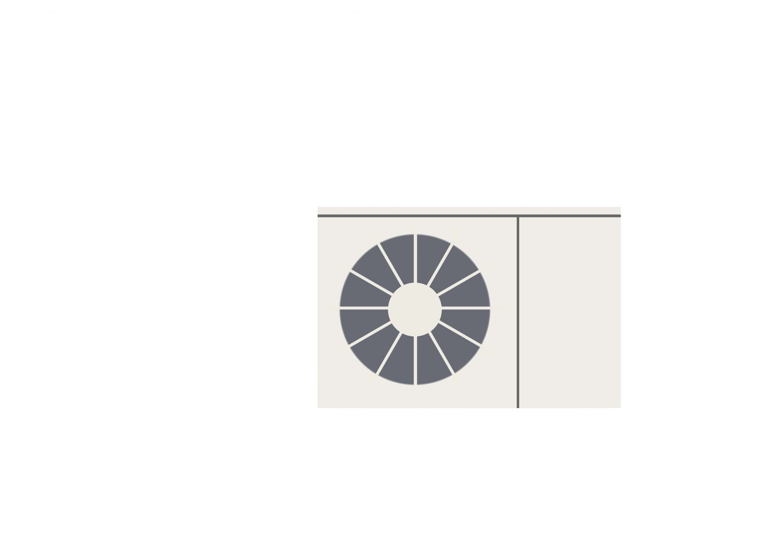
(6) Draw the front of the outdoor unit. The first thing to do is to capture the silhouette of the outdoor unit. Check the ratio of length and width while observing the actual product.
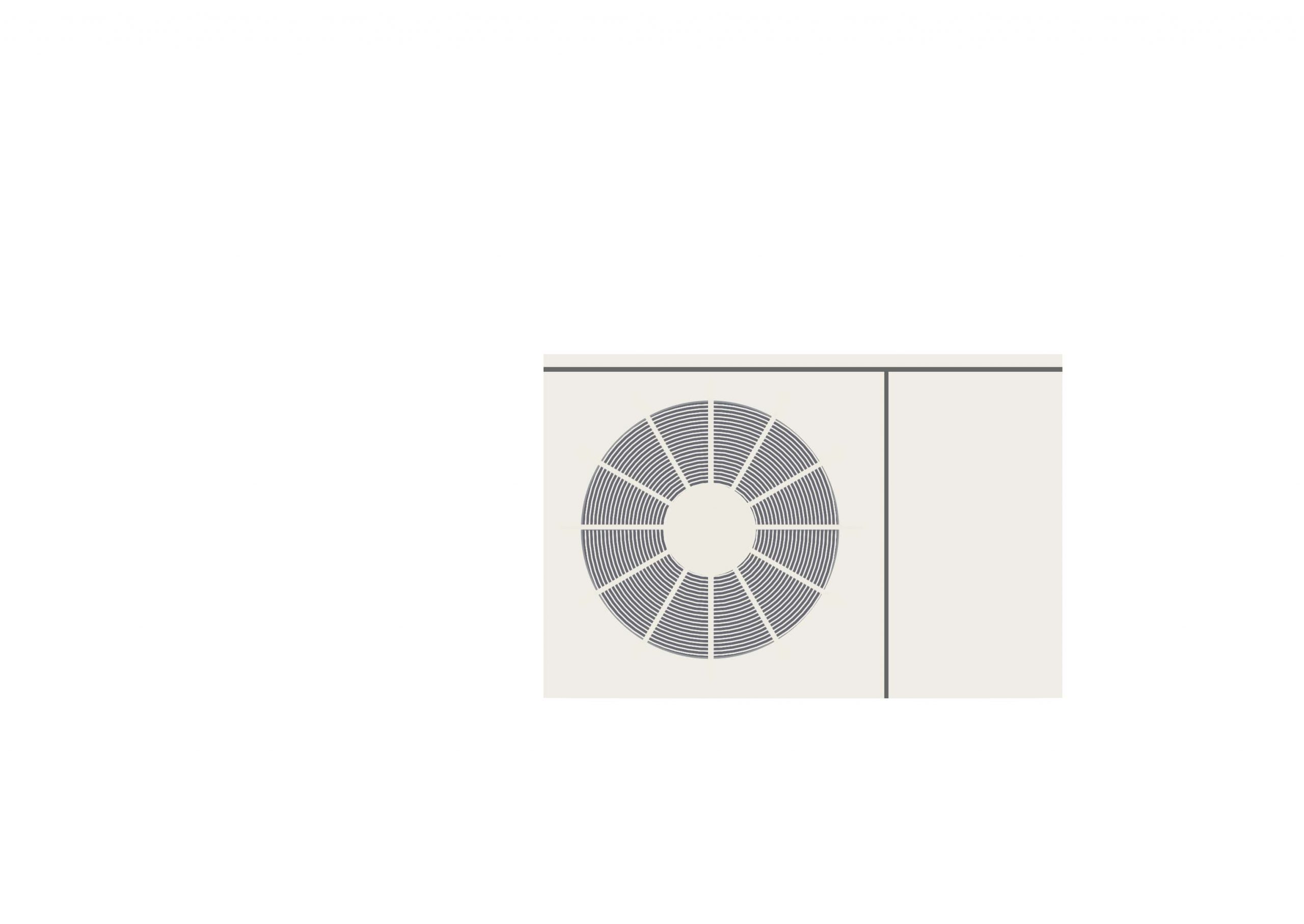
(7) Draw the part that will be the fan. After drawing the framework, create a new layer and draw a circle.
(8) Draw the lattice part. Make sure that the number of lattices is not too many or too few.
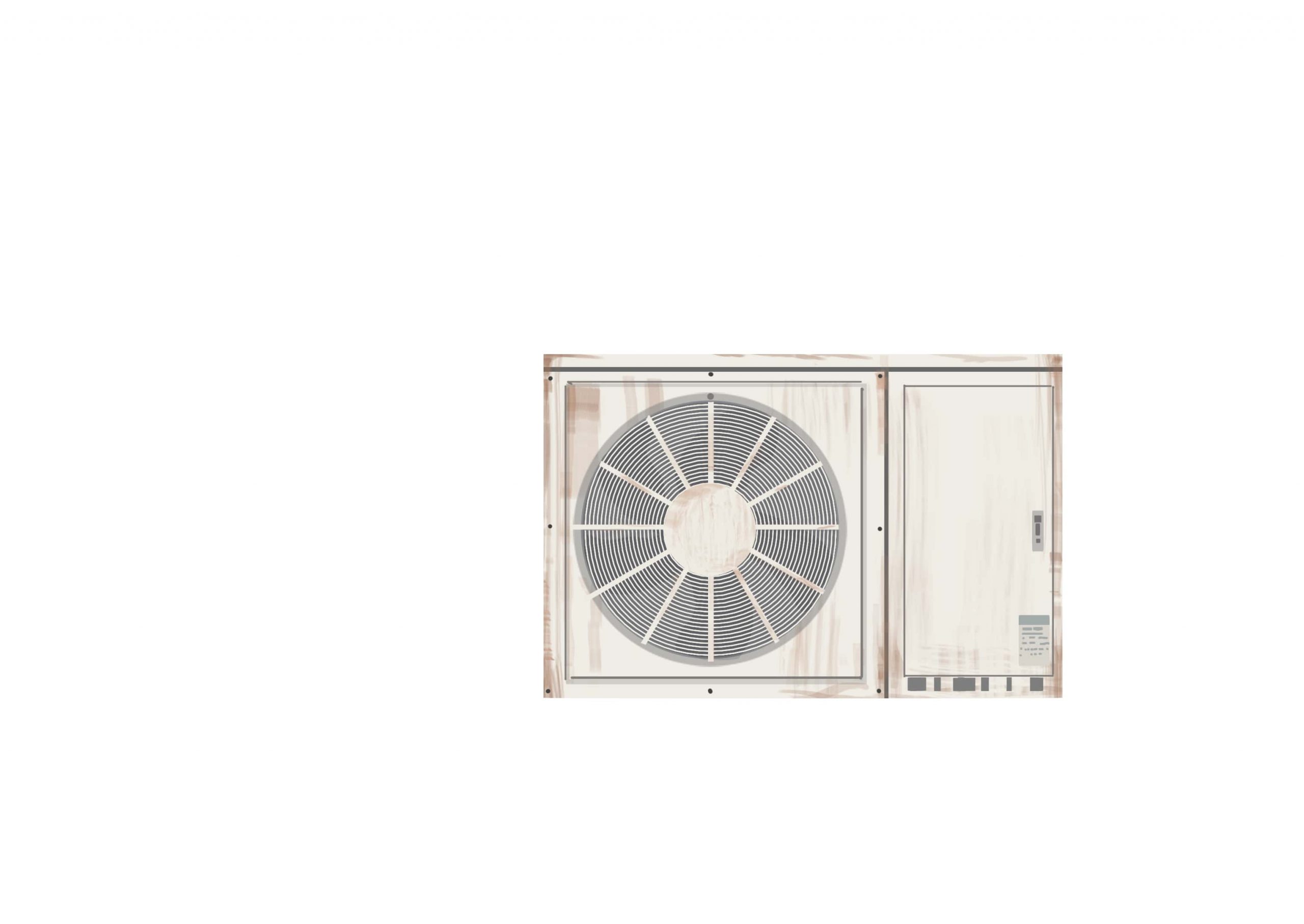
(9) Draw in the rust areas. Since corrosion starts from the edges, paint the edges with a brush with reduced opacity. Carefully observe the position of the plate and bolts.
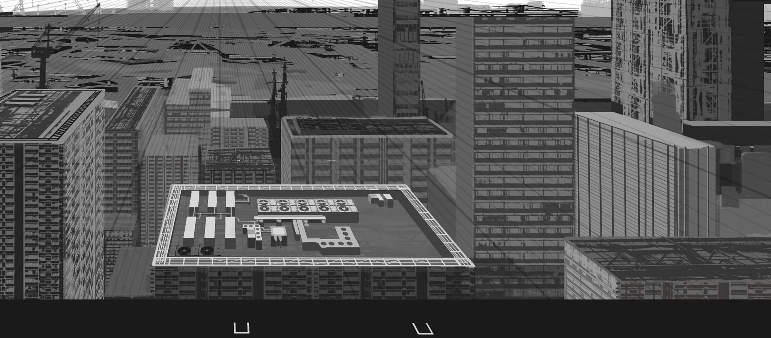
(10) Combine the layers of the outdoor unit created earlier and copy them to create the equipment texture for the rooftop area. Also, draw the exhaust ducts and pipes at the same time.
(11) Create the material for the steel frame in advance. Use an uneven brush or a flat brush as shown in the image to make it more realistic.
(12) Create a texture for the steel frame using the brushes you just used. The color will be overlaid later, so we will use monochrome to create the texture.
3.Paste the texture
(1) Firstly, decide the vanishing point. In this case, I chose a shape that would fit in the center. It is convenient to prepare a visual guide beforehand.
(2) Before attaching the texture, separate the light and dark areas of the building. I used the rough sketch as a reference to paint the building so that the front side would be darker to catch the light at the back.
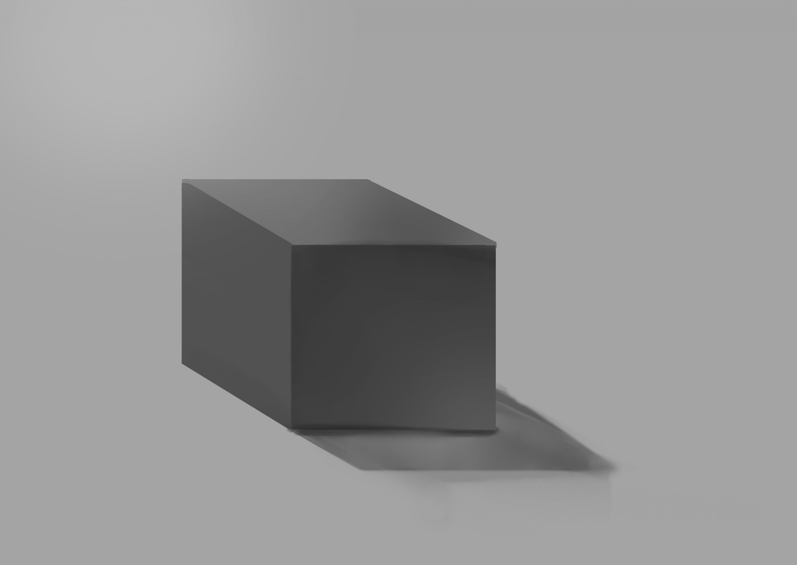
(3) Also, as shown in the image, when you think of the building shapes as cubes, you can only see three sides of the building no matter where you look from, so be conscious of painting light areas that are lit and dark areas that are in shadow.
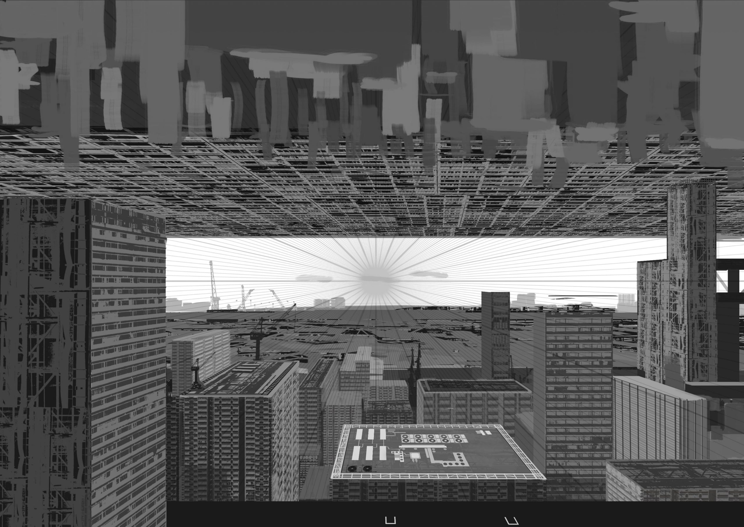
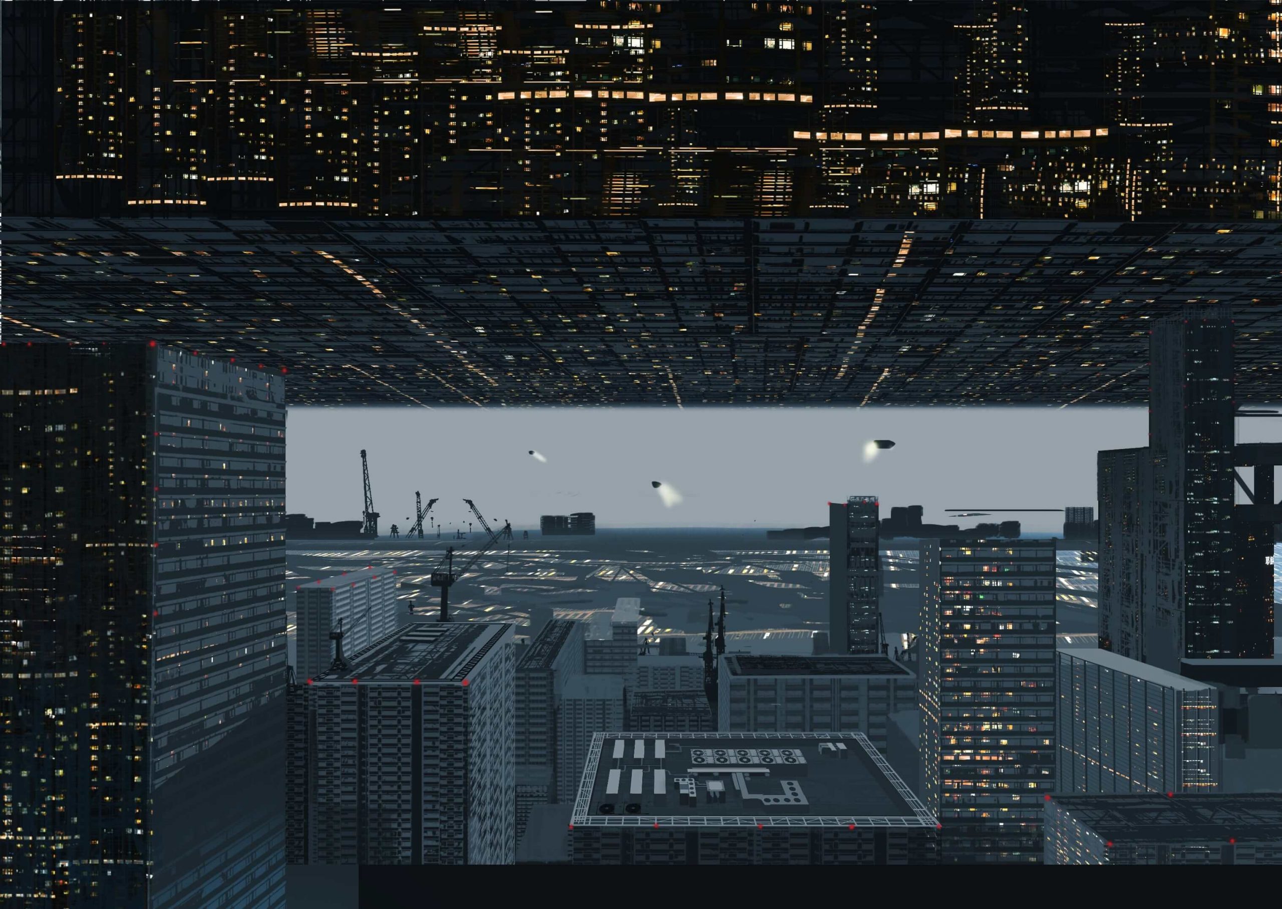
(4) While following the perspective guide, attach the previously created texture. The reason why I chose to create an eerie city where all the buildings are facing the vanishing point is because I wanted to create a suspicious atmosphere, including the color of the picture.
(5) As the current state is only the texture of the rooftop equipment, I will draw in the sides of the equipment. While looking at the real thing, I adjust the height of the equipment making sure it’s not out of place.
4.Painting
(1) Create a new overlay layer on top of the monochrome layer. I also added a sci-fi feel by drawing an airship and searchlight in the back. For each size, draw a large, medium, and small object for a good balance. The placement of the stairs in the foreground are temporary at this point.
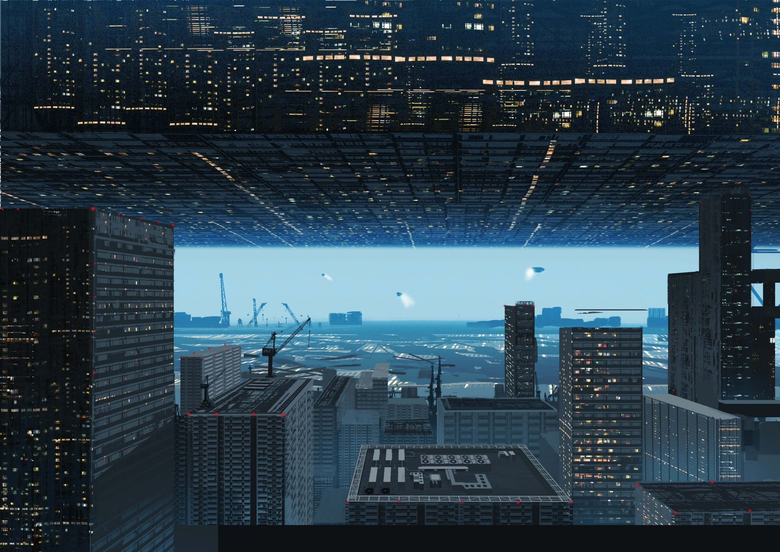
(2) Attach the texture of the lighting part of the building that you created earlier to the building part. Create a new layer and change the layer to Compare (Light). Make sure that the size of the window and the size of the light do not deviate. We will also use Free Transform to stretch the areas that will be subject to the perspective. Draw an aviation obstacle light (red lamp) in the corner of the building to make it look like that.
(3) Add the light. Use a soft brush to add color so that the light at the back of the building shines into the foreground. Also, assuming that the light is coming from under the city, lower the opacity and add blue to make it look like a haze.
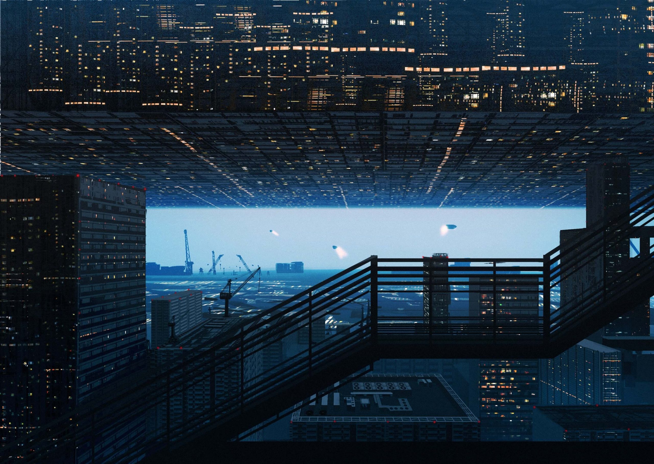
(4) To adjust the overall color tone, use a tone curve to adjust the color. At this time, place the stairs that were drawn on a separate layer and adjust them while keeping an eye on the overall balance.
(5) Add a light to the stairs in the foreground. The reason why I chose green is because I wanted to make sure that the color would not conflict with the aviation obstacle light behind it.
(6) Finally, add a screen layer of color to the layer where I drew the people.
The texture of the building I used this time is now available at ART street!
Please check it out!
ーーーーーーーーー
Creator Rank Benefits
https://medibang.com/page/about-creatorrank/
“Illustration job introduction” work
ーーーーーーーーー
\ We are accepting requests for articles on how to use /
Enhance your character! Creating a cool background
When you create a character illustration, have you ever thought, “I’ve drawn the character, but what do I do with the background?
In this article, I’ll show you how to draw backgrounds to make your illustrations more “cool! In this article, I’ll show you how to draw a background that will make your illustration more “cool”.
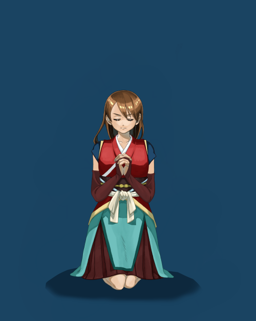
1-Aura
1-Drawing in
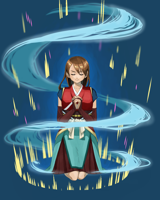
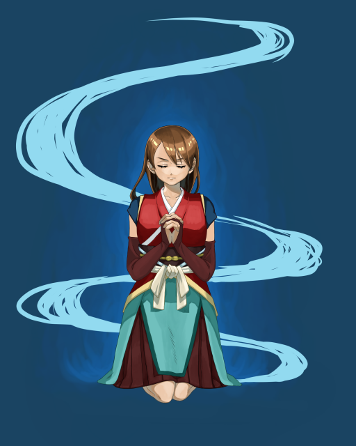
Here is the illustration I created.
The background is monochromatic, with only the shadows cast.
The image is of a pose that looks like the beginning of a battle, as if the character is storing up power.
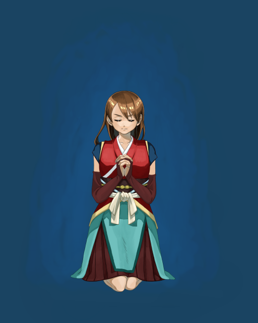
First, I would like to draw the aura that seems to come from the character.
I used a slightly lighter color than the background color to spread the paint.
This time I used a watercolor brush.
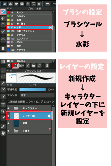
Brush settings Brush tool → Watercolor
Setting up a layer Create New → Set up a new layer under the character layer
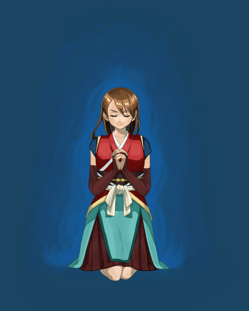
Overlay the haze with another brighter color.
Let’s expand on the fluffy image.
I added another bright color along the edges of the character, roughly three colors to create the aura.
To make it easier for the colors to blend together, I traced the border back to the first and second colors and blurred them out.
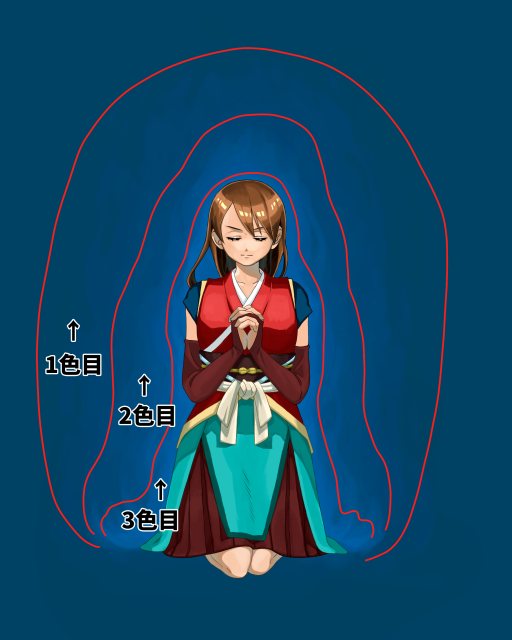
First Color
Second Color
Third Color
2-Swirling winds
1-wind flow
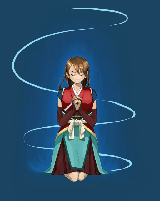
The next step is to draw the wind flow.
When storing power, it’s cool when the wind rises up.
Let’s express the wind in a cool shape.
The first step is to draw the wind flow in lines.
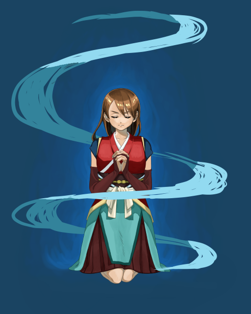
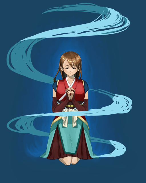
We want to draw the wind flowing around the character, so we’ll draw a spiral to the left and right.
This time, I used the pen tool.
Once you’re done, the layer can be under the character layer.
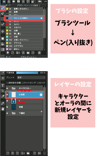
Brush settings Brush tool → Pen (Sharp)
Setting up a layer Set up a new layer between the character and the aura
Let’s draw the wind flow along the lines.
At this point, try to keep in mind that curves are thicker and straight lines are thinner.
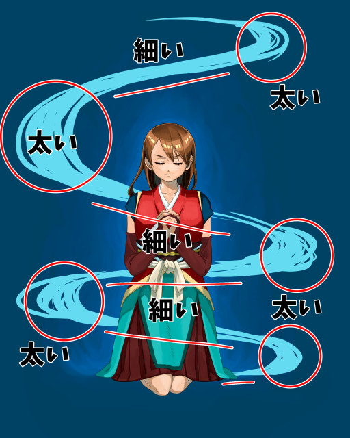
太い…Thick
細い…Thin
2 Creating a 3D effect
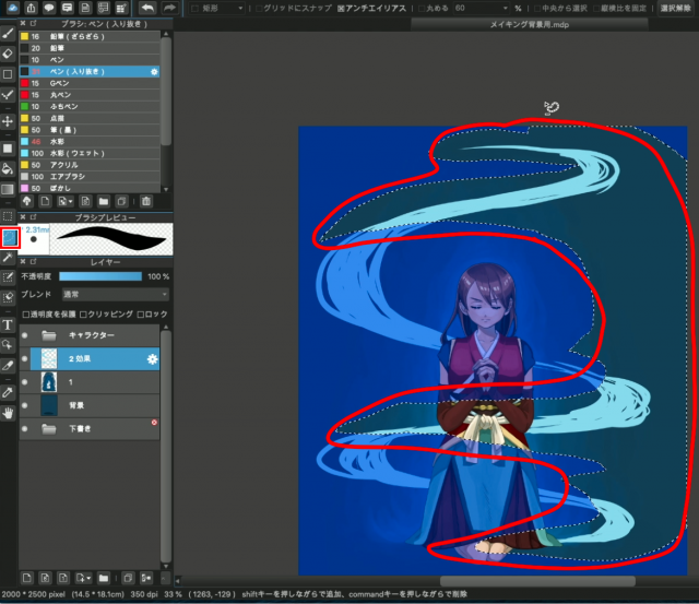
Next, separate the layers so that the wind appears to be blowing up around the character.
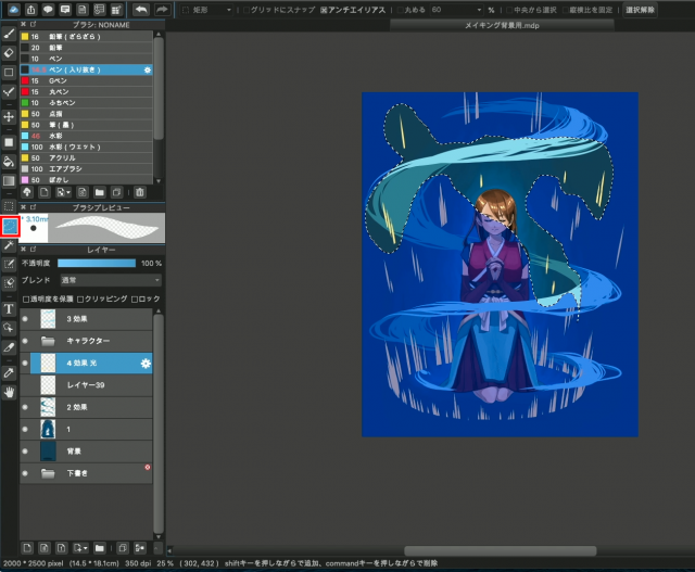
At this point, make your selections while keeping the back and front in mind, as shown in the figure.
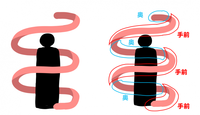
奥…back
手前…front
Choose the free selection tool and trace the wind.
Once you have made your selection, copy-paste it as is.
【mac ⌘C+⌘V】
【windows Ctrl“C”+Ctrl“V”】
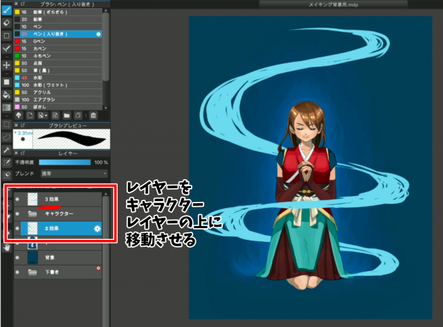
Keep the original layer and erase only the right half of it with the eraser.
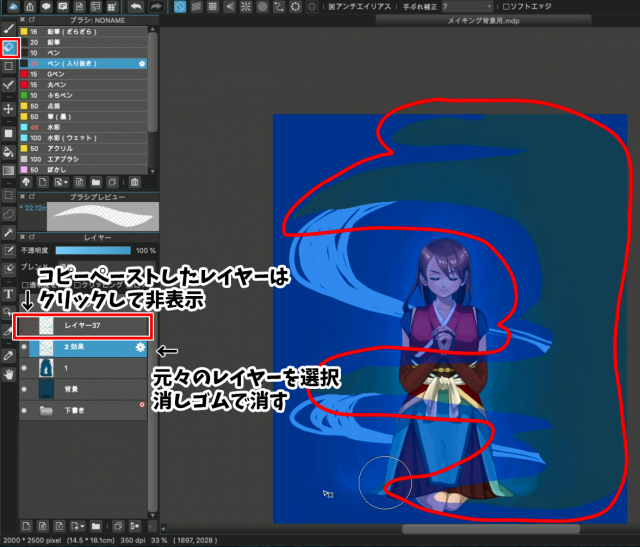
Hide the copy-pasted layer
Display the right half of the image that you just cut out and move it to the top of the character layer.
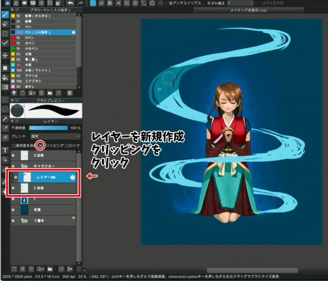
Next, let’s change the color of the wind behind the character.
Create a new layer on top of the lower wind layer.
Click on Clipping
Then paint a darker color than the first one.
When I finished painting the layer, it finally looked like the wind was swirling around the character.
3 Align the wind
Let’s shape the wind.
Use a pen to draw in a quick, crisp motion along the flow.
You can draw a thin, sharp wind if the lines are well-defined as in the example, or a turbulent wind if the lines are broken up.
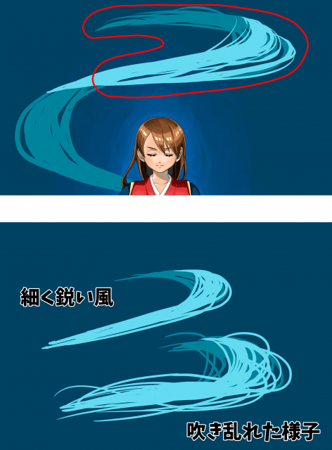
thin, sharp wind
turbulent wind
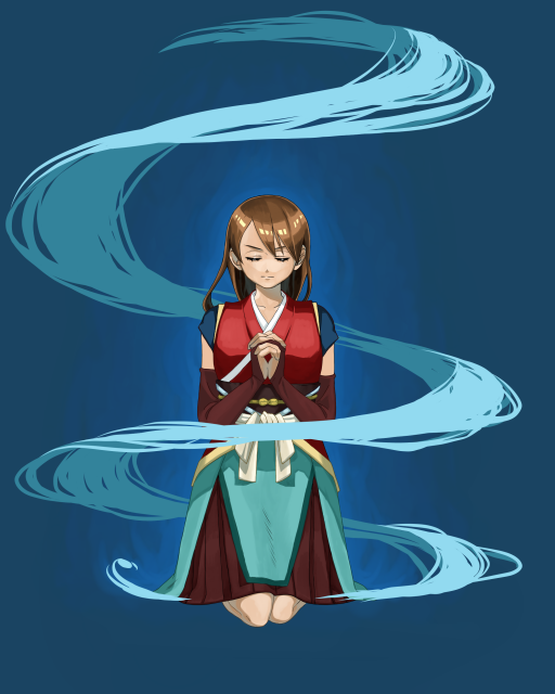
This time, I didn’t want it to be too random, but to represent a well-organized vortex-like wind.
This is what it looks like when the whole thing is aligned.
3-Popping Light
1-Preparation
It would be cool to have a bouncy, electric glow around the character.
Next, let’s make the light.
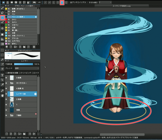
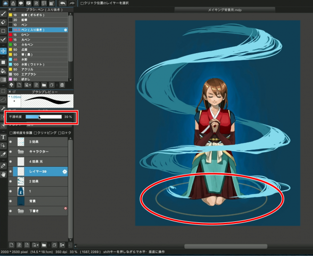
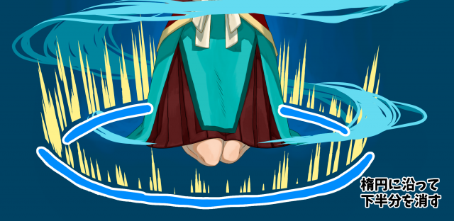
Once you have selected the ellipse, create an ellipse at the foot.
Since we want this ellipse to be the basis for adding light, we will keep the layer we created selected and set the opacity to around 40%.
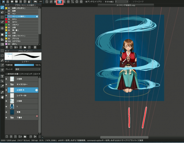
Next, we will use the vanishing point of the ruler tool to add the light.
With the Pen tool selected, select the vanishing point at the top of the screen.
Create a vanishing point by selecting four points to spread out on top.
2 Draw the light
Now that we are ready, let’s add the light.
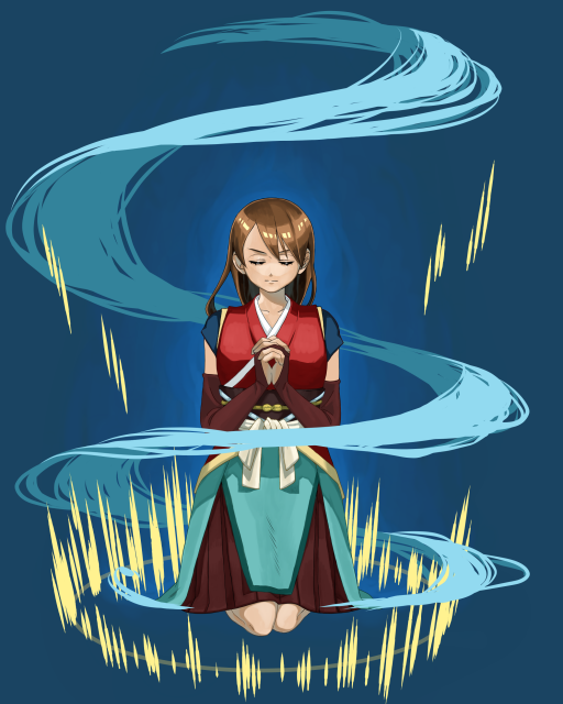
First, we’ll add a bright yellow color along the ellipse.
Then, let’s add yellow to the whole image.
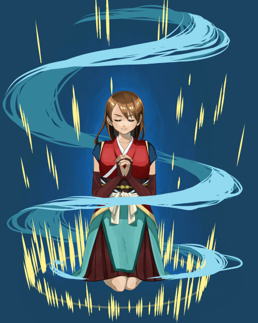
Once you have done this, erase the bottom half of the circle with the eraser.
By doing this, you can emphasize the light that seems to pop out from the ground.
I also randomly erased the bottom half of the light in the sky to give it some movement.
4-Creating an airy feel
1-Blur the blur
Next, let’s blur the light.
Using the same method, I also blurred the wind behind and the light on the ground behind to create depth.
This way, you can feel more space on the screen.
It’s still not enough, so I added more light in colors other than yellow.
The background is generally blue, so I used a red light to add a little accent.
2 Add to the wind
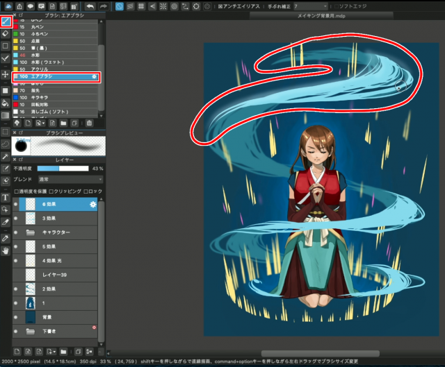
Finally, we will use the airbrush to add more airiness to the wind appearance.
Let’s select the airbrush from the brush tool.
Change the opacity of the layer to about 40%.
Gently trace over the wind from the top of the screen.
Continue on to the entire wind.
The airiness has increased at once.
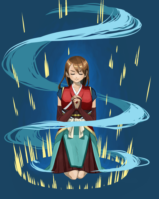
Here is the finished product!
I think this illustration is much cooler than the first one.
When you create a single picture, please try to use this technique.
Even if you use just one of these techniques, such as adding aura, wind, or light, your illustration will be different from what it was before!
Thank you for reading!
(Text and pictures by Hiromi Arakane)
\ We are accepting requests for articles on how to use /


.jpeg)

