How to write bar chart essay
How to write bar chart essay
How To Write an
IELTS Bar Chart Essay
There are 5 steps to writing a good IELTS bar chart essay:
1) Analyse the question
2) Identify the main features
3) Write an introduction
4) Write an overview
5) Write the details paragraphs
Use this simple planning process as you practice writing IELTS bar chart essays and you’ll have no problem remembering it in the exam.
Steps 1 and 2 of the planning process should take around 5 minutes. It is essential that you don’t miss these out as they are the key to writing a high-scoring essay.
On this page, I’m going to take you through the whole planning process step-by-step as we work on a practice question.
Before we begin, here’s a model essay structure that you can use as a guideline for all IELTS Academic Task 1 questions.
Ideally, your essay should have 4 paragraphs:
Paragraph 1 – Introduction
Paragraph 2 – Overview
Paragraph 3 – 1 st main feature
Paragraph 4 – 2 nd main feature
Now that we have all these tools we need, we’re ready to begin planning and writing our IELTS bar chart essay.
Here’s our practice question:
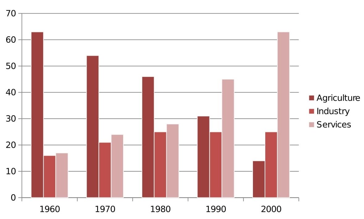
The bar chart below shows the sector contributions to India’s gross domestic product from 1960 to 2000.
Summarise the information by selecting and reporting the main features, and make comparisons where relevant.
Write at least 150 words.
Contribution as % of India’s GDP
Source: EPW Research Foundation
Step 1 – Analyse the question
The bar chart below shows the sector contributions to India’s gross domestic product from 1960 to 2000.
Summarise the information by selecting and reporting the main features, and make comparisons where relevant.
Every question consists of:
Sentence 2 tells you what you have to do.
You must do 3 things:
1. Select the main features.
2. Write about the main features.
3. Compare the main features.
All three tasks refer to the вЂmain features’ of the graphic. You do not have to write about everything. Just pick out 2 or 3 key features and you’ll have plenty to write about.
Our practice graphic is a dynamic bar chart. That is, it includes a timeline giving data from several different points in time.
So, for this question, we need to identify the main trends (that is, the general developments or changes in situation) in the three key sectors of the Indian economy – agriculture, industry and service – between 1960 and 2000.
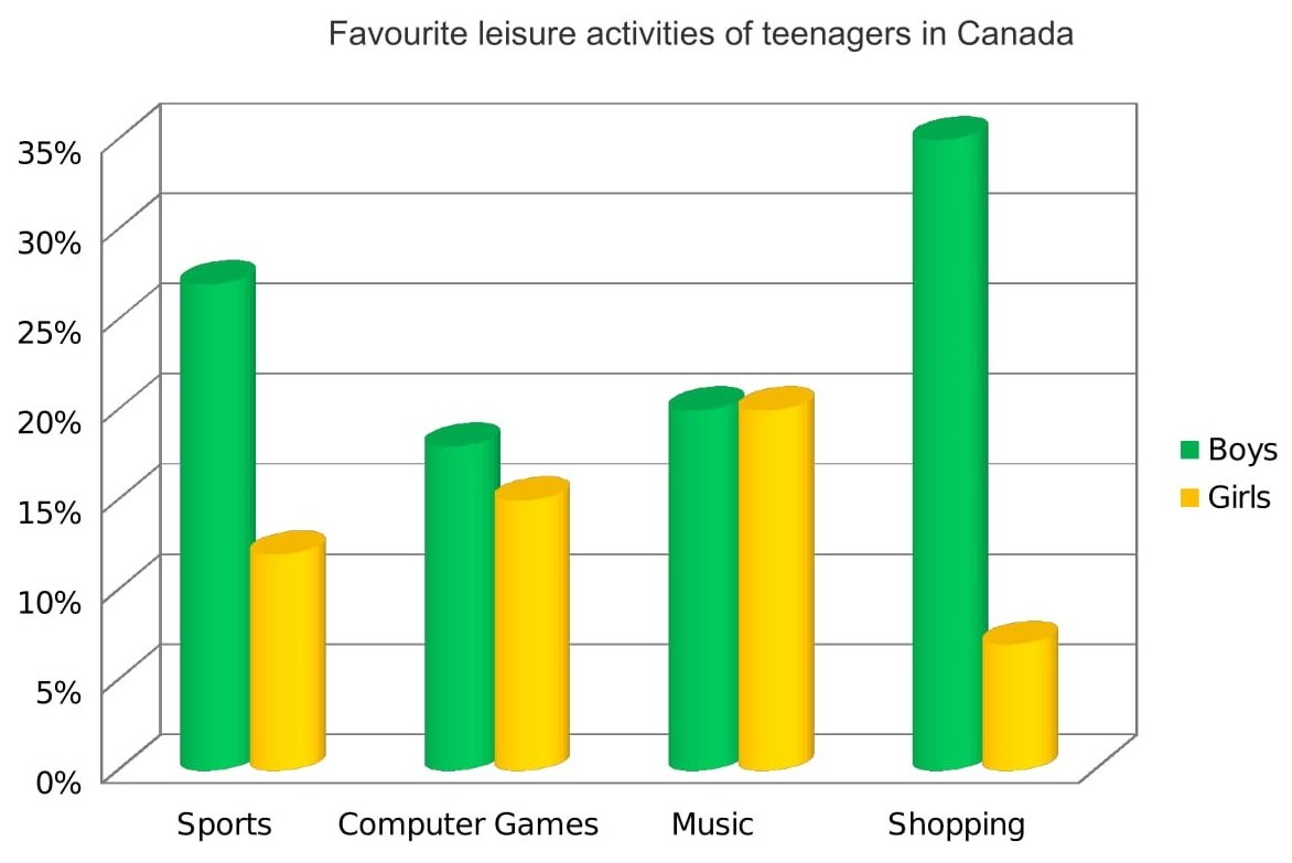
Alternatively, a bar chart may be static with the data coming from one point in time, as in the example below. For this graphic, we would need to compare the different variables, that is, the different leisure activities favoured by Canadian boys and girls.
Step 2 – Identify the Main Features
The graphic in IELTS bar chart questions should not be difficult to interpret. Each question has been created to test your language skills, not your mathematics ability.
All you are looking for are the main features. These will usually be the easiest things to spot. As we’ve just seen, the type of key features will depend on whether the bar chart is dynamic or static.
There will be lots of information in the graphic to help you identify them. Here are some useful questions to ask?
So, what main features stand out in our practice graphic?
Here’s our practice IELTS bar chart again.
Contribution as % of India’s GDP
There are 3 main features/trends in this IELTS bar chart:
Main feature 1: The contribution of the agricultural sector dropped steadily.
Main feature 2: The contribution of the service sector increased each decade.
Main feature 3: Industry remained static from 1980 to 2000.
The general trends you select will be the starting point for your essay. You will then go on to add more detail.
With just 20 minutes allowed for Task 1, and a requirement of only 150 words, you won’t be able to include many details.
We’re now ready to begin writing our essay. Here’s a reminder of the 4 part structure we’re going to use.
Paragraph 1 – Introduction
Paragraph 2 – Overview
Paragraph 3 – 1 st main feature
Paragraph 4 – 2 nd main feature
Step 3 – Write an Introduction
In the introduction, you should simply paraphrase the question, that is, say the same thing in a different way. You can do this by using synonyms and changing the sentence structure. For example:
The bar chart below shows the sector contributions to India’s gross domestic product from 1960 to 2000.
Introduction (Paragraph 1):
The bar graph illustrates the relative percentage contributions made by the agricultural, industrial and service sectors to the Indian economy between 1960 and 2000.
This is all you need to do for the introduction.
Ideally, key words such as вЂsector’ and вЂcontributions’ should be replaced by synonyms but there aren’t any obvious words that could be used instead so it’s fine to repeat them. It’s important that your language sounds natural so never try to force in synonyms that don’t quite fit.
Step 4 – Write an Overview (Paragraph 2)
In the second paragraph, you should report the main features you can see in the graph, giving only general information. The detail comes later in the essay. You should also make any clear comparisons you spot.
This is where we write about the general trends. Here are the ones we picked out above.
Main feature 1: The contribution of the agricultural sector dropped steadily.
Main feature 2: The contribution of the service sector increased each decade.
Main feature 3: Industry remained static from 1980 to 2000.
Now form these ideas into two or three sentences with a total of around 40 words. State the information simply using synonyms where possible. No elaborate vocabulary or grammar structures are required, just the appropriate words and correct verb tenses.
Over the whole time period, the significance of agriculture declined steadily while services grew in importance decade by decade. A different patterned emerged for industry, which initially showed a slowly increasing percentage but then plateaued from 1980 onwards.
Step 5 – Write the 1st Detail Paragraph
Paragraphs 3 and 4 of your IELTS bar chart essay are where you include more detailed information about the data in the graphic. In paragraph 3, you should give evidence to support your first 1 or 2 key features. Don’t forget to make comparisons when relevant.
Here are our first 2 main features again:
Main feature 1: The contribution of the agricultural sector dropped steadily.
Main feature 2: The contribution of the service sector increased each decade.
And this is an example of what you could write:
In 1960, agriculture contributed by far the highest percentage of GDP, peaking at 62%, but it then dropped in steady increments to a low of 12% in 2000. The service sector, on the other hand, had a relatively minor impact on the economy in 1960. This situation changed gradually at first, then its percentage contribution jumped from 28% to 43% between 1980 and 1990. By 2000 it matched the high point reached by agriculture in 1960, showing a reversal in the overall trend.
Step 6 – Write the 2nd Detail Paragraph
For the fourth and final paragraph, you do the same thing for your remaining feature/s. We have one main feature left to write about.
Main feature 3: Industry remained static from 1980 to 2000.
Here’s an example of what you could write:
Industry remained a steady contributor to India’s wealth throughout the period. As a sector, it grew marginally from 16% in 1960 to exactly a quarter in 1980 then remained static for the next two decades, maintaining a constant share of the overall GDP.
Here are the four paragraphs brought together to create our finished essay.
Finished IELTS Bar Chart Essay
The bar graph illustrates the relative percentage contributions made by the agricultural, industrial and service sectors to the Indian economy between 1960 and 2000.
Over the whole time period, the significance of agriculture declined steadily while services grew in importance decade by decade. A different patterned emerged for industry, which initially showed a slowly increasing percentage but then plateaued from 1980 onwards.
In 1960, agriculture contributed by far the highest percentage of GDP, peaking at 62%, but it then dropped in steady increments to a low of 12% in 2000. The service sector, on the other hand, had a relatively minor impact on the economy in 1960. This situation changed gradually at first, then its percentage contribution jumped from 28% to 43% between 1980 and 1990. By 2000 it matched the high point reached by agriculture in 1960, showing a reversal in the overall trend.
Industry remained a steady contributor to India’s wealth throughout the period. As a sector, it grew marginally from 16% in 1960 to exactly a quarter in 1980 then remained static for the next two decades, maintaining a constant share of the overall GDP.
This sample IELTS bar chart essay is well over the minimum word limit so you can see that you don’t have space to include very much detail at all. That’s why it is essential to select just a couple of main features to write about.
Now use what you’ve learnt in this lesson to practice answering other IELTS bar chart questions. Start slowly at first and keep practicing until you can plan and write a complete essay in around 20 minutes.
IELTS Bar Chart/Graph – Samples, Tips to Describe Bar Graphs
Updated On Mar 07, 2022
Amidst all the other types of questions, you will also come across a question that will showcase a bar graph. Also known as a bar chart, the bar graph is evaluated similar to a line graph. Such a bar chart also comes with two axes, showing changes and diversifications over a given period of time. Furthermore, the bar graph has rectangular bars that could be either displayed vertically or horizontally, representing two or more values of data.
Types of IELTS Bar Graphs
When preparing for the IELTS exam, you would have to prepare for two different types of bar graphs: vertical and horizontal.
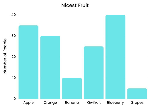
Vertical Bar Graph
Here is how a vertical bar graph looks like:
Horizontal Bar Graph
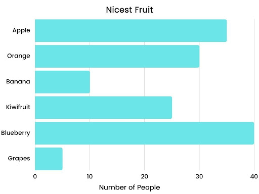
Here is how a horizontal bar graph looks like:
A Comprehensive Guide to Write IELTS Bar Chart Essay
If you wish to learn more about writing a high-scoring IELTS bar essay, here is a comprehensive process that will help you out.
Evaluating the Question
The first and foremost step is to evaluate and analyze the question. In the question, you will get a brief description of the bar chart along with instructions. Your job here will be to discover the central idea.
Assessing the Given Data
The next step is to assess the data that you have in the question. Find out whether it is dynamic or static. If it is dynamic data, it will show two or more time periods. If it is static data, it will show only one time period. For both these data types, you will have to use different languages to write the description.
Discovering Primary Features
Majorly, bar graph questions are meant to test your mathematical as well as language skills. Hence, you must know how to derive the primary features from the given data and write about it.
Describing a Bar Chart
Here is the complete format that should be used when describing a bar chart or a bar graph.
The Introduction
In the introduction paragraph, you would have to paraphrase the asked question. This can be done by using synonyms and paraphrased words and sentences. Also, ensure that this section is sounding natural.
The Overview
Usually, an overview forms the second paragraph of the essay. In this one, you would have to write down the main features. Also, you must discover available comparisons and talk about general trends occurring in the given data.
The First Body Paragraph
In the first body paragraph, you will have to give detailed information and explain the given data. Here, you must focus more on language instead of facts. Making relevant comparisons is always useful.
The Second Body Paragraph
This second body paragraph will have your explanation of the remaining features. It will be the same as the first body paragraph, but with different information.
Choosing the Information from the Bar Graph
As you would already know, a bar graph question requires a report of 150 words to be written. To help you out with an easier way, you can follow (but not stick to) the below-mentioned guidelines.
| Format | Content |
|---|---|
| Introduction | One sentence |
| Main Features | Two sentences |
| Comparison | One sentence |
| Exception | One sentence |
| Describing Data | One sentence |
Tips to Write IELTS Bar Chart Essay
Jotted down below are some tips that will help you write a relevant, on-point IELTS bar chart essay
1. Is it difficult for you to match the word count?
Most of the time, people find it difficult to match the word count. Hence, they start using complicated words to unnecessarily extend the sentences. While using high-end vocabulary is a pro, writing sentences that are difficult to be understood is a con.
2. Be straightforward in your writing
When describing the bar graph, try not to complicate the description. Be straightforward and on-point.
3. Do you only practise with one type?
While practising, do you only try working on one type of chart or graph, or do you expand your horizons as well?
4. Practise as much as possible
While practising, work on varying bar charts or graphs so as to enhance your ability to explain whatever comes in the examination.
5. Are you always in a hurry for submission?
One of the common mistakes that people commit is not reviewing their answers before submission. This could lead to you missing out on errors and issues that can impact your marking.
6. Review your writings before submitting
Once written, double-check for grammatical errors. Review important details and superlatives to make sure you didn’t miss anything.
Answering IELTS writing task 1: bar chart
In this lesson we’re going to learn how to tackle bar charts in IELTS Writing task 1 questions to get the highest score. To get a band 9 in IELTS Writing task 1, you should follow this answer structure:
Let’s look in detail how to apply this structure to an IELTS bar chart question.
IELTS bar chart Question:
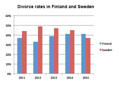
The bar chart shows the divorce rates in two European countries from 2011 to 2015.
Summarise the information by selecting and reporting the main features, and make comparisons where relevant.
You can watch a video tutorial on how to describe bar charts in IELTS Academic Writing task 1:
And now let’s learn how to answer IELTS bar chart questions.
IELTS bar chart answering strategy:
1. Introduction
You should start your answer by writing an introduction. The introduction is 1 or 2 sentences, where you paraphrase the information from your question. You should mention two things in your introduction:
In our example, the introduction can look like this:
The bar chart provides information about the percentages of divorces in Finland and Sweden between 2011 and 2015.
See how I used synonyms to paraphrase the question:
shows в†’ provides information about
divorce rates в†’ percentages of divorces
two European countries → Finland and Sweden (it’s good to be more specific)
from 2011 to 2015 в†’ between 2011 and 2015.
2. General Overview
The second paragraph of your answer is a general overview, where you briefly describe major trends on your graph. Ideally, you should describe 2-4 key features.
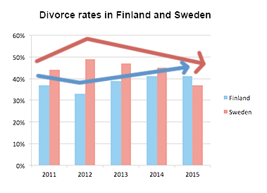
To make major trends easier to notice, you can outline Sweden’s bars and Finland’s bars like this:
Now it’s obvious that:
Use word overall to start your general overview. In our case, the overview may look as follows:
Overall, Sweden experienced a downward trend, while Finland showed an upward trend throughout the period. Both countries’ divorce rates had some fluctuations. Although Finland initially had a lower rate, it outraced Sweden at the end of the period.
3. Specific details
After we’ve written the introduction and general overview, it’s time to give the specific details. You should describe the specific features in 2 or 3 (sometimes more) paragraphs.
You can group data in such way:
When giving specific features, you have to write exact numbers/percentages and include as much details as you can.
In our case, the specific details may look as follows:
Sweden’s divorce rate was about 45% in 2011, being higher than Finland’s rate by approximately 8%. Then, it rose to almost fifty percent in 2012. However, the figure showed a gradual decrease to about 47% in 2013, and continued to decline steadily to the end of the period, reaching around 45% in 2014 and hitting a low-point of about 37% in 2015.В
В
Percentage of divorces in Finland was less than 40% in 2011, and it decreased in 2012, when about one third of marriages in Finland ended with a divorce (as opposed to almost a half in Sweden). However, the figure experienced a steady growth during the next two years. It rose to approximately 39% in 2013, then increased by around 3% in 2014, and remained steady for the next year, outracing the rate of Sweden.
Tips:
The full answer + Practice
It’s the end, we have finally written the answer for IELTS bar chart question. And now, let’s practice: fill in the gaps in this answer with appropriate words.
The provides about the percentages of divorces in Finland and Sweden between 2011 and 2015.
, Sweden experienced a downward trend, while Finland showed an trend throughout the period. Both countries’ divorce rates had some fluctuations. Although Finland initially had a lower rate, it Sweden at the end of the period.
Sweden’s divorce rate was about 45% in 2011, being higher than Finland’s rate by approximately 8%. Then, it rose to fifty percent in 2012. However, the figure showed a gradual decrease to about 47% in 2013, and continued to decline steadily to the end of the period, reaching around 45% in 2014 and hitting a of about 37% in 2015.
Percentage of divorces in Finland was than 40% in 2011, and it decreased in 2012, when about one third of marriages in Finland ended with a divorce (as to almost a half in Sweden). However, the figure experienced a steady growth during the next two years. It rose to approximately 39% in 2013, then increased by around 3% in 2014, and remained steady for the next year, outracing the rate of Sweden.
IELTS Bar Chart: Tips for a High Score
Learn how to describe an IELTS bar chart by following the tips and techniques in this video lessons. This lesson is 100% vital for all IELTS candidates doing writing task 2 academic paper in 2018.
IELTS Bar Chart Tips Video Tutorial
This video lesson shows you how to tackle an IELTS bar chart for writing task 1 (academic paper).
IELTS Bar Chart Essential Tips
Below are useful tips for an IELTS bar chart.
1. Introduction Paragraph
Keep your introduction paragraph simple. Just paraphrase the information given by IELTS. It is usually just one sentence. It is possible to also comment on the units of measurement in the chart “Units are measured in …”.
2. The overview
Look at your bar chart and choose the key features. These might be highs, lows, main differences etc. Collect them together and present them in an overview. To learn more about the overview / conclusion debate, please see my IELTS Overview Video Lesson. You must remember that the examiner is looking for the overview and it is an essential part of your Task Achievement mark. That criterion is 25% of your marks.
3. Body Paragraphs
Make sure you have more than one body paragraph. The usual is two body paragraph. Decide how you will divide the information in the bar chart into difference body paragraphs. You must organise your paragraphs into a logical order.
4. Support Sentences with Data
Your body paragraphs must have numbers to support them. If you fail to have numbers with your sentences in the body paragraphs, you might get only band 5 in Task Achievement. To learn useful vocabulary for using data accurately, see my lesson: IELTS Vocabulary: Accurate Data.
5. Complex Sentences
You must write your task 1 using a range of complex sentences. You must learn these sentence structures. The best way is from model answers: IELTS Writing Task 1 Model Answers.
6. Linking devices
You should use a range of linking devices. For example, while / whereas / as opposed to / compared to / in comparison with. All these will help you get a higher score in Coherence and Cohesion which is 25% of your marks. Make sure you use them correctly.
7. Assessment Criteria
Learn more about what the examiner wants to see in your writing. You must understand the requirements for the band score you are aiming for. See this page to learn about IELTS Writing Task 1 Band Scores 5 to 8 Explained.
Recommended
Main IELTS Pages
Develop your IELTS skills with tips, model answers, lessons, free videos and more.
Get my free lessons by email
Comments
Thank you for your lesson😃
Can I make “5 consumer goods” longer? for example, “5 kinds of consumer goods” of “5 types of consumer goods.”
Thank you Liz for such fabulous and succinct explanation of every topic. The content you provide is probably one of the most comprehensive IELTS curriculum out there on the internet.
Hello mam, this is the task 1 given below, so please mam could you tell me my all the mistake and how much band should I get in this task.
The chart illustrates the proportion of donation that provide by among people to different ages in Britain.
Overall, the greater percentage of British people give money to charity in 1990 then in 2010. However, the pattern differs before and after the age group of 50.
In 1990, over 40% of the 36-50 age group made charitable donation, and this the highest percentage of donation, Oppositely, this figure had fallen to 30% in 2010. Both in 1990 and in 2010, 18-25 age group people contributed least (almost 17% and 7% respectively). In 2010, the 51-65 age group are contributing highest just less than 40%. In 1990, just after the age of 50 this data decrease at 35%.
On the other hand, the figure of both age group 26-35 and over 65 looks similar (41% and 42%) in 1990. In 2010, the percentage of 26-35 age group is dropped by nearly 15% from the highest data and over the 60 age group people donate to charity 35%.
Hi Liz, thank you so much for your lessons. It was only ecause of your lessons that I was able to score 7.5 in writing and an overall bandscore of 8.5. I’m very grateful to you for your help and also to my fiancè for recommending your blog.
That’s great news! Very well done 🙂 I wish your fiance lots of luck.
Hi Liz,
The phrase as opposed to isn’t synonym with by contrast? How is it making sense in this sentence of overview?
Thank you
“as opposed to” means “in contrast with”.
Hey Tr.Lizz, Thanks for amazing session on writing task one. I just wanted to know if that’s okay to put numerical value like 5 consumer goods in your introduction paragraph. Except the dates and percentages being described in the test, whether it is okay to write number on certain sentences even though it’s not being written in the question.
If it is too long to list the names of categories, you can provide the number: five countries. See my model answers to learn all the options: https://ieltsliz.com/ielts-writing-task-1-lessons-and-tips/
Hello Liz!
How do I insert symbols which are not on the keyboard if I take computer test? Should I keep writing “pounds” instead?
Thank you!
In nearly all question in IELTS, the currency will be given in the question which means you do not write it in the answer. However, if this isn’t the case, you can write the word.
Hi Liz
I just wanted to ask that percentage (%) are allowed to write in task 1 or should we write in alphabets only (I. E percentage).
Thanks in advance
Liz,
Can i write the overview after the Body paragraphs like a conclusion.
Which would get me more marks?
Yes, it can be written at the end of the report. No, it doesn’t get you a higher score – it makes no difference to your score if you put it after the introduction or at the end.
Hi liz please i would want to know if this is for Academic or general writing.
Please go the RED MENU BAR and select “Test Information”, then choose GT IELTS – you can read for yourself about GT writing.
Hi
Is it right to use “on the other hand” for task 1
It can be used to highlight contrast.
Words are not enough to say Thank you, my dearest teacher 🙂
For the introduction in task 1:
if the y-axis is in the form of (percentages %) and I need to add a second sentence like ‘Units are measured in the form of percentages’
I believe that it isn’t correct, if not what could I write instead?
Thanks in advance
If your introduction begins “the chart illustrations the proportion…”, the word “proportion” means percentage. So, you would not introduce that twice.
I tried doing one of the practice tests you posted for writing task 1. However, there was no available model answer. I just wondered if you could check this report I made with regard to one of the bar graphs, which pertained to the digital games’ revenues over a span of 6 years (2000 to 2006).
“The graph illustrates the global revenue of various digital games over a span of 6 years from 2000 to 2006. Units used are in billion dollars.
Overall, the most popular digital game over the period given were the handheld games, with its constant increase in sales. There was also an observed increase in the revenue trends of both online and mobile phone games whereas a gradual decrease in the sales of console games.
I was just hoping to get your feedback on this one as this part of the test, including speaking, is what I am most anxious about.
Although I know that the writing task 2 has a greater impact on my writing band score, do you think this kind of writing in task 1 will warrant me a band score of greater than 6? *fingers crossed*
Apologies for the lengthy comment.
Hope to hear from you. Thanks! 🙂
“such as” means examples – they are not examples, they are actual.
I have a problem at the site, all video can’t be open
Please how can I solve the problems
My videos on this site are Youtube videos. They all work fine for me and other users. Not sure how I can help you.
You are very good teacher. I see your video and i can improve my writing task 1. So clear and help. May God Bless you sister liz.
From Kuala Lumpur, Malaysia.
That information is always in the present tense because it refers to the chart sitting before you on the paper at the present time.
Hello my teacher,
I just want to appreciate your caring.
with best regards
a student from Iran
Hello mam,
In academic writing task you mentation that we put information in bracket. So, i won to know examinar counts that words?
ALL words are counted – words in brackets, small words: ALL words.
Is the examiner going to score handwriting??
I have a VERY BAD handwriting
If the examiner can’t read it, you will get a low score. If the examiner can read it, it’s fine.
Liz, you’re so nice to share this information to everyone! You will be blessed 🙂
Hello liz!
what should we write after an overview? we summarize all the key features in overview.
then what we suppose to write in body paragraphs A and B?
Bar Chart
It is common in the IELTS Writing paper to be asked to describe a bar graph. Bar graphs, also known as bar charts, are similar to line graphs in that they have two axes and are useful for showing how something has changed over a given period of time, especially when there are significant changes. Bar graphs consist of rectangular bars, which can be orientated horizontally or vertically, with the lengths proportional to the data values that they represent. They are typically used for comparing two or more values.
Sample Questions
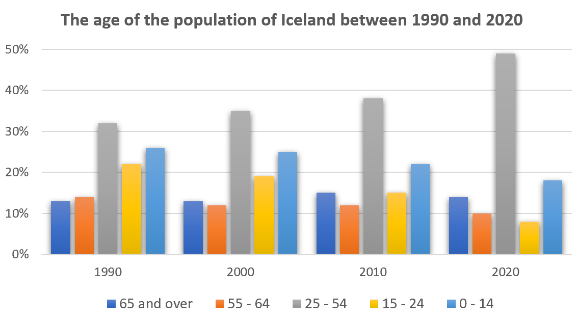
The age of the population of Iceland between 1990 and 2020
The graph gives information about the age of the population of Iceland between 1990 and 2020.
Summarise the information by selecting and reporting the main features, and make comparisons where relevant.
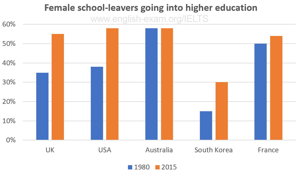
The percentage of women going into higher education in five countries
The chart gives information on the percentage of women going into higher education in five countries for the years 1980 and 2015.
Summarise the information by selecting and reporting the main features, and make comparisons where relevant.
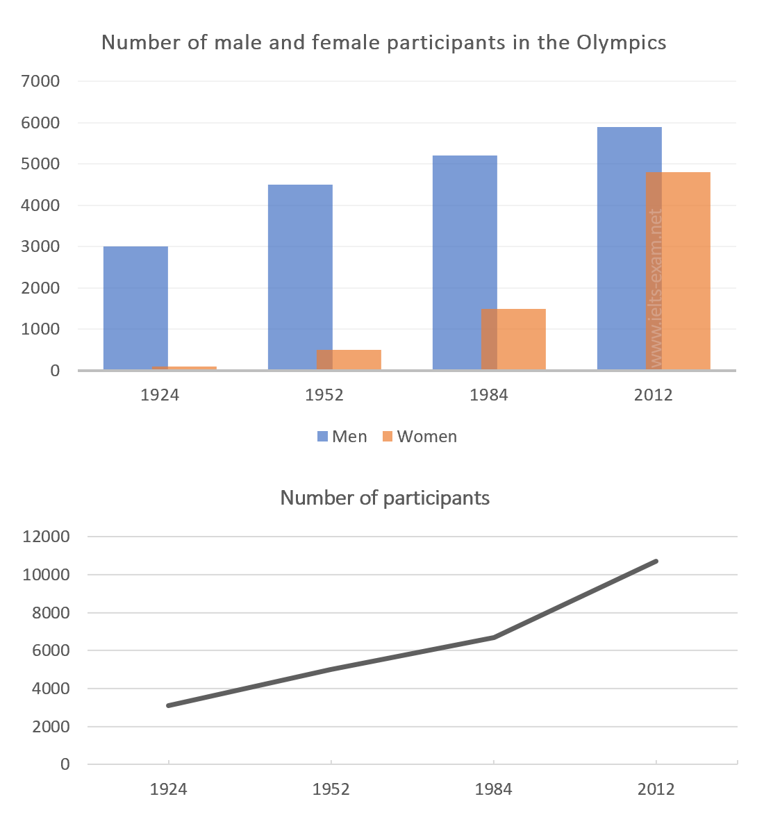
Participants who have entered the Olympics since it began
The chart and graph below give information about participants who have entered the Olympics since it began.
Summarise the information by selecting and reporting the main features, and make comparisons where relevant.
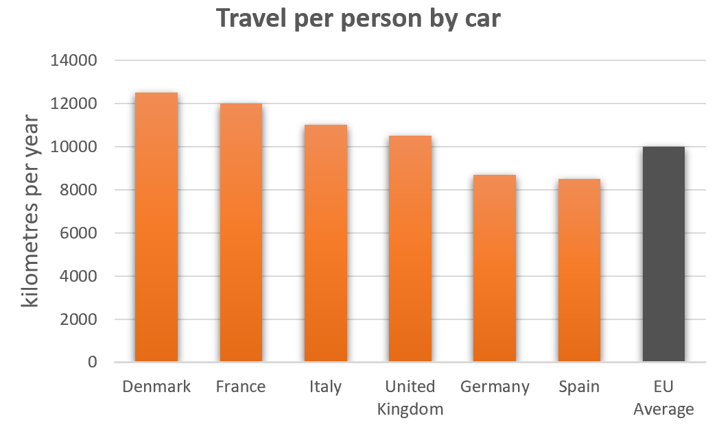
Road transport in a number of European countries
The bar charts below give information on road transport in a number of European countries.
Summarise the information by selecting and reporting the main features, and make comparisons where relevant.
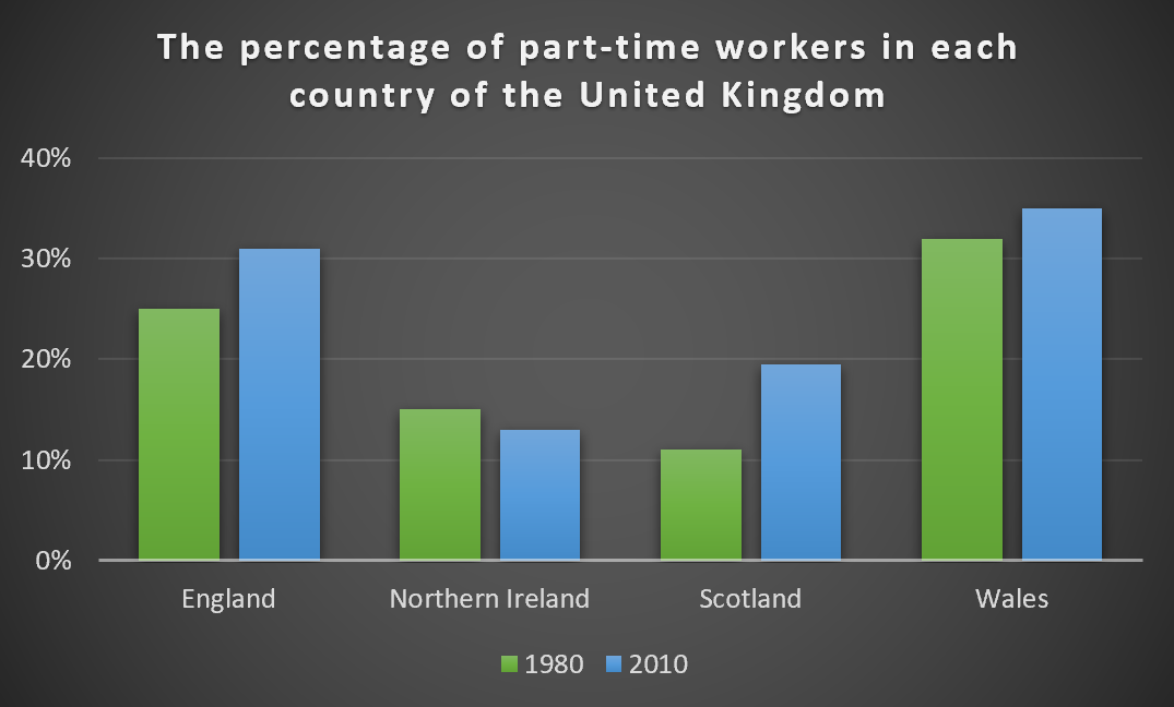
The percentage of part-time workers in each country of the United Kingdom
The graph below shows the percentage of part-time workers in each country of the United Kingdom in 1980 and 2010.
Summarise the information by selecting and reporting the main features, and make comparisons where relevant.
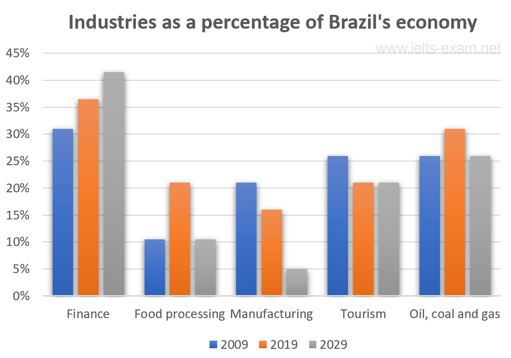
Industries� percentage share of Brazil�s economy
The bar chart below illustrates five different industries� percentage share of Brazil�s economy in 2009 and 2019 with a forecast for 2029.
Summarise the information by selecting and reporting the main features, and make comparisons where relevant.
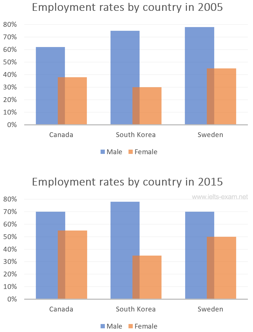
The percentages of men and women in employment
The bar charts below show the percentages of men and women in employment in three countries in 2005 and 2015.
Summarise the information by selecting and reporting the main features, and make comparisons where relevant.
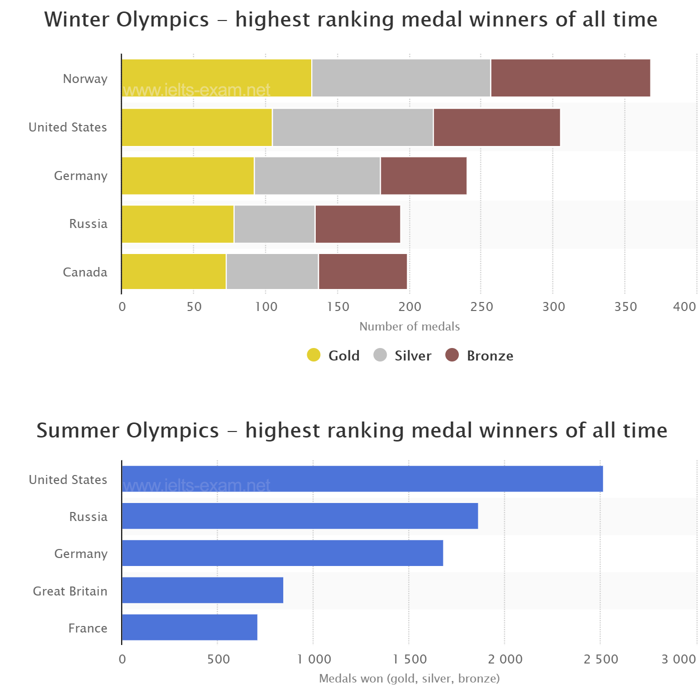
The number of medals won by the top five countries in the summer and winter Olympics
The graphs below show the number of medals won by the top five countries in the summer and winter Olympics.
Summarise the information by selecting and reporting the main features, and make comparisons where relevant.
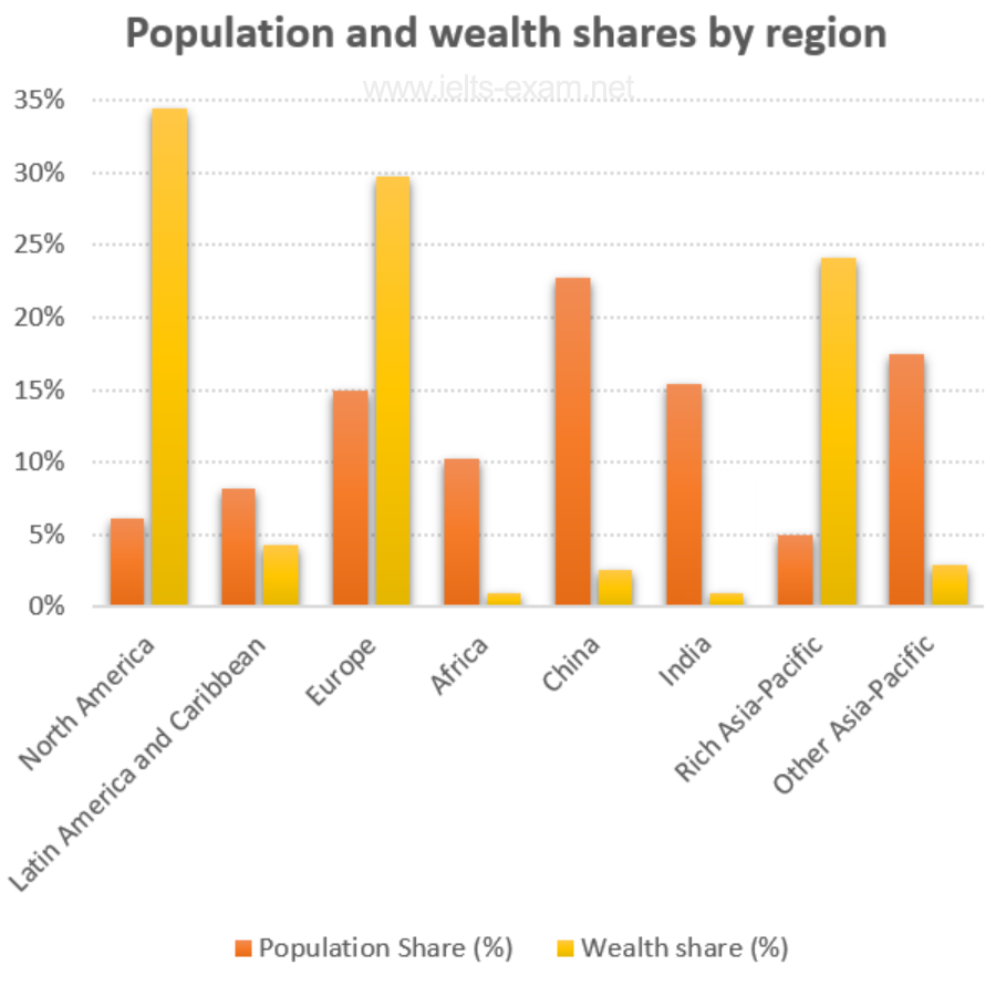
Global population percentages and distribution of wealth by region
The chart below gives information about global population percentages and distribution of wealth by region.
Summarise the information by selecting and reporting the main features, and make comparisons where relevant.
Percentage of Canadians gave money to charitable organisations
The chart below gives information on the percentage of Canadians gave money to charitable organisations by age range for the years 2000 and 2015.
Summarise the information by selecting and reporting the main features, and make comparisons where relevant.
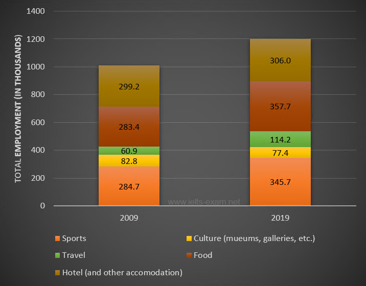
Employment figures in different tourism-related industries
The bar chart below shows employment figures in different tourism-related industries between 2009 and 2019.
Summarise the information by selecting and reporting the main features, and make comparisons where relevant.
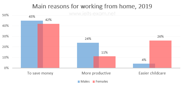
The main reasons workers chose to work from home
The diagrams below show the main reasons workers chose to work from home and the hours males and females worked at home for the year 2019.
Summarise the information by selecting and reporting the main features, and make comparisons where relevant.
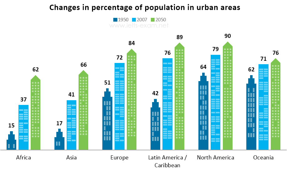
Percentage of the population living in urban areas
The bar chart below gives information about the percentage of the population living in urban areas in different parts of the world.
Summarise the information by selecting and reporting the main features, and make comparisons where relevant.
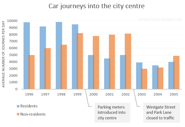
Car journeys into the city centre
The bar chart gives information about the number of car journeys into the city centre made by residents and non-residents.
Summarise the information by selecting and reporting the main features, and make comparisons where relevant.
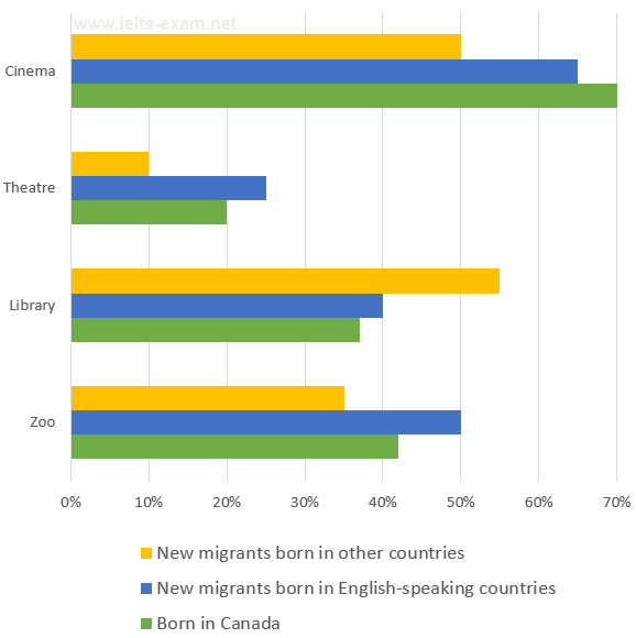
The places visited by different people living in Canada
The chart below shows the places visited by different people living in Canada.
Summarise the information by selecting and reporting the main features, and make comparisons where relevant.
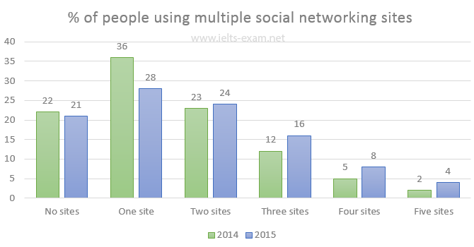
Percentage of people using multiple social networking sites
The chart below gives information about the number of social networking sites people used in Canada in 2014 and 2015.
Summarise the information by selecting and reporting the main features, and make comparisons where relevant.
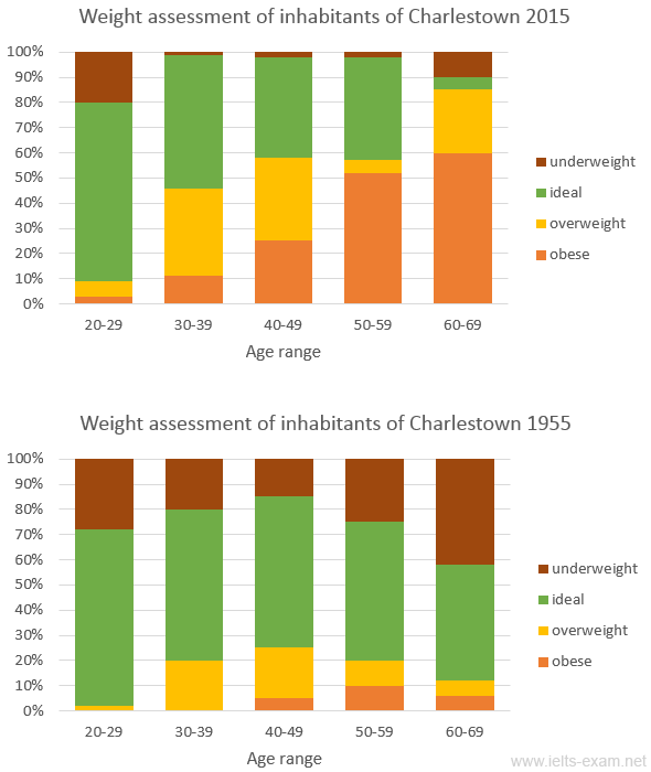
Weight assessment of inhabitants of Charlestown 2015
The charts summarise the weight measurements of people living in Charlestown in 1955 and 2015.
Summarise the information by selecting and reporting the main features, and make comparisons where relevant.
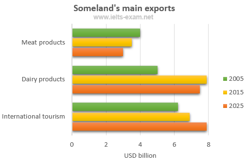
Someland’s main exports
The chart below gives information about Someland’s main exports in 2005, 2015, and future projections for 2025.
Summarise the information by selecting and reporting the main features, and make comparisons where relevant.
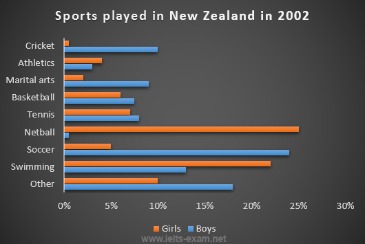
Sports played in New Zealand in 2002
The chart below gives information about the most common sports played in New Zealand in 2002.
Summarise the information by selecting and reporting the main features, and make comparisons where relevant.
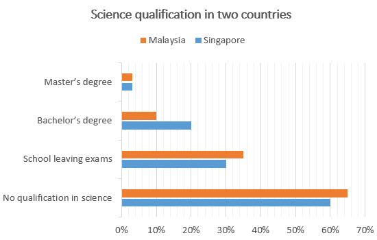
Science qualifications in two countries
The chart below gives information about science qualifications held by people in two countries.
Summarise the information by selecting and reporting the main features, and make comparisons where relevant.
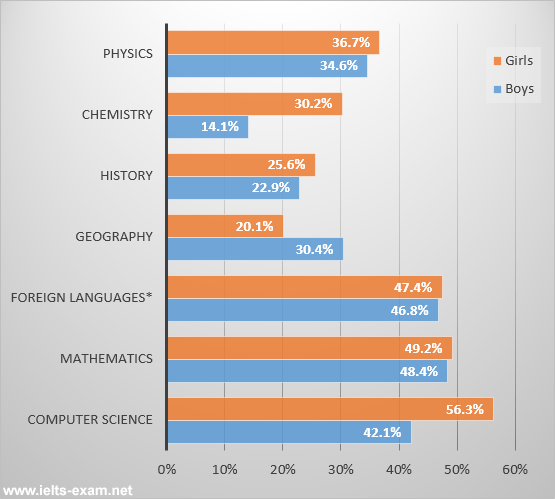
Students passing high school competency exams, by subject and gender
The bar chart shows the percentage of students who passed their high school competency exams, by subject and gender, during the period 2010-2011.
Summarise the information by selecting and reporting the main features, and make comparisons where relevant.
Female unemployment rates in the United Kingdom in 2013 and 2014
The graph shows female unemployment rates in each country of the United Kingdom in 2013 and 2014.
Summarise the information by selecting and reporting the main features, and make comparisons where relevant.
Percentage who watch reality shows and game shows
The charts show the number and genres of TV programmes watched by men and women and four different age groups in Australia.
Summarise the information by selecting and reporting the main features, and make comparisons where relevant.
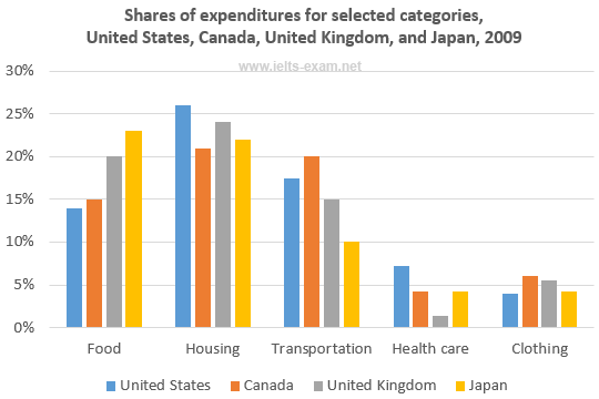
Shares of expenditures for selected categories
The bar chart shows shares of expenditures for five major categories in the United States, Canada, the United Kingdom, and Japan in the year 2009.
Summarise the information by selecting and reporting the main features, and make comparisons where relevant.
International graduates, Canadian universities, 2001 and 2006
The chart shows the percentage change in the share of international students among university graduates in different Canadian provinces between 2001 and 2006.
Summarise the information by selecting and reporting the main features, and make comparisons where relevant.
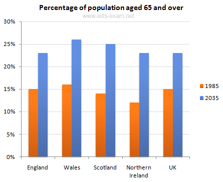
Percentage of population aged 65 and over
The chart gives information about the UK’s ageing population in 1985 and makes predictions for 2035.
Summarise the information by selecting and reporting the main features, and make comparisons where relevant.
Percentage of pupulation in urban areas
The bar chart gives information about the percentage of the population living in urban areas in the world and in different continents.
Summarise the information by selecting and reporting the main features, and make comparisons where relevant.
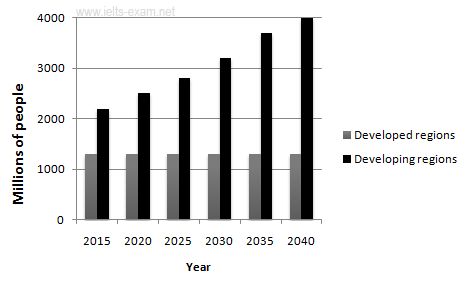
Urban populations in different world regions
The graphs provide information on global population figures and figures for urban populations in different world regions.
Summarise the information by selecting and reporting the main features, and make comparisons where relevant.
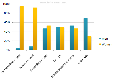
The percentage of male and female teachers
The chart shows the percentage of male and female teachers in six different types of educational setting in the UK in 2010.
Summarise the information by selecting and reporting the main features, and make comparisons where relevant.
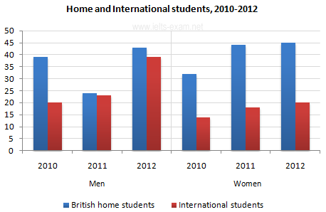
Home and International Students
The bar chart gives information about the number of students studying Computer Science at a UK university between 2010 and 2012.
Summarise the information by selecting and reporting the main features, and make comparisons where relevant.
Finland’s telephone calls, by category, 1995-2004
Summarise the information by selecting and reporting the main features, and make comparisons where relevant.
