How to draw mountains
How to draw mountains
How to Draw Mountains: Easy Step by Step Tutorial
Here is an easy step by step tutorial on how to draw mountains, perfect for beginners.
Learning how to draw mountains is a great way to learn how to implement light and shadow into your drawings, as well as just having fun with the process of drawing.
Step 1: Draw the outline of your mountain
For this mountain, I created two peaks. Draw this outline lightly, as it is just a guideline and will be erased later.
Step 2: Draw the ridges of the mountains
One of the easiest ways is to imagine a pyramid and see where the profile lines will fall in a pyramid for each mountain peak.
Then I just make the line more raggedy, making it zig-zag a bit, and creating points along the line.
Step 3: Draw the ragged outline of the mountain
Draw the ragged outline of the mountain using the line we drew in Step 1 as guidance.
For this step, I generally like to make gradual points all along the mountain.
Step 4: Erase the original outline drawn in Step 1
Step 5: Draw little peaks
Step 6: Add little shadows along the peaks
Imagine where the sun is positioned and which side will be receiving more light. The tops of the little peaks will be receiving more light and behind the little peak will be where the shadow falls.
Step 7: Create the shadowed side of the mountain
Darken the side of the mountain that is facing away from your light source.
Near the ridge will be darker than the areas that are farther away from the ridge.
Create a gradient of shadow, from areas that are almost black to areas that are more grey in color in order to make your mountain drawing more realistic.
Step 8: Add some shadows to the opposite side of the mountain as well
I added some shadows near the peaks of the mountains.
Step 9: Add little tiny peaks all around the mountain
They look like dots sometimes or just little lines.
Step 10: Go back and erase near the main ridge line to add highlight
Erase along the side where the light hits the mountain (not the shadowed side).
And this is our finished mountain drawing!
Mountain Drawing Steps Overview
More Easy Mountain Drawing Ideas
Since there are many kinds of mountains to draw, here are some more mountain drawing ideas to try out!
Thank you for stopping by this blog post and I hope this step by step tutorial made drawing mountains more easy for you.
I hope you have a wonderful day and take care!
Related
Leave a Comment Cancel reply
Hello There, I’m Shihori – and welcome to my little corner here on the internet.
I’m an artist and blogger. I’m shy and quiet, and I need to connect with others. This is how I find fulfillment for my life’s journey and I hope to inspire an infinite amount of people in their own self discoveries.
Mountain Landscape Drawing: How to Draw Mountains for Beginners
Read Next
Learn how to Paint a Watercolor Gradient and Graded Washes in 3 straightforward Steps
If you like to draw landscapes, sooner or later you will have to deal with the drawing of rocks and mountains. If you want to learn how to draw mountains, you will love this 5-step guide.
Required material
How to draw mountains: The step by step tutorial
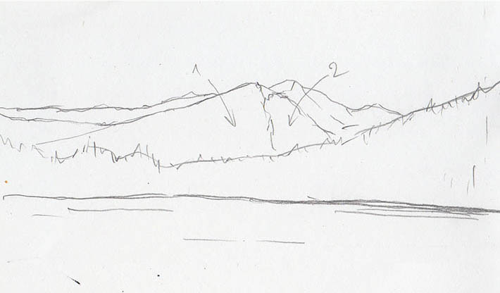
1. Draw the horizon line and organize the image
Determine the horizon line. First, you should draw the horizon line. This is the line where the mountains meet the sky. This line separates the background from the middle ground. All you have to do is outline the mountain ridge.
Work from the back to the front to avoid overlapping of lines.
Another line shows the transition from the middle ground to the foreground, which is essential to represent the atmospheric perspective later on correctly.
The further away the mountains are, the more reduced their shapes are, and the weaker their outlines become.
2. Divide each peak into two main planes
Divide the mountains into two planes to create the illusion of volume and depth. You can do this by drawing one side of the mountain brighter and one side darker. Shade the darkest areas to create a contrast between the peaks of the mountain ridges.
Photographs can be an excellent reference for understanding the interplay of light and dark in a mountainscape. If you’re drawing from a reference, it’s best if the photographs convey a lot of information. More specifically, perspective features, lighting, and contrast are three of the elements that a good template should provide.
Hint: On sites like Unsplash.com, you can download royalty-free images for free. Numerous mountain photos are ideal for use as a reference.
3. Determine the distance and textures
Note that each surface has a unique line direction when drawing mountains. You can shade particularly distinctive peaks with cross-hatching, for example. Three to four layers of strokes in offset directions are appropriate to mark the darkest areas. Lighter areas, such as the mountainside facing the light source, can be shaded with straightforward hatching.
Less prominent peaks can be drawn with two or three layers of cross-hatching.
The same approach applies to the use of value gradings. The mountains close to the observe should be darker and more detailed than the peaks further in the background. This way, you can suggest the atmospheric perspective.
In our case, we have emphasized the prominent peaks in the center of the image with sharper outlines and darker shading.
The highest peaks in the left half of the image are not less distinctive, but we suggest their greater distance from the viewer with weaker shading and looser outlines.
4. How to draw mountains: Add details to the scene
If you want to draw mountains, you should not abandon details like trees, fences, animals or lakes. In the realistic drawing, these details are not only used to make the motif look more exciting, but also to emphasize the already suggested distances between the mountains and the viewer.
Trees that are closer to the viewer are drawn with darker pencils and with greater accuracy than the mountains that are in the middle or even in the background. Proportion, value (brightness/darkness), and degree of detail of the details decide on the logical distances between pictures.
5. Make refinements
Once you have drawn the details of the mountain motif, you should check once again on whether the picture elements harmonize with each other. Make small adjustments if necessary. Any inaccuracies should be corrected, and final details should be added until you are satisfied with your mountain drawing.
Note: Make sure that you do not abandon your entire concept in this touch-up phase, but limit yourself to correcting small inaccuracies.
Sign Up to Our Newsletter
Get notified about exclusive offers every week!
Drawing Mountains Can Be a Peak Experience With These Simple Tricks
September 2, 2020 By Veronica Winters & filed under Art Blog.
Artists have taken inspiration from mountains since … forever. Whether up close or far away, covered in snow or in trees, rounded or jagged, they tend to symbolize something vast and vital. And when you draw them, you want that feeling to come to life on the page. Here’s how.
Good to Know: These tips works no matter what medium you’re using — graphite, pen and ink, colored pencil or painting.
1. Determine the Horizon Line
First, figure out where you want the horizon line to be on your page and draw the outline of a mountain range above it. Usually a mountain range has a layered appearance, with peaks overlapping each other. The more distant the mountains, the simpler and lighter they look.
2. Divide Each Peak into Two Major Plains
Divide your mountains into two plains to create volume: light and dark. Shade the darkest areas first, building contrast between the foreground and background to make the picture more eye-catching.
Photographs can be great reference tools, or you can work en plein air if you live in a mountainous area. If you’re working from photos (or taking your own to reference later), use images that convey a lot of information, showing the depth of field as well as the ideal lighting conditions.
3. Determine Distance and Textures
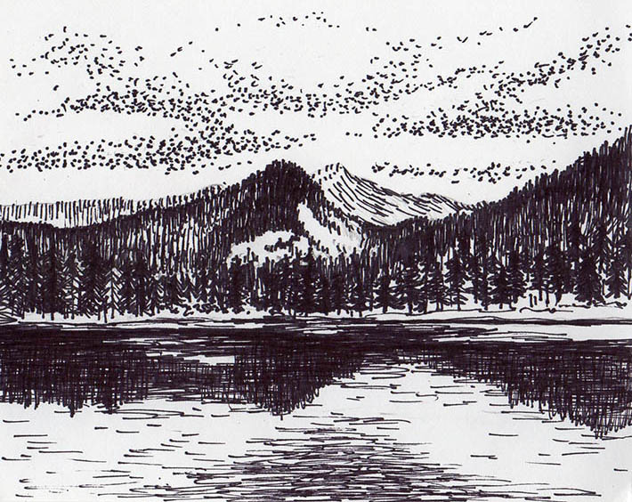
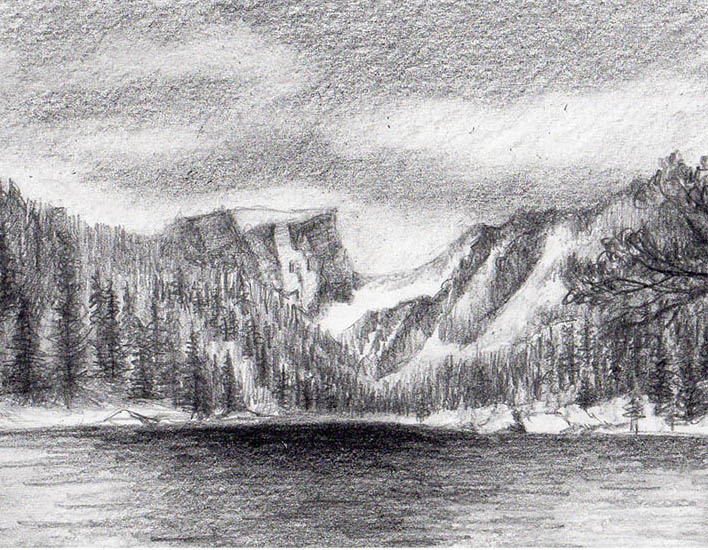
In the drawing above, the mountains are sketched with an ultra-fine black felt-tip marker. Notice that every area has a unique stroke direction. For far-away mountains, use parallel strokes to suggest distant trees and rock surfaces. To depict up-close mountains, try contour and scribble lines or crosshatching to give the impression of greater detail.
The same approach applies to your use of values. The up-close mountains should be darker, brighter and more vividly detailed than those in the distance. Take the drawing above: the nearest mountains sit low and have a bit of vegetation, while the mountains in the distance have no detail and are lighter in value.
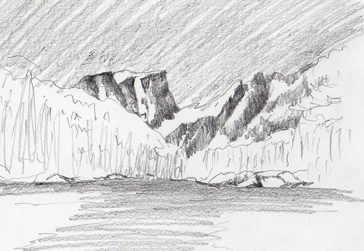
4. Sketch in Graphite
After placing the biggest elements and differentiating between light and dark areas, use broad pencil strokes to mark the general position of the darkest values and fill in the sky (and water, if your landscape has any). It’s best to do this in graphite, so you can easily erase as needed.
5. Add the Details
Finally, add any extra elements — trees, snow, reflections in the water. Keep the sky soft to contrast the trees and sharper angles of the mountains.
How to Draw Mountains
Table of Contents:
Make a Majestic Mountain Drawing
Who doesn’t get inspired when looking at the awesome majesty of a mountain range? Artists for centuries have been struggling with how to draw mountains. And although mountains may be an intimidating subject, especially if you’re a beginning artist, they are something that can be mastered with practice. I’ve put together this step-by-step guide to learn how to draw a mountain in hopes it will give you a foundation to take your mountain drawing to new heights.
List of Supplies
6 Easy Steps
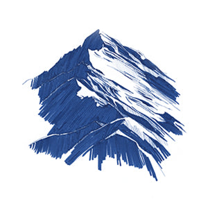
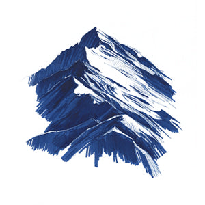
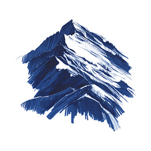
The mountain range in this guide is done using a monochromatic scheme, meaning only one color is used. In this case, I used Arteza’s Denim Blue A107 TwiMarker. By using one of these art markers, I had an added benefit of a fine tip on one end that she used for small details and a wider tip on the opposite end for filling in broader areas. Made with water-based ink, these markers also make blending colors easier, which is an important part of this exercise.
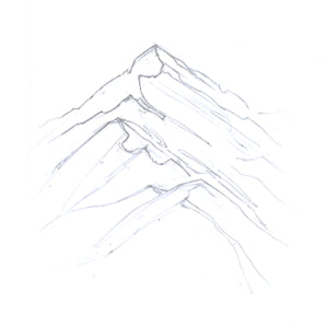
Step 1. Draw an outline
First, determine where the tops will be placed on your paper. You can place them high or low, depending on how much sky there will be.
TIP: A standard rule of composition is to avoid placing your focal point, in this case, the mountains, across the page’s center. Positioning them off-center will make your drawing more unexpected and interesting.
Make a sketch of the mountain’s general form. Create a faint line by applying just a little pressure on the pencil. This line should be somewhat wavy to resemble various mountain heights as well as differentiate which side will be in shadow. Begin sketching your largest peak first, which is located in the distance. Decrease each one’s size as they get closer to the viewer.
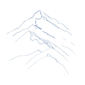
Step 2. Darken the outline
Using TwiMarker’s fine tip, I created a line of consistent width to go over my initial lines. Next, I erased all visible pencil marks.
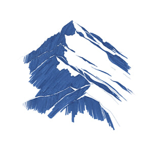
Step 3. Add the initial shadows
What will make your range look realistic is the placement and tones of your shadows. Determine which side is receiving the most light. In this demonstration, I decided that the right side would be illuminated; therefore, the mountain’s left side would be in shadow.
As you progress through your drawing, use three tones for shadows: a light tone, a mid-tone (or halftone), and a dark tone. To achieve this, start by giving all areas that are in shadow an even layer of color using the marker’s wide tip. Be careful not to go over your previous marks, as layering at this stage will eliminate the light tones later on.
Step 4. Create the mid-tone shadows through hatching
Now, add the mid-tone shadows to define the illuminated side. For this, I used TwiMarker’s smaller tip. To make halftones, a technique known as “hatching” is used. Hatching is the placement of thin lines horizontally, vertically, or diagonally very close together. The closer these lines are placed to one another, the darker an area will appear. You may do your hatches in one or two directions. Hatching partially covers the paper’s surface and looks like a shadow of one mountain sitting in front of another. This adds some diversity to the painting to make it more interesting. Learn more about using markers for hatching by reading our blog, “Fun & Easy Marker Drawing Techniques.”
Step 5. Make the darkest shadows by layering
This stage is where I layer and blend to make the darkest shadows. This contrast is important to really define the ragged edges of the ridgeline and give the true feeling of light shining on it.
TIP: It is important to pay special attention to the ridgeline where the light and shadow meet. This is where the highest amount of contrast will be, resulting in being where the viewer’s eye is drawn first.
To make the darkest contrast, use the hatching method and make multiple layers with the TwiMarker.
Step 6. Add finishing touches
Once again, employ the fine tip end of the marker to draw tiny trees on the illuminated side. Also, add some jagged random lines to further enhance the rugged territory of the mountainside.
Recommendations
Congratulations! You’ve drawn a beautiful and realistic mountain range. We hope this guide will help you confidently add more mountains to your artwork, and inspire you to try new tools, such as Arteza TwiMarkers.
How to Draw Mountains
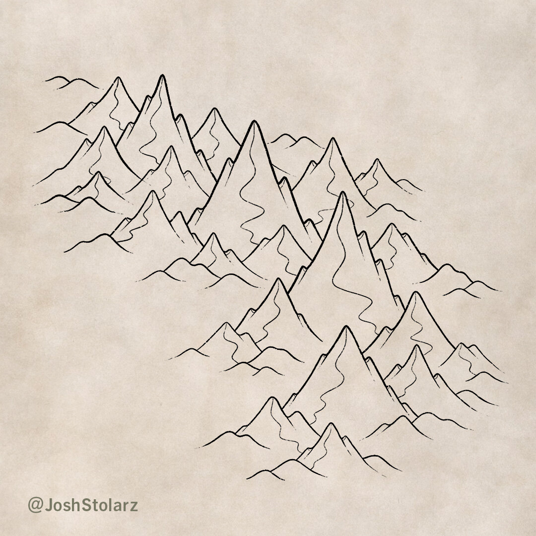
Mountains are perhaps the most important natural feature you can draw on a map. They impact weather patterns, where rivers flow, and ultimately where cities and nations arise. But, how do you draw them so they don’t just look like squiggly triangles on your map?In this tutorial I will walk through one of the methods I use to draw mountains on fantasy maps.
1: Define the Shape
Draw a line to indicate where you would like to place your mountain range.
This helps you to focus more on the overall composition of your mountain range so it looks natural on the map. If you draw the actual mountains too soon you’ll often have to redraw them to fix their placement.
2: Sketch Some Basic Mountains
On a new layer or with a pencil, lightly sketch some simple mountain shapes to define the tallest mountains along the middle of the range.
The main thing you want to focus on here is the general placement and the height. Keep things simple at this point to set a good foundation before you begin to draw in the final line work. It helps to establish the size of the mountains here to keep them consistent across the map.
3: Refine the Main Mountains
Once you are happy with the placement of your main mountains, you can create a new layer and draw your final line work.
For this style of mountains you will want to use a type of jagged step pattern for the main shape of the mountains.Try to vary the placement and height of these ridges so the mountains don’t appear too similar.
4: Add Smaller Mountains
With your tallest mountains in place, you can now draw some smaller mountains around them. You can use the same method as the previous step, but notice the smaller mountains are less vertical in nature.
As you place the smaller mountains, think about the range tapering into the surrounding landscape. Usually when people begin drawing maps their mountains are all the same height and it looks rather unnatural.
5: Draw in the Foothills
Last but not least, draw in some small rounded hills at the base of the mountains to blend with the terrain.
In the real world it is unusual to encounter massive mountains which emerge from a completely flat landscape. Usually, there is a transitional area made up of rolling foothills. This can go a long way to making your map feel more realistic.
6: Add the Main Ridge
With all your mountains in place, you can now begin to draw in detail. The first thing is to add a ridge line that flows down from the main peak and connects to an adjacent mountain. Try to use a smooth back and forth motion when drawing the ridge.
The other thing is you can draw a line down from each of the little ridges on the outside of the mountain. This helps give a sense of depth.
The astute observer will also notice that I have added a couple of medium sized mountains that weren’t there in the previous step. The reason being when I began to draw the ridge on the top two large mountains, I was unhappy with how far the line had to travel before it hit another peak. It just didn’t look right to my eye, and I wanted to leave this in just in case you encounter a similar problem with the spacing of your mountains.
7: Refine the Ridge
Now that your ridge is in place you can draw lines that flow down from each point or curve of the ridge which will define more of the form of each mountain.
Really try and imagine each mountain as a three dimensional object in order to make these lines feel like they they follow a natural slope.
8: Finish the Details
The last details to add are some additional lines that follow the contour of the mountain. They also help indicate the direction of the light as you can add more lines to the side of the mountain that will be in shadow in order to add greater depth.
Continue to follow the natural slope that you defined in the previous step. Be sure to use a finer line for this step to make the Detail feel more subtle.
9: Paint in the Base Shadows
With the line work finished you can begin to paint in some shadows on the right side of each mountain.
If you want the old world sepia look like this; select your eye dropper tool and pick the paper background color. Lower the brightness, shift the hue a little more toward red, and increase the saturation just a bit. The exact color I used was #b9a48e.
I am using the Rock Climber Filler brush to achieve that nice rocky texture in the shading. Otherwise the shading can look a bit too smooth and digital.
10: Deepen the Shadows
The next thing to do is to deepen some of the shadows to add greater depth. Use a darker shade of brown (#7c644e) particularly near the top of each mountain and following the detail lines you added earlier.
Tip: If you paint these shadows on a separate layer from the previous ones you can use the opacity slider to get them just right. In this case I actually painted them all in and then lowered the opacity to 60% to get something I was happy with.
11: Paint in the Highlights
Finally, the last thing to do is paint in some highlights on the opposite side of your mountains. Use a color that is based on your paper background but obviously lightened. In this case the color I used was #f2eae2.
Just like the deepest shadows, your brightest highlights should be near the top of the mountain where the light hits most directly. I tend to prefer a lighter touch with the highlights so the mountains don’t end up looking too reflective.
The Modern Map Maker Essential Brushes
$19 | For Procreate & Photoshop
Want the the brushes I am using for this tutorial?
The Modern Map Maker Essential brushes is a collection of 15 brushes designed to take the guess-work out of getting started drawing fantasy maps with digital tools.
Mountains were one of the things that took me the longest to figure out when I began to draw maps. A big part of the problem was seeing them only as individual mountains rather than a cohesive range that is made up of mountains. When you see them as unified and connected with the rest of the terrain then with practice your mountains will look less like they are just stuck on top of your map, but are part of the landscape.
If You’re Struggling…
Anyone can learn to draw if they have the desire to do so and put in the time. I am convinced that art is 90% skill and only 10% “talent”; the good news is that skills are learned. They aren’t magically born into some people and not others. Even the most talented person still has to put in the time and acquire the skills before they become great.
So if you follow this tutorial and struggle, rest assured that I did too and I never imagined I would be doing a tutorial on this to help others. But if you put in the time and are doggedly determined to figure it out, you’ll get there, I promise.
If you found this helpful I would appreciate it if you pinned this to save for later and to share with your friends. Thank you, and I look forward to seeing you map your story!


