How to lie with statistics
How to lie with statistics
Как лгать при помощи статистики?
В текущие времена постоянной информационной войны всех со всеми считаю необходимым ввести в школьные программу «Критическое мышление» и хотя бы «Основы аналитики» (каждый должен понимать, что такое медиана, квартиль, выборка, когортный анализ). Но пока такого нет – давайте хотя бы периодически качаться в этих направлениях.
Ложь при помощи статистики – это целая наука и есть даже одноименная посту книга на эту тему, но сейчас не о ней, а о том, что в эпоху пандемии можно наблюдать много попыток манипулировать мнением при помощи статистики. Кто-то пытается запугать, другие, наоборот, продолжают убеждать, что от гриппа каждый год всегда столько же людей болело/умирало, и бояться нечего. Я не хочу никого ни к чему склонять в этой инфовойне, но хочу показать наглядно совсем на другом примере, как работает статистика и почему к ней надо всегда подходить со скептицизмом.
Короче, пост для развития критического мышления.
Думаю, многие, как и я, часто слышали утверждение, что средняя ожидаемая продолжительность жизни двести лет назад была 35, а в более древнем мире – вообще 25 лет. Складывается впечатление, будто за мамонтами только подростки и охотились.
На то, что что-то здесь не так, меня натолкнула мысль – а кто тогда детей воспитывал, если в 25 все умирали? Зная, как интерпретируют статистику, я решил почитать материалы на тему продолжительности жизни 200 лет назад и раньше, чтобы понять откуда берутся такие числа.
Что я узнал в итоге.
Средняя продолжительность жизни действительно могла быть 35 и даже 25 лет. Но есть один важный нюанс. В 17 веке в Швеции умирали до 40% всех младенцев, в Германии – до 35%, а в менее развитых странах ситуация была еще хуже. Вполне вероятно, что в более ранние века этот процент был выше. Но суть в том, что если у отца было 10 детей, и 4 из них умерли в возрасте до одного года, а 6 других дожили хотя бы до 60, то средняя продолжительность жизни у всех десяти будет 36 лет. Кстати, для сравнения, Википедия говорит, что, по данным на 2016 год, в Германии детская смертность составила 0,32%, а в Швеции 0,24%.
Раньше ситуация была явно похуже. К примеру, в бронзовом веке ожидаемая продолжительность жизни была около 30 лет, но 15-летние спокойно могли рассчитывать прожить еще 30–35 лет, то есть, дожить до 45-50.
В итоге, главный вывод, который мы должны сделать из статистики средней продолжительности жизни в древние времена: тогда был высокий уровень детской смертности. Но по умолчанию мы делаем другой, представляя, что после 25-30 лет все резко начинали умирать, – в этом и ловушка статистики. Вроде бы тебе не врут, говоря, что раньше средний возраст был 25-30 лет, но мозг сам додумывает ложь.
Так что думайте своей головой и не верьте числам, только потому что это числа.
А закончить этот пост хочу цитатой из упомянутой в начале книги Дарелла Хаффа «Как лгать при помощи статистики»:
Давным-давно, когда Университет Джонса Хопкинса только начал принимать девушек, некто, не испытывавший особых восторгов по поводу совместного обучения, обнародовал данные, ставшие для многих потрясением: оказывается, 33% студенток университета повыходили замуж за преподавателей!
Однако исходные цифры позволяли точнее оценить картину «бедствия».
На тот момент в списке учащихся числились три девушки-студентки, и одна из них действительно вышла замуж за преподавателя.
Как правильно лгать с помощью статистики
Существуют три вида лжи: ложь, наглая ложь и статистика (источник)
Есть такой замечательный жанр — «вредные советы», в котором детям дают советы, а дети, как известно, всё делают наоборот и получается всё как раз правильно. Может быть и со всем остальным так получится?
Статистика, инфографика, big data, анализ данных и data science — этим сейчас кто только не занят. Все знают как правильно всем этим заниматься, осталось только кому-то написать как НЕ нужно этого делать. В данной статье мы именно этим и займемся.
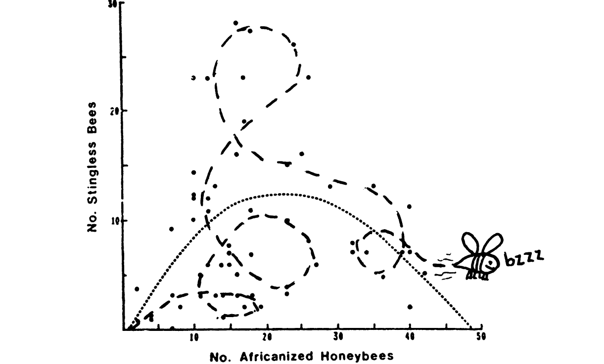
Hazen Robert «Curve fitting». 1978, Science.
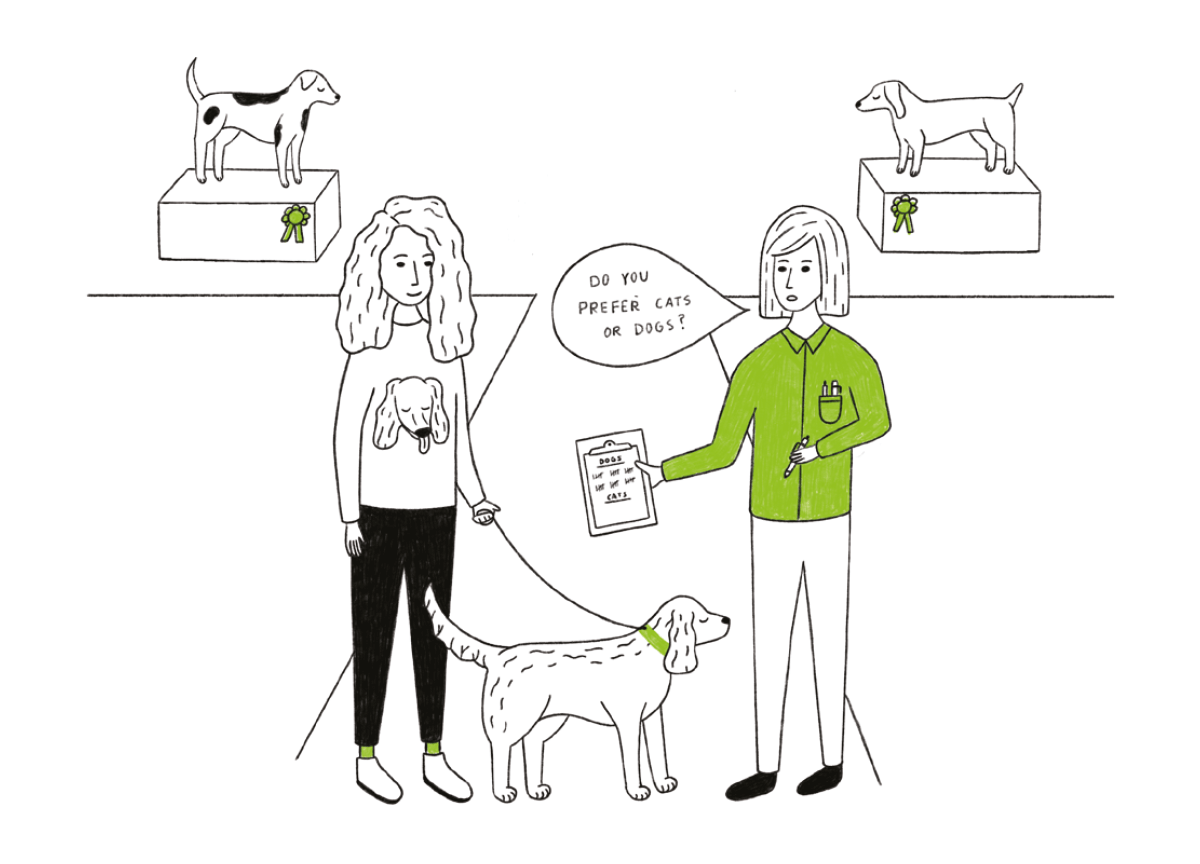
Предвзятая выборка (Sampling bias)
В 1948 году во время президентской гонки в США в ночь на оглашение результатов выборов Труман (демократы) против Дьюи (республиканцы) газета Chicago Tribune опубликовала свой, пожалуй, самый знаменитый заголовок DEWEY DEFEATS TRUMAN (см. фото). Сразу после закрытия участков газета провела опрос, обзвонив огромное (достаточное для выборки) число избирателей, и всё предвещало оглушительную победу Дьюи. На фото мы видим смеющегося Трумана, победителя выборов 48го года. Что же пошло не так?
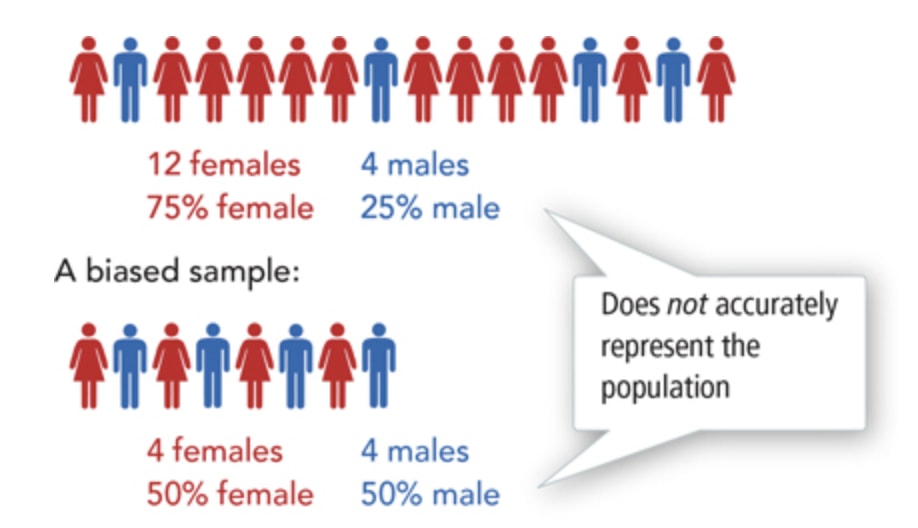
Людей обзванивали действительно случайно и в достаточном количестве, но в 48-ом году телефон был доступен только людям определенного достатка и редко встречался у людей с небольшим заработком. Таким образом, сам метод опроса вносит поправку в распределение голосов. Выборка не учитывала достаточно широкий пласт избирателей Трумана (как правило демократы имеют большую долю голосов среди бедного населения), которым телефон в свою очередь был недоступен. Такая выборка и называется предвзятой (sampling bias).
Народное творчество о данном феномене:
По данным интернет-голосования 100% людей пользуются интернетом.
Зарплата выпускников
Никого не удивляло, что когда мы слышим о зарплатах выпускников ВУЗов, то почему-то всегда это неправдоподобно высокие цифры? В США сейчас доходит дело даже до судов, где выпускники утверждают, что данные по зарплатам искусственно завышены.
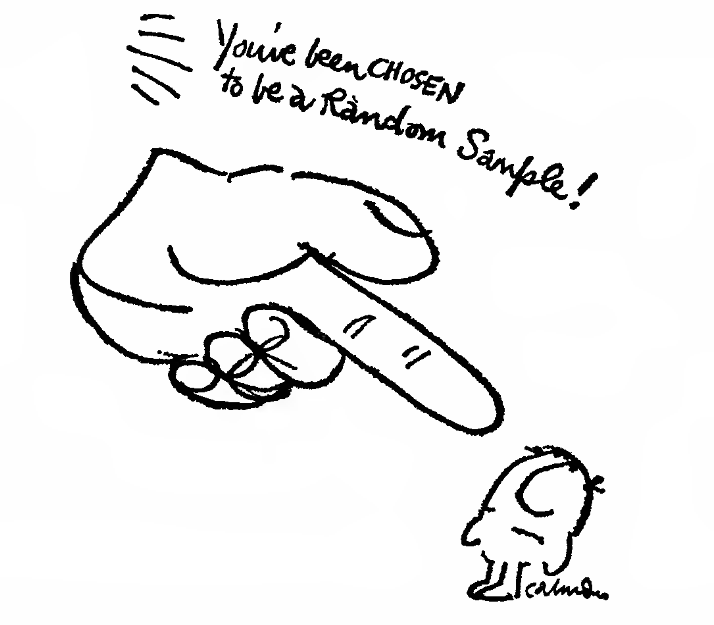
(картинка из How to Lie with Statistics)
Это довольно старая проблема, согласно Darrell Huff, подобный вопрос возникал у выпускников Yale 24-го года. И на самом деле все говорят правду, да только не всю. Сбор статистики происходил в виде опросов (а в те годы с помощью бумажной почты). Отправляют ответ далеко не все, а только небольшая часть всех выпускников; активнее других отвечают те, у кого дела идут хорошо (что часто выражается в неплохой зарплате), поэтому мы видим только «хорошую» часть картины. Это-то и создаёт предвзятость выборки и делает результаты подобных опросов абсолютно бесполезными.
Правильно выбираем среднее (Well-chosen average)
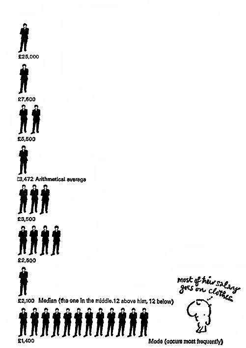
Представим себе компанию, в которой руководитель получает 25 тысяч, его заместитель 7,6 тысяч, топ-менеджеры по 5,5 тысяч, менеджеры среднего звена по 3,5 тысячи, младшие менеджеры по 2,5 тысячи, а обычные работники по 1,4 тысячи (абстрактных фунтиков) в месяц.
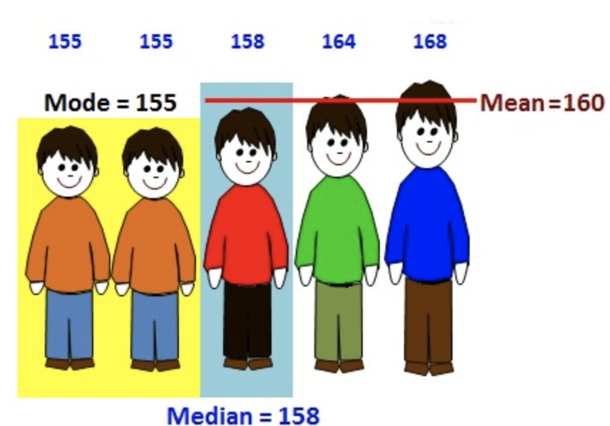
И наша задача представить информацию о компании в положительном свете. Мы можем написать средняя заработная плата в компании составляет X, но что означает среднее? Рассмотрим возможные варианты (см. схему ниже):
(картинка из How to Lie with Statistics)
Арифметическое среднее некоторого конечного множества X=
Это самая бесполезная информация с точки зрения работника — 3,472 средняя зарплата, но за счет чего получается такая высокая цифра? За счет высоких зарплат руководства, что создает иллюзию, что работник будет получать столько же. С точки зрения работника данная величина не является особо информативной.
Конечно же народное творчество не обошло стороной эту особенность «средней величины» в виде средне арифметического
Чиновники едят мясо, я — капусту. В среднем мы едим голубцы.
Медиана некоторого распределения P(X) (X=
Проще говоря, половина работников получает больше данной величины, а половина меньше — ровно середина распределения! Данная статистика достаточно информативна для работников компании, так как она позволяет определить как зарплата сотрудника соотносится с большинством сотрудников.
Мода конечного множества X=
Таким образом в зависимости от ситуации под средним значением может пониматься любая из указанных выше величин (в принципе и не только из них). Поэтому принципиально важно понять, как же рассчитывается это среднее значение.
И еще 10 неудачных экспериментов, про которые мы не написали
Опустим обычную газету в серную кислоту, а журнал ТВ Парк — в дистиллированную воду! Почувствовали разницу? С журналом ничего не произошло — бумага как новая! (Весь ролик тут.)
Наши исследования сообщают, что зубная паста Doake’s на 23% процента эффектнее конкурентов, и всё это благодаря Dr Cornish’s Tooth Powder! (Который наверняка содержал β-каротин и секретную формулу леса — прим. автора.) Вы наверное удивитесь, но исследование действительно провели и даже выпустили технический отчет. И эксперимент действительно показал, что зубная паста на 23% процента эффективнее конкурентов (чтобы это не значило). Но только вся ли это история?
В действительности выборка для эксперимента составляла всего лишь дюжину человек (согласно Darrell Huff и уже упомянутой книге). Это именно та выборка, которая нужна, чтобы получить любые результаты! Представим, что мы подбрасываем монетку пять раз. Какова вероятность, что все пять раз выпадет орел? (1/2) 5 = 1/32. Всего лишь одна тридцать вторая, это не может быть просто совпадением, если выпадут все пять орлов, ведь так? А теперь представим, что мы повторяем этот эксперимент 50 раз. Хоть одна из этих попыток увенчается успехом. О ней-то мы и напишем в отчете, а все другие эксперименты никуда не пойдут. Таким образом мы получим исключительно случайные данные, которые отлично вписываются в нашу задачу.
Играем со шкалой
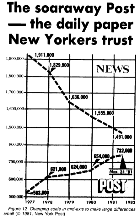
Предположим, завтра нужно показать на совещании, что мы догнали конкурентов, но числа немного не сходятся, что же делать? Давайте немного подвигаем шкалой! Даже известный своей качественной работой с данными New York Times выпустил подобный совершенно сбивающий с толку график (обратите внимание на скачок с 800к до 1,5м в центре шкалы).
(пример из How to Display Data Badly Howard Wainer. The American Statistician, 1984.)
Выбираем 100%
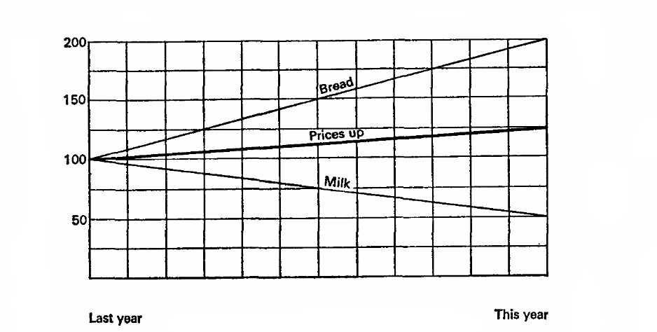
Представим, что в прошлом году молоко стоило 10 копеек за литр и хлеб был 10 копеек за буханку. В этом году молоко упало в цене на 5 копеек, а хлеб вырос на 20. Внимание вопрос, что мы хотим доказать?
Представим, что прошлый год — это 100%, основание для расчетов. Тогда молоко упало в цене на 50% процентов, а хлеб вырос на 200%, среднее 125%, а значит в целом цены выросли на 25%.
Давайте попробуем еще разок, пусть текущий год — 100%, значит цены на молоко составляли 200% в прошлом году, а хлеб 50%. А значит, в прошлом году цены в среднем были на 25% выше!
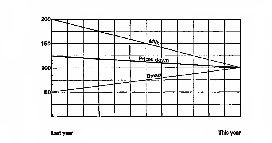
(графики и пример из главы «How to Statisticulate» How to Lie with Statistics)
Скрываем нужные числа
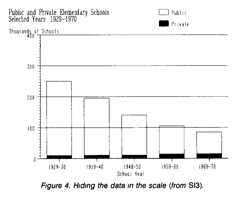
Лучший способ что-то скрыть — это отвлечь внимание. Например, рассмотрим зависимость количества частных и публичных школ (в тысячах штук) по годам. Из графика видно, что число публичных школ сокращается, а число частных существенно не изменяется.
На самом деле рост числа частных школ скрыт на фоне числа публичных школ. Так как они отличаются на порядок, то фактически любые изменения будут не заметны на шкале с достаточно большим шагом. Перерисуем число частных школ отдельно; теперь мы отчетливо видим существенный рост числа частных школ, который был «скрыт» на предыдущем графике.
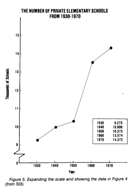
(пример и графики из How to Display Data Badly, Howard Wainer. The American Statistician, 1984.)
Визуальная метафора
Если сравнивать не с чем, а запутать очень хочется, то самое время для непонятных визуальных метафор. Например, если мы изобразим вместо длины площадь на графике, то любой рост будет казаться гораздо более значительным.
Рассмотрим потребление количества пива в США за 1970-1978 годы в миллионах баррелей и долю рынка компании Schlitz (см. график ниже). Неплохо выглядит, внушительно. Не правда ли?
А теперь давайте избавимся от ненужного «мусора» на данном графике и перерисуем его в нормальном виде. Уже как-то не так внушительно и серьезно выходит.
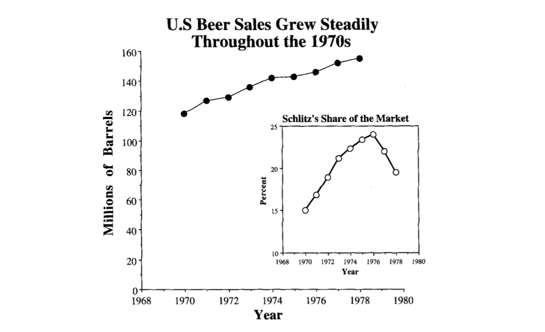
(графики и примеры из John P. Boyd, lecture notes How to Graph Badly or What. NOT to Do)
Первая картинка не врет, все числа в ней верные, только она неявно преподносит данные в совершенно ином свете.
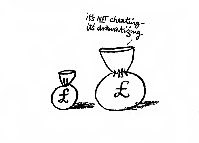
(картинка из How to Lie with Statistics).
Пример качественной визуализации
Качественная визуализация прежде всего преподносит результаты, избегая неоднозначности, и передает достаточное количество информации в сжатом объеме. Про работу Шарль-Жозефа Минара хорошо сказано тут:
Тут прекрасно совершенно все, зрителя не держат за идиота, и не тратят его время на втыкание в
censored. Широкая бежевая полоса показывает размер армии в каждой точке похода. В правом верхнем углу — Москва, куда приходит французская армия и откуда начинается отступление, показанное черной полосой. К маршруту отступления для дополнительного интереса привязан график времени и температуры.
Вывод в итоге: изумленный зритель сравнивает размер армии на старте с тем, что вернулось домой. Зритель весь в чувствах, он узнал новое, он ощутил масштаб, он заворожен, он понял, что в школе ничего не узнал.

(Charles Joseph Minard: Napoleon’s Retreat From Moscow (The Russian Campaign 1812-1813), 1869.)
Заключение и дальнейшее чтение
76% всей статистики взято из головы
Данная подборка покрывает далеко не полный список приемов, которые осознанно, а также не осознанно искажают данные. Данная статья прежде всего демонстрирует, что мы должны очень внимательно следить за предоставленными нам статистическими данными и выводами сделанными на их основе.
Короткий список к дальнейшему чтению:
How to Lie with Statistics — замечательная небольшая книга, невероятно интересно и хорошо написанная, читается на одном дыхании. Демонстрирует основные «ошибки», которые допускают СМИ (и не только они) при работе с данными.
How to Display Data Badly. Howard Wainer. The American Statistician (1984) — сборник типичных ошибок и общих «вредных» правил, чаще всего встречающихся в работах с визуализацией данных.
11 Ways To Lie With Statistics
Twitter LinkedIn icon The word «in».
LinkedIn Fliboard icon A stylized letter F.
Flipboard Facebook Icon The letter F.
Email Link icon An image of a chain link. It symobilizes a website link url.
Indeed the book is a best seller even though some examples are out of date, like the salary of Yale graduates and the price of bananas.
Likewise the tricks described by Darrell Huff, from misleading charts to misuse of averages, are still used today. «Many a statistic is false on its face. It gets by only because the magic of numbers brings about a suspension of common sense,» Huff says.
«Proper treatment will cure a cold in seven days, but left to itself a cold will hang on for a week.»
When numbers appear, the reader believes some truth is about to be imparted. Even a nonsensical statement such as this carries the air of authority until the meaning sinks in.
And, yes, statistics can be used to manipulate, obfuscate, sensationalize, and confuse. It will be clear to anyone who clicks on just how simple it is for anyone to learn to do all of that and more.
We start with the statistical sample: the statistician’s best friend for good or evil
Samples are, by definition, incomplete pictures of the whole. How much of the whole, this is the question. When a sample is large enough and selected properly, it tells us something.
The basic sample is called ‘random.’ As its name suggests, it is formed by chance from the ‘universe,’ that is the whole from which the sample is part. Everyone in the universe must have an equal chance of landing in that pool. It is expensive to do and difficult to obtain.
So, more often than not we accept a ‘stratified random sampling.’ Here, the universe is divided up into groups which themselves proportionally represent the universe. Hard to do accurately when you want to, too easily biased if you want it to be.
Samples are based on responses, which reveal either the truth or the airbrushed version of who we wish we were.
When samples rely on people to tell the truth about themselves, we learn more about what they want to be than who they really are.
You may recall the study that showed some extraordinarily high number of Americans reported washing their hands after using the bathroom. Reporters staked out public restrooms far and wide and came away with a far lower percentage of actual post-washroom washing.
Why? From the days of yore, people tend to respond with what will please the one asking the question (who wants to say they don’t wash?), will offend the poll taker least (studies show the gender or race of the one asking the questions greatly affects the answers given), or will make them look the best (self-reported income tends to be far higher than actual).
This means it is a range, though some either ignore this fact or try to use it to say something that isn’t there.
Ignoring? Let’s say your IQ is said to be 130 and your spouse’s 128. As much as you would like to speak in slow, simple sentences at home, the range says there is no difference between the two.
«A difference is a difference only if it makes a difference.»
When the sample is too small to speak to anything, it allows you to say what you want to say without pesky facts getting in the way
Flip a coin four times. Will you get the mythical 50%? Probably not, but maybe. This may suffice when tossing a coin. When you make a medical decision or assess the validity of a scientific study, we demand more proof.
The mean average is the one you most commonly think of when you hear the word average. Advertisers and others sometimes rely on this. You arrive at the mean average by adding a group of numbers, then divide by the number of items you’ve just added together.
Huff suggests this way of misusing the mean: A real estate agent wants to be able to say a neighborhood has a high average income. The neighborhood in question is mostly farmers and hourly-wage workers. There are three families, though, who are millionaire weekenders. The mean average will assist the broker’s wish for a higher number because the wealthy few will bring the mean average considerably higher. Of course, it will not paint a particularly accurate portrait, but it gets the job done.
The median average is most often used when there is a great range among the numbers being considered. It describes what is typical about a group of values.
The misuse of the median would go a little something like this:
You have seven dogs and want the co-op board to approve you anyway. Foolishly they require no meeting of canines or photos. You have three Newfoundlands and four Yorkshire Terriers. You say to the board, the average weight of the dogs is 8 pounds! And I promise to always use the service elevator. The mean average (add the weights and divide by 7) would not work for you here. You are referring to the median average: the point at which there are an equal number of dog weights on one side as the other. And the median is, yes, 8 pounds. The fact that the list is topped by three which top the scales at 150 (not counting the drool) is glossed over.
A perfectly appropriate use of the mode would be if you were looking for the most commonly used girl name in a NYC. The one that appears most frequently is the mode.
A less-than-kosher use would be if you went out and played a 9 holes of golf and came home boasting an average score of 4. You know in your heart that your scores were 4, 4, 7, 10, 4, 11, 6, 8, 4. Only the mode is going to give you any kind of bragging rights. Whether you avail yourself or not, this is another matter entirely.
Graphs can blur, exaggerate and hide because the eye doesn’t ‘understand’ what isn’t there
When information is plotted on a graph, it can either be a true and clear show of the facts or a narrow enough slice of it to make a different point entirely. It is all in what you choose to include and how you choose to show it.
For example, when there is a zero at the bottom of a graph (for comparison), and 10% looks like 10%, the trend (up, down, flat) is in proportion. A mere glance offers an easy-to-read and accurate sense of things.
Looking for a little more shock value? Chop off the bottom of that same graph, don’t start from zero, and, voila, the exact same graph looks much more extreme.
Or, throw caution to the wind and change the proportions between the ordinate (x) and the abscissa (y). There are no rules to these things and the graph suddenly has a very different message indeed. Numbers that slope comfortably now thunder upward like thoroughbreds on Derby Day.
When the numbers available don’t say what you want to say, just talk about something else. «In the daze that follows the collision of statistics with the human mind, hardly anybody will notice the difference.»
The terrific example Huff offers in the book: It is safer to drive at 7am than at 7pm, because four times more accidents occur at the latter time.
The problem? The relevant fact is not the time of day, it is the fact that there are more drivers out on the road at the later time. More drivers, more miles covered, more time and distance in which an accident might occur.
If A, then B, therefore C: correlation comes in many flavors and some play fast and loose with the truth
Or, two related events happen, you just aren’t sure which is the cause, and which the effect. A chicken-egg quandary that allows you to dub one the cause, the other effect, as suits your purpose.
Or, you would like to conclude what goes beyond the scope of the date. It rains, crops grow. Rain is always good for crops. Well, except too much rain is not good for crops. If you’d like to stop with ‘rain is good,’ there is nothing stopping you.
The trickiest of them all, the one most often used to spurious effect: when two events have zero effect on the other, yet there is a very real correlation between the two. Duff offers this example: Suicide rates are highest in June. Do suicides produce June brides? Or, do June weddings produce suicidal urges? Or, unrelated and more likely the case, the very depressed soul who gets makes it through the winter with the promise of a better spring, finds that hasn’t been the case, proceeds to the sad, next step.
Lessons on How to Lie with Statistics
Timeless Data Literacy Advice
How to Lie With Statistics is a 65-year-old book that can be read in an hour and will teach you more practical information you can use every day than any book on “big data” or “deep learning.” For all promised by machine learning and petabyte-scale data, the most effective techniques in data science are still small tables, graphs, or even a single number that summarize a situation and help us — or our bosses — make a decision informed by data.
Time and again, I’ve seen thousands of work hours on complex algorithms summarized in a single number. Ultimately, that’s how the biggest decisions are made: with a few pieces of data a human can process. This is why lessons from “How to Lie with Statistics” (by Darell Huff) are relevant even though each of us probably generates more data in a single day than existed in the entire world at the writing of the book. As producers of tables and graphs, we need to effectively present valid summaries. As consumers of information, we need to spot misleading/exaggerated statistics which manipulate us to take action that benefits someone else at our expense.
These skills fall under a category called “data literacy”: the ability to read, understand, argue with, and make decisions from information. Compared to algorithms or big data processing, data literacy may not seem exciting, but it should form the basis for any data science education. Fortunately, these core ideas don’t change much over time and often the best books on the subject (such as The Visual Display of Quantitative Information) are decades old. The classic book discussed in this article addresses responsible consumption of data in a concise, effective, and enjoyable format. Here are my lessons learned from “How to Lie with Statistics” with commentary from my experiences.
1. View Correlations with Skepticism
When two variables X and Y are correlated — meaning they increase together, decrease together, or one goes up as the other does down — there are four possible explanations:
C. A 3rd variable, Z, affects both X and Y
D. X and Y are completely unrelated
We often immediately jump to — or are led to believe — A or B when C or D may be as likely. For example, when we hear that more years of college education is positively correlated with a higher income, we conclude that additional years of university lead to greater wealth. However, it could also be a 3rd factor, such as willingness to work hard or parental income, is behind the increase in both more years of tertiary education and higher income. The 3rd hidden variable can lead us to incorrect conclusions about causality.
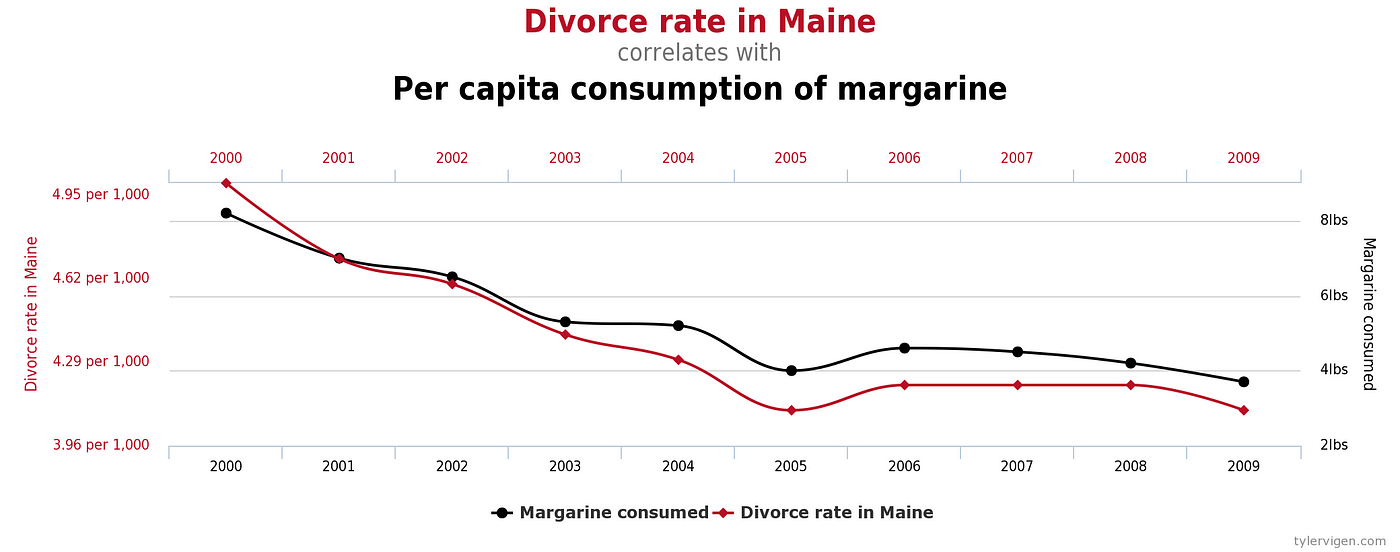
Other times two variables may appear to be correlated, but really have nothing to do with each other. If you make enough comparisons between datasets, you are bound to find some interesting relationships that look to move in sync. Tyler Vigen documents these at Spurious Correlations.
We’ve all heard the advice that correlation does not imply causation, but even when there is a causal effect, it’s often uncertain which way it goes. Does more praise of students from a teacher lead to higher grades? Do higher grades cause more praise? Or is there a third factor, smaller class sizes or more natural lighting in a class, causing both variables to increase? Questions of cause are answered by randomized controlled trials, not by observational studies where we cannot rule out additional factors that we do not measure. To avoid being misled, approach correlations between variables with skepticism by looking for confounding factors. Humans like neat, causal narratives, but that’s usually not what the data is telling us.
2. Relationships Don’t Last Forever
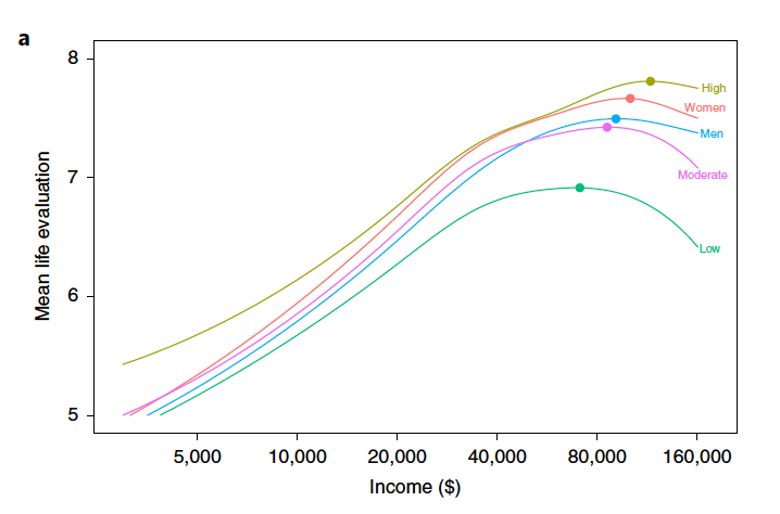
If you have successfully identified a correlation, don’t assume it lasts forever in either the positive or negative direction. Linear relationships are almost always only linear in a limited region of both variables. Beyond a point, the relationship may become logarithmic, completely disappear, or even reverse.
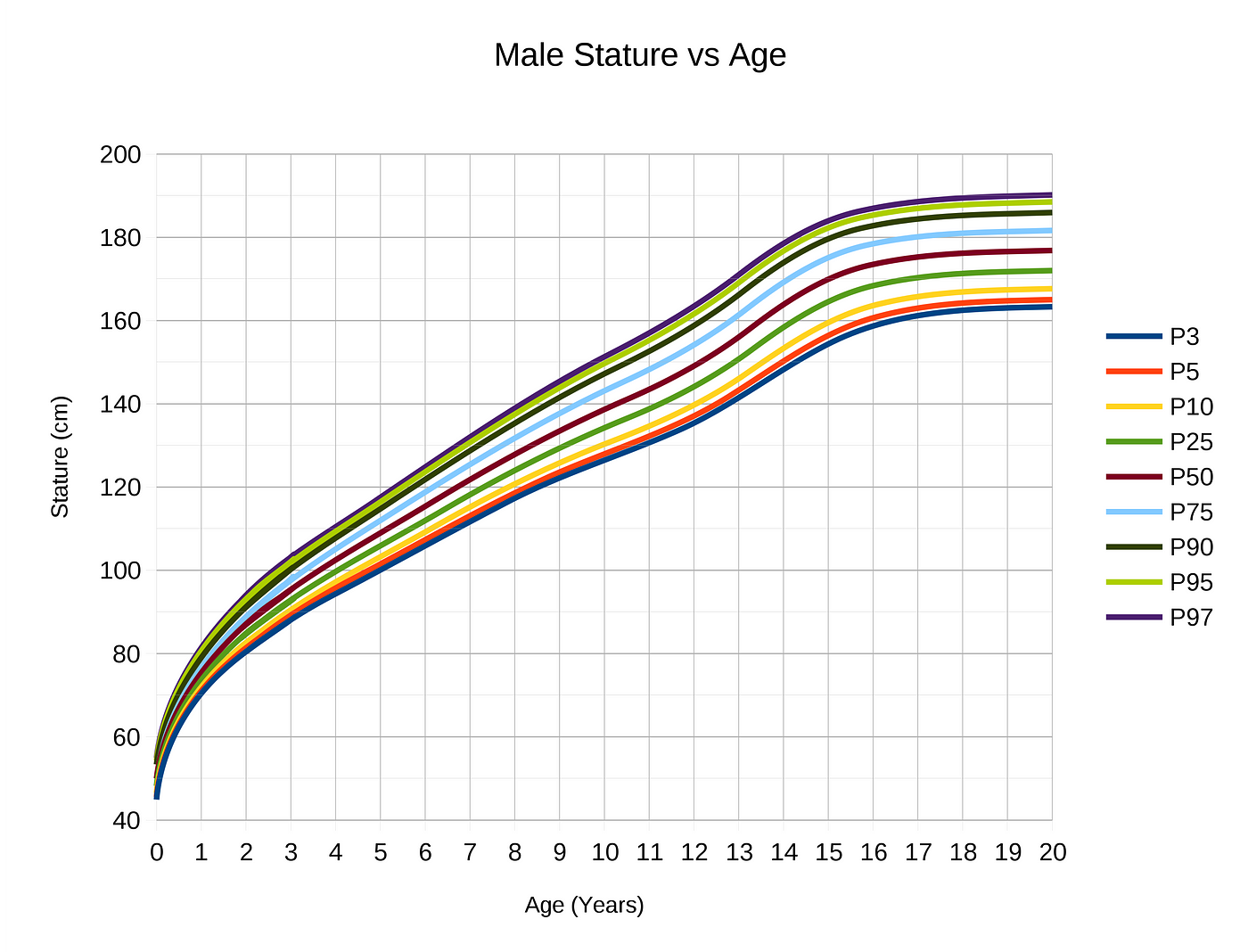
This can be observed in growth curves extrapolated over time. There are periods of linearity where growth occurs at a constant rate, but eventually, growth levels off because almost nothing continues growing indefinitely.
3. Always Look at the Axes on a Chart
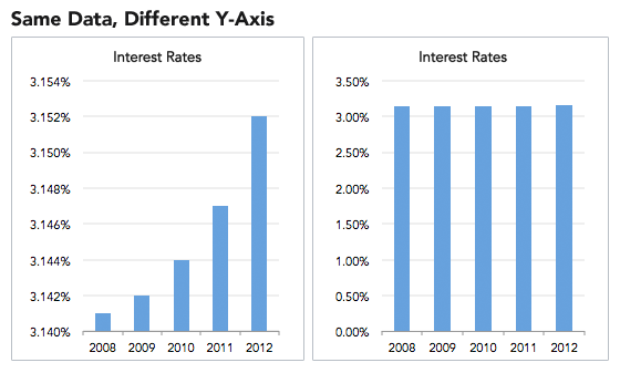
Adjusting the axes of a graph to make a point is a classic technique in manipulating charts. As a first principle, the y-axis on a bar chart should always start at 0. If not, it’s easy to prove an argument by manipulating the range, by for example, turning minor increases into massive changes:
Another example of misleading graphs is y-axes with different scales. By carefully adjusting values, you produce surprising trends where none exist.
While this may seem like an obvious manipulation, advertisers and newspapers get away with it because people do not read information. Most people see a graph and immediately draw a conclusion from the shape of the lines or bars, exactly as the person who made the graph wants. To counter this, try reading axes values. A simple examination may tell you changes are not as big as they look and trends have been created from nothing!
Once you get some practice making graphs, you realize how easy it is to manipulate them to your advantage. The best protection against inaccurate figures may be firsthand practice in making them yourself.
4. Small Samples Produce Shocking Statistics
Would you be surprised if I told you the highest cancer rates tend to occur in the counties with the smallest populations? Not that shocking. How about when I add that the lowest cancer rates also tend to occur in counties with the lowest number of people? This a verified example of what occurs with small sample sizes: extreme values.
Any time researchers conduct a study, they use what is called a sample: a subset of the population meant to represent the entire population. This might work fine when the sample is large enough and has the same distribution of the larger population, but often, because of limited funding or response rates, psychological, behavioral, and medical studies are conducted with small samples, leading to results that are questionable and cannot be reproduced.
Scientists are usually limited to small samples by legitimate problems, but advertisers use small numbers of participants in their favor by conducting many tiny studies, one of which will produce a positive result. Humans are not great at adjusting for sample sizes when evaluating a study which in practice means we treat the results of a 1000 person trial the same as a 10 person trial. This is known as “insensitivity to sample size” or “sample size neglect”.
Here’s another example; if you consider yourself to be data literate, then you will have no problem with this question:
A certain town is served by two hospitals. In the larger hospital, about 45 babies are born each day, and in the smaller hospital, about 15 babies are born each day. As you know, about 50% of all babies are boys. However, the exact percentage varies from day to day. Sometimes it may be higher than 50%, sometimes lower.
For a period of 1 year, each hospital recorded the days on which more than 60% of the babies born were boys. Which hospital do you think recorded more such days?
1. The larger hospital
2. The smaller hospital
3. About the same (that is, within 5% of each other)
If you guessed 2., then congratulations, you are data literate! The reasoning is the smaller the sample size, the more extreme the values. (This is from Judgment under Uncertainty: Heuristics and Biases by Tversky and Kahnemann. I’d highly recommend reading this paper and Thinking, Fast and Slow, to learn about cognitive biases that affect our decision-making.)
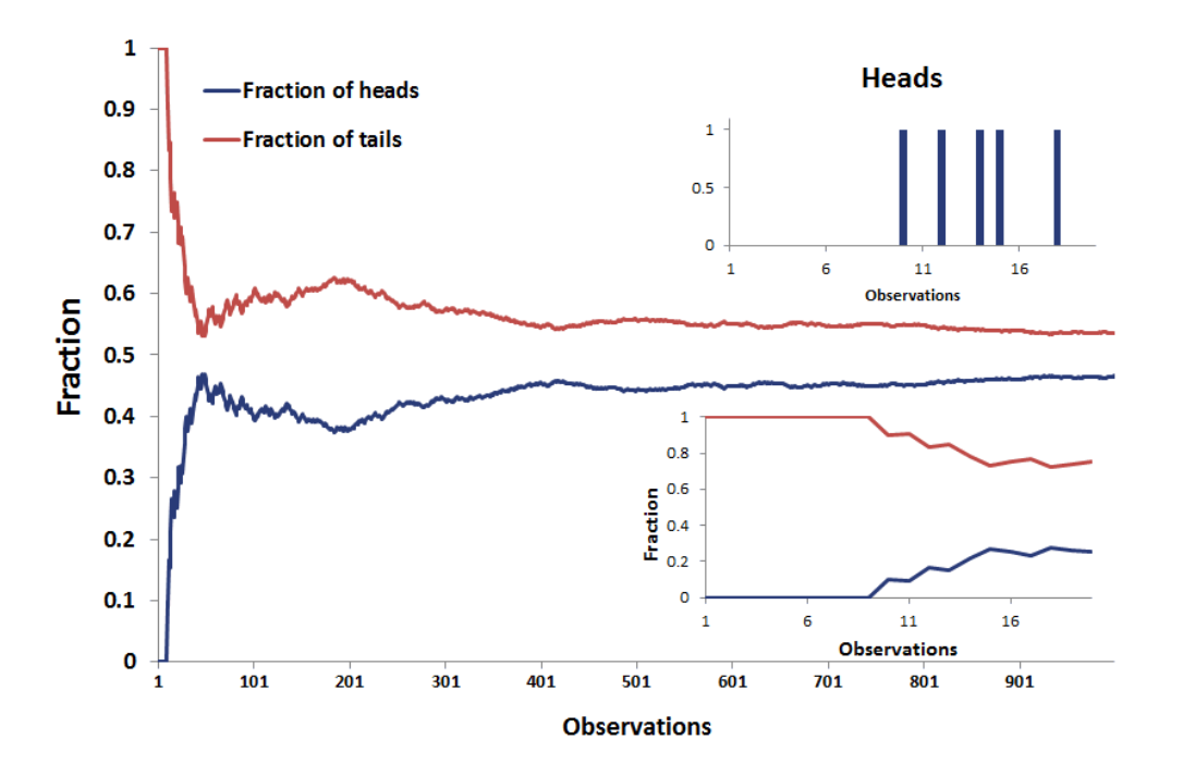
You can test the principle that small samples produce extreme results by flipping a coin. With a small sample, say 5 tosses, there is a good chance you get 4 tails. Does this mean the coin always comes up 80% tails? No, this means your sample is too small to draw any significant conclusions.
This trick is often used when marketing products by asking a small number of people about a particular brand. You can get impressive-sounding numbers (90% of doctors like this toothpaste) if you repeatedly survey small groups and only report the favorable results. Ask a small group, look at the results, throw away the bad, and repeat until you get the stats you need!
The solution to avoid being fooled by small sample sizes is to just look for the number of observations in the data. If not given, then assume whoever took the study has something to hide and the statistics are worthless. Behavioral scientists have shown that most of us are fallible to neglecting sample size; don’t make the same mistake — trust a large number of observations, not shocking statistics from small samples.
5. Look at all the Numbers that Describe a Dataset
Checking the sample size can be one way to avoid getting fooled by data, but only if the sample size is provided. Another trick used to mislead consumers of data is to avoid listing relevant numbers that describe a dataset, such as the count of observations, the spread of the data (range), the uncertainty about the data (standard error), the quantiles of the data, and so on. Each of these can be used to get a deeper dive into the data, which often goes against the interest of whoever presents the dataset.
As another example from the book, if you have two children, one of whom tests a 99 on IQ and the other a 102, you really should not tell them to avoid comparisons. Why? Because IQ tests can have a standard error of around 3 points which means a child scoring a 99 once would be expected to score between 96 and 102 about 68% of the time. The overall difference might not be significant and could reverse itself in repeated testing. In other words, by leaving out the expected standard error in the results, you can draw a more drastic conclusion than that offered by the data.
Studies that don’t report more than one number usually have something to hide. Likewise, if a graph looks like it cuts off some of the data, it’s not trustworthy. It’s too easy to change a narrative by subsetting data.
Think of it this way: if there was a medicine that increased lifespan by 2 years on average would you take it? Would it change your mind if the worst impact was a loss of 12 years of life and the maximum a gain of 14 years? It usually is the details that matter and one summary statistic cannot tell the whole story.
6. Check which Average is Used
Another useful way to tell whatever story you want with data is to vary the definition of “average”. You have 3 options (maybe more if you’re clever):
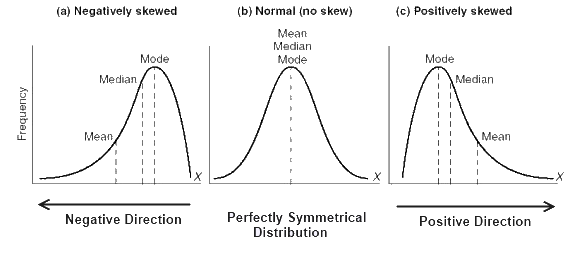
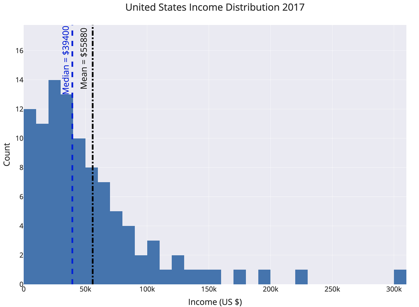
I’ve written about this issue before (see here for details), and the basic idea is: the mean and median of a distribution are the same only if it is normal and we live in a world with mostly non-normal data. This means the mean and median of a dataset are not the same value, often by a considerable amount.
The way to avoid this is to look at the mean, median, and mode of a dataset (again you need all these numbers!). Figure out which one is most appropriate (usually the median for highly skewed datasets such as income, city size, life span, housing prices and so on) and use that if you need a one figure summary. If you can, graph the entire set of values in a histogram and look at the distribution. Try to use more than a single number to describe a dataset, and if you report an average, specify which you are using!
7. Use Comparisons to a Common Baseline
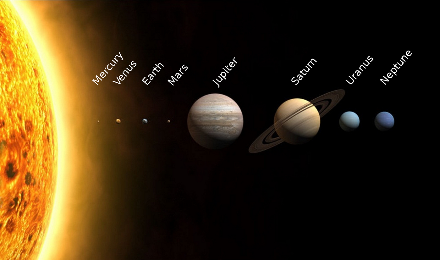
Data is often on scales with which we are unfamiliar, and we need a comparison to other numbers to know if a statistic represents a real change. Is a mean radius of 3389 km for Mars large? I have no conception of what that means until it’s compared to other planets!
Not only do we want to compare a statistic to values in the past and to numbers in the same category, but we also want to make sure the definition of the stat doesn’t change. According to “How to Lie”, The number of farms in the US increased from 1930 to 1935 by 500,000 because the definition of a farm from the Census Bureau changed! The easiest way to lower unemployment is just to change the definition to exclude people who have stopped looking for work.
Changes in the way data is gathered or in the definition of values can often produce extreme results mistaken for actual trends. To counter this, first, look at the entire series of values for perspective. Second, make sure the definition has not changed over the time range. Only then can you start to draw conclusions from the data series. You can scare people by saying New York had 289 murders in 2018, but when you compare that to 2245 in 1990, you realize New York City has never been safer! It’s usually the comparison that matters; don’t let an isolated number sway your rational thinking.
8. Look for Bias in Sample Selection
Remember when we talked about all data being gathered from samples which we hope are representative of the population? In addition to being concerned about sample size, we also need to look for any bias in the sample.
This could come from the measurement method used: a landline phone screen might favor wealthier, older participants. It could also come from the physical location: surveying only people who live in cities because it’s cheaper might bias results toward more progressive views. Sample bias is particularly prevalent in political polling where 2016 showed that sometimes samples are not representative of an entire population.
When examining a study, we need to ask who is being included in the sample and who is being excluded. For decades, psychology and sociology studies have been hurt by the WEIRD bias. Samples only included people (often college students) from Western, Education, Industrialized, Rich, Democratic, Nations. It’s hard to reasonably say a survey represents all of humanity when the participants are this limited!
We should also look for sampling bias in our sources of information. Most of us now impose information selection bias on our selves by choosing sources that we tend to agree with. This leads to dangerous situations where we don’t encounter people who have different opinions and so we grow more entrenched in our views. The solution to this is simple but difficult: read different sources of news, particularly those that don’t agree with you.
If you are a New York Times reader, try the Wall Street Journal for a while. For those who are feeling adventurous, you can even try talking to people who disagree with you. While this may seem intimidating, I’ve found that people who disagree outwardly often have more in common — the same core driving desires — motivating them to choose their respective sides. It’s much easier to come to a common understanding in person but even engaging in civil discourse online is possible and productive and can help you escape a self-imposed information-selection bias.
In summary, we need to be wary both of outside sampling bias and self-created sampling bias from our choice of media sources. You would not like someone telling you to read only a single newspaper, so don’t do the same to yourself. Diverse viewpoints lead to better outcomes, and incorporating different sources of information with varying opinions will give you a better overall picture of events. We can’t always get to the complete truth of a matter, but we can at least see it from multiple sides. Similarly, when reading a study, make sure you recognize that the sample may not be indicative of the entire population and try to figure out which way the bias goes.
9. Be Wary of “Big Names” on Studies and Scrutinize Authority
Huff describes the idea of an “O.K name” as one added to a study to lend it an air of authority. Medical professionals (doctors), universities, scientific institutions, and large companies have names that lead us to automatically trust the results they produce. However, many times these “experts” did not actually produce the work but only were tangentially involved and the name has been added to sway us. Other times, such as when cigarette makers used doctors to sell their deadly products, the authorities are directly paid to lie.
One way to avoid being persuaded by an impressive name is to “make sure the name on the study stands behind the study and not beside it.” Don’t see an institutional name and immediately assume the study is infallible. I don’t think we should look at the author or university until we’ve analyzed the statistics to avoid any unconscious bias we impose on ourselves.
Even when the results come from a confirmed “expert” that does not mean you should accept them without question. The argument from authority is a fallacy that occurs when we assume someone with greater power is more likely to be correct. This is false because past success has no bearing on whether current results are correct. As Carl Sagan put it: “Authorities must prove their contentions like everybody else.” (from The Demon-Haunted World: Science as a Candle in the Dark).
No one is above skepticism, as we’ve seen throughout the history of science (remember when Aristotle said there were 5 elements? or when the president of IBM said “I think there is a world market for maybe five computers”.) Many of the greatest findings have come from challenging authority and accepted wisdom. A statistic with a big name attached should get just as much scrutiny as any other. Statistics and data have no allegiance to a higher power.
10. Don’t Place Too Much Faith in any One Statistic
The overall theme of “How to Lie with Statistics” is: view any single statistic with skepticism. Any number represents a distillation of a set of data, which was taken on a sample of a population by mistake-prone humans, using imperfect tools, in constantly changing conditions at a single point in time. The data was analyzed by another human, who works for an institution, which may have outside funders with differing motivations. Finally, the statistic or graph was delivered to you by a publisher that has its own interests in getting you to believe one idea.
All this leads to two conclusions:
We should not completely abandon statistics and data gathering. With the right design, studies can find critical trends — smoking is bad for you, chloroflourocarbons created a hole in the ozone layer, greater wealth leads to more happiness, and flouridated water vastly improves dental health— that then lead to better overall outcomes. Rather, we need to acknowledge data gathering and processing is an uncertain process with many factors influencing the final numbers we see.
Humans are variable, and the world is variable — that’s part of what makes it so great to be living in it — and so we should be wary of statistics claiming to summarize it neatly in one graph or table. We should look for the range of values, report numbers with confidence intervals, gather more data before jumping to conclusions, compare multiple studies, and ask about the design of the data-gathering process.
We need to admit that we are wrong and change our minds when the burden of evidence is irrefutable. There may not be objective truths that hold for the entire universe, but we can become less wrong over time. That is basically the goal of science: light a little more of the darkness with each new study. This should also be the goal of data science: uncover a bit more of the structure of our world with each new dataset. At the same time, we need to recognize the limits of data and not over-generalize. More data is not a panacea, but more data with debate, multiple analyses, and scrutiny can lead to better real-world decisions and that’s what we hope for as data literate citizens.
Conclusions
If I’ve learned anything in the data science field, it’s that the most effective way to spend my time is to make a bar chart with 4 numbers. Machine learning modeling is cutting-edge, but in the end, all the CEO wants to see is a simple chart from which she can draw a conclusion. There is nothing inherently wrong with this: as data scientists, our job is to extract meaning from large quantities of data. Meaning does not imply showing hundreds of numbers, it means displaying a limited few with high value. How we present those numbers can make a large impact on how — or if — they are used.
Data literacy means having the skills to interpret graphs, charts, and statistics and draw actionable conclusions. These conclusions do not have to agree with whoever produced the chart, and you should be skeptical when they do. As consumers of data products, we need to understand how easy it is to manipulate data to prove a point or turn a negative into a positive. Getting practice reading statistics and visualizations — actually reading a figure — helps. Another useful tactic is to make a lot of charts yourself. Practice using the best techniques and make sure to not deliberately mislead others.
The world is not a bad place, but there are people who don’t have your best wishes at heart. Often, they’ll use data as a tool to convince you to act in their interest and against your own. The best shield against these tactics is basic data literacy: understand how data can be manipulated and the ways you can break through the misconceptions. A healthy dose of skepticism is good for you personally and for the entire field of data science. With these lessons in mind, get out there and be a responsible producer and consumer of data.
As always, I welcome feedback and constructive criticism. I can be reached on Twitter @koehrsen_will.
How to Lie with Statistics
Table of Content
Introduction
Semantics basically means “Study of meaning”. Semantically correct means that you’re calling something what it actually is.
“Without Writers who use the words with honesty and understanding and readers who know what they mean, the result can only be semantic nonsense”
“A well-wrapped statistic is better than Hitler’s big lie; it misleads yet it cannot be pinned down” The crooks already know these tricks; honest men must learn them in self defense.
Sneaky use of statistics is quite common in news, media and even medical research. Once we know this statistical tricks it is difficult to unsee them.
“Average Americans brushes their teeth 1.02 times a day.” When we hear these statistic, We can ask many questions. :
A pure random sample is the only kind that can be examined with complete confidence by statistical theories. There is one big thing wrong there. It is so difficult and expensive to obtain for many uses that the sheer cost eliminates it. A more economical substitute which is almost universally used in such fields as opinion polling and market research, is called stratified random sampling.
To get stratified random sampling, we divided the population into several groups in proportion to their known prevalence. There are few big issues there :
The obvious thing is to start with a name of everyone and go after names choses from it randomly. but this is too expensive.
To summarize it is very important to choose the right sample selection process and to do it correctly so that exact findings may be attained. For Clients it is important to inquire about the sample selection process to understand the possible biases in the Results.
The Well Chosen Average
There are tricks that can be manipulated by the user/researcher while using average in describing any fact. The main idea is that there are three types of averages rather than one which is commonly assumed. The same data can give three different types of values when all three types of averages are calculated.
The 3 type of averages are :
We assume that these are same but in reality different kind of scenario requires different kinds of average to describe the situation precisely. The reporters and others many times choose the one that supports their argument.
Discarded Data, The data which is absent.
The statistics that are used by the marketing of advertising world of consumer products can be tricky. Obviously the statistics are highly going to be in favor of the product. However there are many underlying tricks.
First the sample size can be very small. With smaller sample sizes, the variance is large. With 10 coin flips you can get 8 heads, but you’re not much likely to get 80 heads in 100 coin flips.
By hiding the prevailing situation or pros and cons of an environment, any result of any study can be diverted according the desire of the researcher.
Companies can keep running experiments until they get the results they want, discarding the experiments that failed to produce “significant findings.”
Graph Manipulation
Numbers are not always good enough or adequate to make any report worthy or comprehensible. There is no doubt that pictures are easy to understand and there is no better way to way to make numbers comprehensible to mass people.
Lets look at some graph examples
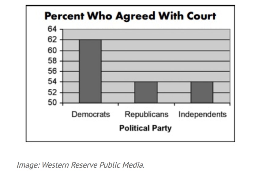
Non Zero Baseline
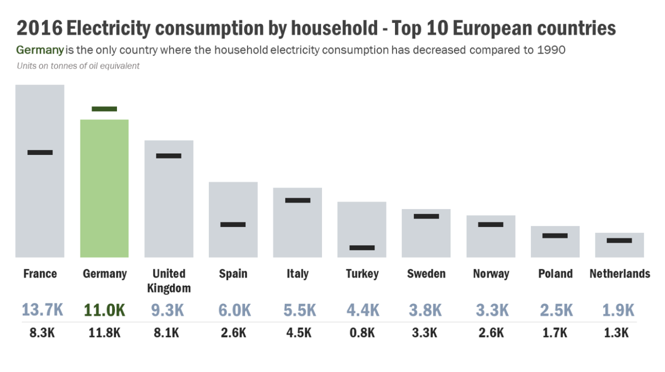
A first look at this graph makes it look like three times as many democrats supported the decision. But on closer inspection, note the scale on the vertical axis. Only slightly more democrats supported than republicans (62% vs. 54%).
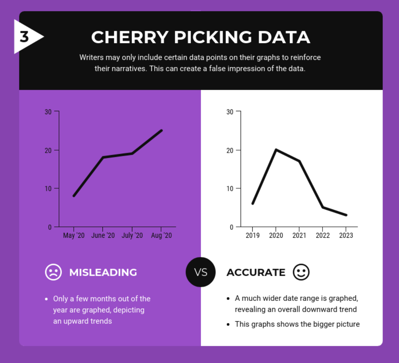
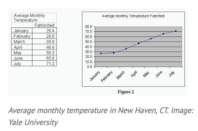
Incomplete Data
If you really want to make a shocking statement, make sure you only include part of the data. Take this first example of a misleading graph that proves global warming is real. In the graph and data below only Jan-July month data is included!
Correlation vs Causation
It can very well be other way round that low grades may lead to smoking. Another fact is that both smoking and low grades can be result of third factor of not taking books seriously.
The trick used very commonly in media is relating an issue with another non-relevant issue very smartly just to serve the purpose of the presenter. In some cases there might be a positive correlation but this correlation too works up to a mark to grow the effect positively but after that it may hinder.
The main idea here is that there might be correlation between two events but there are other factors influencing and bringing changes. The kind of manipulation done here is to relate on one of the hundred possible effects which is not exclusive at all with the concerned issue and to claim that this input has bought the result.
Semi Attached Figure
“If you can’t prove what you want to prove, demonstrate something else and pretend that they are the same thing.”
The semi attached figure is a tool that can be used to cope with any situation that is not much in favor of presenter.
Consider some examples :
Another trick is based on the fact that same data can be expressed in different ways. For e.g. same fact about a company can be
All these stories are told partially which is partially true but the whole story brings a different meaning.
How to Statisticulate/Manipulate
It is not always the statisticians who are busy to produce manipulated statistics. Rather a good or pure set of findings may be found distorted in the market by sales man. Sometimes the policy designers or statisticians are not that much skilled to find or interpret the exact relationship between two events/phenomena and that leads to a poor policy
Percentages and Percentage offer a fertile field for confusion. And like the ever-impressive decimal they can lend an aura of precision to the inexact.
How to talk back to Statistics
5 simple questions :
The “Who” question affects the reliability of the information.
Look carefully for unconscious bias. It is often lot more dangerous
How does he know?
In what way the information for the study was known? Was it reliable? Did people respond honestly?
What’s missing?
It is noticed that the most used technique to present distorted information is to hide information. So seeking hidden or missing information can reveal lot more truth than the author says.
Did someone change the subject?
It is like changing the direction of the study and present a different kind of result.
Does it make sense
So as a common man, and not being an expert the last question to ask is that does it make sense or just irrational and out of context.


